Join us on the Community Forums!
-
Community Guidelines
The Fitbit Community is a gathering place for real people who wish to exchange ideas, solutions, tips, techniques, and insight about the Fitbit products and services they love. By joining our Community, you agree to uphold these guidelines, so please take a moment to look them over. -
Learn the Basics
Check out our Frequently Asked Questions page for information on Community features, and tips to make the most of your time here. -
Join the Community!
Join an existing conversation, or start a new thread to ask your question. Creating your account is completely free, and takes about a minute.
Not finding your answer on the Community Forums?
- Community
- Platform
- Android App
- Average active Vs zone minutes
- Mark Topic as New
- Mark Topic as Read
- Float this Topic for Current User
- Bookmark
- Subscribe
- Mute
- Printer Friendly Page
- Community
- Platform
- Android App
- Average active Vs zone minutes
Average active Vs zone minutes
- Mark Topic as New
- Mark Topic as Read
- Float this Topic for Current User
- Bookmark
- Subscribe
- Mute
- Printer Friendly Page
08-30-2022 14:44
- Mark as New
- Bookmark
- Subscribe
- Permalink
- Report this post
08-30-2022 14:44
- Mark as New
- Bookmark
- Subscribe
- Permalink
- Report this post
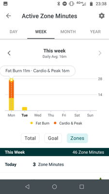
It's so annoying these new charts. I want to make sure I do the agreed health target of 22 zone minutes but your average doesn't take into account high intensity....so in theory on Monday it's 43 equivalent minutes of activity, but for your weekly average it doesn't account for high intensity?!?!?!?
08-31-2022 04:30
- Mark as New
- Bookmark
- Subscribe
- Permalink
- Report this post
 Diamond Fitbit Product Experts share support knowledge on the forums and advocate for the betterment of Fitbit products and services. Learn more
08-31-2022 04:30
- Mark as New
- Bookmark
- Subscribe
- Permalink
- Report this post
@Unfit100 I'm moving your post to the Android app forum, a better fit for your question. Fitbit released this new display to the Android version, but not the iOS version. The list of complaints about this update is quite long. As an iPhone user, I'm not seeing what you see and can't make a fair comparison.
I'm sorry, but I'm not sure what you mean by not accounting for high intensity. Fitbit awards 1x the number of minutes in the fat burn zone and 2x the number of minutes in the cardio and peak zones. On Monday, you got 43 zone minutes for 27 minutes of activity. The total number of zone minutes reflects intensity.
Laurie | Maryland
Sense 2, Luxe, Aria 2 | iOS | Mac OS
Take a look at the Fitbit help site for further assistance and information.
 Best Answer
08-31-2022 12:23
- Mark as New
- Bookmark
- Subscribe
- Permalink
- Report this post
08-31-2022 12:23
- Mark as New
- Bookmark
- Subscribe
- Permalink
- Report this post
@Unfit100 ... what @LZeeW is true...
If you look at the 'Total' chart, this gives you your total adjusted active zone minutes (so includes the 2 active zone minutes per minute of being in a zone above 'Fat Burn').
The 'Zones' chart simply gives you a breakdown of the actual/'real' number of minutes that your body was working inside the zones.
I've always simply gone by the 'Total' amount of active zone minutes. We're looking at a total of 150 per week to match the recommended amount of activity that it's advised that we should get. I've never really, until today, looked at the 'Zones' chart....
Now, the bigger area of concern with the data on the Zones chart on the Android app is something that was alluded to - it's the calculated daily average figure. I've looked at my data for this week, and last week, and I cannot reconcile my figures to match the alleged daily average figures that the app is calculating and displaying (and I know that this should be the daily average for the 'real' i.e. non-adjusted zone times for whatever week period). To put it politely, I think they're very wrong where high figures are included in the calculations...
I mean, in the example above....
Monday - 11 mins in fat burn + 16 mins cardio/peak = total of 27 non zone adjusted minutes
Tuesday - 3 mins in fat burn
So 27 + 3 = 30 minutes in total. The figures were for up to and including Tuesday (the day the app was on, and the start day of the week is set to be Monday), so 30/2 = 15. Not 16...
In my case, as of right now, my figures are:
Mon - 43 mins fat burn + 41 mins cardio = 84
Tues - 42 mins fat burn + 41 mins cardio = 83
Weds - 31 mins fat burn + 42 mins cardio = 73
So, according to me, 84 + 83 + 73 = 240 mins. 240/3 = 80. I work my average daily zone minutes figure to be 80 minutes.
Apparently my daily zone times average value, according to the app, is 'only' 40 minutes
We won't actually get any form of explanation as to how the Android App is calculating the figure that it is doing... but hopefully someone will see this and add it to the list of bugs/defects that are in the Dev's queue....
 Best Answer
