Join us on the Community Forums!
-
Community Guidelines
The Fitbit Community is a gathering place for real people who wish to exchange ideas, solutions, tips, techniques, and insight about the Fitbit products and services they love. By joining our Community, you agree to uphold these guidelines, so please take a moment to look them over. -
Learn the Basics
Check out our Frequently Asked Questions page for information on Community features, and tips to make the most of your time here. -
Join the Community!
Join an existing conversation, or start a new thread to ask your question. Creating your account is completely free, and takes about a minute.
Not finding your answer on the Community Forums?
- Community
- Platform
- Android App
- Sleep data with new layout
- Mark Topic as New
- Mark Topic as Read
- Float this Topic for Current User
- Bookmark
- Subscribe
- Mute
- Printer Friendly Page
- Community
- Platform
- Android App
- Sleep data with new layout
Sleep data with new layout
- Mark Topic as New
- Mark Topic as Read
- Float this Topic for Current User
- Bookmark
- Subscribe
- Mute
- Printer Friendly Page
04-13-2024
07:31
- last edited on
04-17-2024
12:52
by
RodrigoMFitbit
![]()
- Mark as New
- Bookmark
- Subscribe
- Permalink
- Report this post
04-13-2024
07:31
- last edited on
04-17-2024
12:52
by
RodrigoMFitbit
![]()
- Mark as New
- Bookmark
- Subscribe
- Permalink
- Report this post
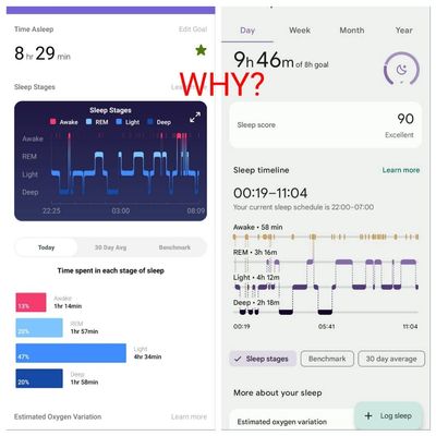
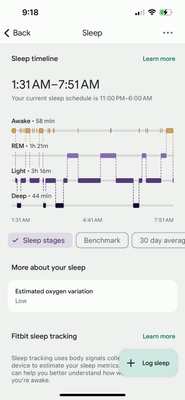
I suppose there was an update. The app presents sleep data differently. Have others noticed this?
I miss seeing how long episodes of awake, light, REM and deep sleep are
Moderator edit: Subject for clarity.
04-16-2024 09:14 - edited 04-16-2024 09:36
- Mark as New
- Bookmark
- Subscribe
- Permalink
- Report this post
04-16-2024 09:14 - edited 04-16-2024 09:36
- Mark as New
- Bookmark
- Subscribe
- Permalink
- Report this post
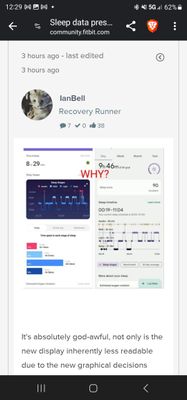
It's absolutely god-awful, not only is the new display inherently less readable due to the new graphical decisions these homewreckers have made but they've moved the totals OVER the sleep graph making it a bloody, unparseable mess, and thank you Susan for pointing out that clicking on the segments no longer gives information for that specific segment. [EDIT: this information can be accessed by pressing and holding on the graph and sliding your finger around, so the info isn't gone but it would have been nice if they had actually decided to let us know a completely different gesture was required to access it]
Under google it seems every single update brings reduced functionality. The popular theory at least in the iOS forum where I accidentally posted my initial complaints about the app interface overhaul is that google wants to make Fitbit as painful or more as using google fit devices.
04-16-2024
09:19
- last edited on
04-17-2024
12:43
by
RodrigoMFitbit
![]()
- Mark as New
- Bookmark
- Subscribe
- Permalink
- Report this post
04-16-2024
09:19
- last edited on
04-17-2024
12:43
by
RodrigoMFitbit
![]()
- Mark as New
- Bookmark
- Subscribe
- Permalink
- Report this post
Lame changes, absolutely bloody awful, ugly, stupid, terrible changes... and they could have had like a pop-up or something to explain how the segment checking element of the interface now requires a COMPLETELY DIFFERENT GESTURE TO ACCESS IT
This puff piece partly explains, in theory, the brainless design """'philospophy"""" behind these thoughtlessly imposed updates
https://www.androidcentral.com/apps-software/google-design-fitbit-app-redesign
These are the same kind of people that don't want to ever see a room that doesn't have everything in flat, smooth, neutral colours. The kind of people who rip out hardwood lintels and archways to make spaces more "seamless" and who paint over natural stone exteriors with dark grey paint and white trim because... that's what new things look like.
04-16-2024 10:09
- Mark as New
- Bookmark
- Subscribe
- Permalink
- Report this post
04-16-2024 10:09
- Mark as New
- Bookmark
- Subscribe
- Permalink
- Report this post
I just checked and noticed mine has updated to the 'new' version. It is awful. I used to be able to assess everything at a glance and now it looks like it did many years ago - what a significant downgrade. I've been holding on with all the changes and trying to roll with them but it this keeps up I don't see a future with Fitbit products (I've been with Fitbit since 2015).
04-16-2024 11:18 - edited 04-16-2024 11:28
- Mark as New
- Bookmark
- Subscribe
- Permalink
- Report this post
04-16-2024 11:18 - edited 04-16-2024 11:28
- Mark as New
- Bookmark
- Subscribe
- Permalink
- Report this post
Unpopular opinion, but I've been using the Fitbit interface for years now and actually like these changes. I feel bad for the interface design team that comes across this thread to see the harsh criticism from the comments in here. I guess all input is valid and subjective though and you're simply never going to please everyone.
Sure it's a different way of accessing the info, but I feel that all the same sleep data is present. I like how I can start from a wider timeframe like year or month tab, then drill down into more granular info like week and day by continually tapping into specific time periods.
I'm in no way affiliated with Google / Fitbit but just wanted to give kudos to their team for these changes. Looking forward to seeing more of the updates across the app though. Still seeing the old UI in areas like Health, Nutrition, and Stress & Mindfulness which gives a less cohesive feel. I'm sure there are plans to roll those out next. It would be nice to get some glimpses during Google IO next month.
04-16-2024 11:22
- Mark as New
- Bookmark
- Subscribe
- Permalink
- Report this post
04-16-2024 11:22
- Mark as New
- Bookmark
- Subscribe
- Permalink
- Report this post
Terrible interface!!! I hate it. It's unacceptable.
04-16-2024 12:23
- Mark as New
- Bookmark
- Subscribe
- Permalink
- Report this post
04-16-2024 12:23
- Mark as New
- Bookmark
- Subscribe
- Permalink
- Report this post
Thanks for the info. Yes, it’s an obvious and glaring change. I think it is awful. Is there any way to go back to the old graph for sleep data? This visual is not helpful to me at all.
04-16-2024 12:24 - edited 04-16-2024 12:32
- Mark as New
- Bookmark
- Subscribe
- Permalink
- Report this post
04-16-2024 12:24 - edited 04-16-2024 12:32
- Mark as New
- Bookmark
- Subscribe
- Permalink
- Report this post
Save your well written post because in the past, true and informative posts like yours were removed by "moderators" to "keep the forums clean from clutter"
And thank you for articulately expressing what most of us wanted to say for a while
I am referring to this post as this forum does not allow replying to a specific message...
04-16-2024
12:25
- last edited on
04-17-2024
12:44
by
RodrigoMFitbit
![]()
- Mark as New
- Bookmark
- Subscribe
- Permalink
- Report this post
04-16-2024
12:25
- last edited on
04-17-2024
12:44
by
RodrigoMFitbit
![]()
- Mark as New
- Bookmark
- Subscribe
- Permalink
- Report this post
100%. I have had this particular FB for four years now. Been considering getting a new one, or going elsewhere. I think all the recent “updates”🤦🏼:female_sign: and changes have made my decision for me. I can’t even read that graph. *sigh*. Oh well.
I’m with you. I think I will be moving on to something else. This is pretty awful.
So, I haven’t looked back at all, yet. You are saying we also lost all our old data and graphs? We weren’t even warned!! I’m so disappointed. An understatement
Here, here!!👍🏼🙌
04-16-2024 14:47
- Mark as New
- Bookmark
- Subscribe
- Permalink
- Report this post
04-16-2024 14:47
- Mark as New
- Bookmark
- Subscribe
- Permalink
- Report this post
Why would Fitbit change a wonderful sleep graph to this horrible useless thing?
please restore back.
I have owned Fitbit watches forever.
Since Goggle purchased Fitbits have gone down hill. Please restore original sleep score graphs.
If not, I will be checking out Apple Watch or Elon Musk’s new watch. I am sure many others will too.
Extremely disappointed
04-16-2024 22:48
- Mark as New
- Bookmark
- Subscribe
- Permalink
- Report this post
04-16-2024 22:48
- Mark as New
- Bookmark
- Subscribe
- Permalink
- Report this post
This new app, this new graphs is simply horrible. I think I will not use neither this app nor my fitbit sense watch any more. Shame on fitbit. Back to my tried-and-true Citizen radio-controlled, solar-powered watch! I've been using the fitbit sense for many years, BUT I'M GUTTING IT’S OVER.i do not want this new poor interface of the sleep control function - its ugly.
04-17-2024 01:23
- Mark as New
- Bookmark
- Subscribe
- Permalink
- Report this post
04-17-2024 01:23
- Mark as New
- Bookmark
- Subscribe
- Permalink
- Report this post
This morning I got an update to the Fitbit app. Instead of 2-3 minutes it took almost 20 m to sync this night's sleep. Is this temporary, or is there some fault introduced to the app?
04-17-2024 03:30
- Mark as New
- Bookmark
- Subscribe
- Permalink
- Report this post
04-17-2024 03:30
- Mark as New
- Bookmark
- Subscribe
- Permalink
- Report this post
Whoa whoa whoa. My app updated and now the Sleep Stages screen is completely awful as well. What in the world were they thinking? Are they trying to make people hate their app? The sleep stages was the last nice looking and useful interface for the Fitbit. Now it looks horrendous! How is this possible that they thought this was a good idea? My latest watch is finally teetering and probably closer to dying. Definitely saying goodbye forever to Fitbit after 10+ years. Another customer lost.
04-17-2024 03:55
- Mark as New
- Bookmark
- Subscribe
- Permalink
- Report this post
04-17-2024 03:55
- Mark as New
- Bookmark
- Subscribe
- Permalink
- Report this post
Why did you ruin the sleep display? I hate it.
The old display was very much more readable, detailed, and easy to understand
Please change it back, or tell us how to get the old version back.
You likely don't care about my input, as I do not pay for a premium subscription, so I'll probably just trash this Fitbit Charge 5.
The new update has trashed it's usefulness for me.
04-17-2024 03:56
- Mark as New
- Bookmark
- Subscribe
- Permalink
- Report this post
04-17-2024 03:56
- Mark as New
- Bookmark
- Subscribe
- Permalink
- Report this post
I just received the update to the sleep date and find it pretty much useless! It's way too busy, too much text. It was much easier & quicker to review the detailed data in the old format. It seems that the recent updates have taken the user backwards making the Fitbit more difficult too use...maybe it's time to look elsewhere for my fitness tracking.
04-17-2024 03:57
- Mark as New
- Bookmark
- Subscribe
- Permalink
- Report this post
04-17-2024 03:57
- Mark as New
- Bookmark
- Subscribe
- Permalink
- Report this post
Having worn and followed Fitbit for many years, I am incredibly disappointed in the new upgrades Especially in sleep. Looks similar now to the iwatch stats which are very hard to read. I wear an iwatch also but follow many stats in Fitbit. Now I’m not sure about keeping my Fitbit. I really share my stats from Fitbit and now I can’t. No color either. So disappointing. Unless it changes either back or to something better. Probably going to throw it away
04-17-2024 06:22
- Mark as New
- Bookmark
- Subscribe
- Permalink
- Report this post
04-17-2024 06:22
- Mark as New
- Bookmark
- Subscribe
- Permalink
- Report this post
Your brain trust devs managed to basically ruin the sleep tracking area of the app. Congratulations, you guys have angered your user base and folks are looking for the exits. I strongly recommend that you roll back the changes to the sleep tracking unless you actually want people to move to Whoop or Apple.
04-17-2024 06:41
- Mark as New
- Bookmark
- Subscribe
- Permalink
- Report this post
04-17-2024 06:41
- Mark as New
- Bookmark
- Subscribe
- Permalink
- Report this post
How do you get the old App version
04-17-2024 06:51
- Mark as New
- Bookmark
- Subscribe
- Permalink
- Report this post
04-17-2024 06:51
- Mark as New
- Bookmark
- Subscribe
- Permalink
- Report this post
I agree. If they don't change I will get a new way to measure the sleep. Friend has the ring
04-17-2024 06:56
- Mark as New
- Bookmark
- Subscribe
- Permalink
- Report this post
04-17-2024 06:56
- Mark as New
- Bookmark
- Subscribe
- Permalink
- Report this post
What deep-thinking developer decided that people were no longer interested in being able to track their sleep process in detail over days rather than the jumbled, overly busy line graph that unhappily showed up this morning? The previous view was uncluttered and informative particularly since the user, you know, the folks that are interested in the information, could view past days. If folks are having sleep issues that's a critical body of information totally lost in that 30-day mess. And frankly the colored blocks for sleep phase were more than adequate. This line graph more obfuscates than informs. Please, oh please undo this additional insult added to the many imposed by this "updated" application. And while I'm begging, is it really all that unreasonable to think the people developing this app would benefit by running brilliant ideas like this one by the user community before surprising us when we next open the app? Post a proposed idea on this page and ask for feedback. That's how real, user-centric development is accomplished.
04-17-2024 06:56
- Mark as New
- Bookmark
- Subscribe
- Permalink
- Report this post
04-17-2024 06:56
- Mark as New
- Bookmark
- Subscribe
- Permalink
- Report this post
Longtime Fitbit user here! I have to agree, this is a Beta level design for the sleep tracking feature at best. Sorely disappointed waking up to this display!!! Please revert to the previous one, because this is TRASH and unwarranted
🤮🤦🏾:male_sign:
interface


