Join us on the Community Forums!
-
Community Guidelines
The Fitbit Community is a gathering place for real people who wish to exchange ideas, solutions, tips, techniques, and insight about the Fitbit products and services they love. By joining our Community, you agree to uphold these guidelines, so please take a moment to look them over. -
Learn the Basics
Check out our Frequently Asked Questions page for information on Community features, and tips to make the most of your time here. -
Join the Community!
Join an existing conversation, or start a new thread to ask your question. Creating your account is completely free, and takes about a minute.
Not finding your answer on the Community Forums?
- Community
- Health & Wellness
- Manage Weight
- Do I understand this graph correctly?
- Mark Topic as New
- Mark Topic as Read
- Float this Topic for Current User
- Bookmark
- Subscribe
- Mute
- Printer Friendly Page
- Community
- Health & Wellness
- Manage Weight
- Do I understand this graph correctly?
Do I understand this graph correctly?
- Mark Topic as New
- Mark Topic as Read
- Float this Topic for Current User
- Bookmark
- Subscribe
- Mute
- Printer Friendly Page
08-12-2022 07:06
- Mark as New
- Bookmark
- Subscribe
- Permalink
- Report this post
08-12-2022 07:06
- Mark as New
- Bookmark
- Subscribe
- Permalink
- Report this post
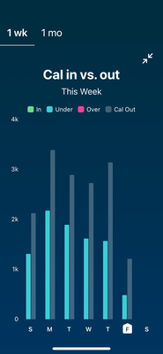
I am trying to lose a few pounds by Dr’s appointment next month. My regimen is set up to deficit myself 500 cals a day to meet the goal. In the graph attached, does each day represent the goal BEFORE the 500 cals or after?..
Thanks for viewing 😊
 Best Answer
08-15-2022 14:21
- Mark as New
- Bookmark
- Subscribe
- Permalink
- Report this post
 Fitbit Product Experts Alumni are retired members of the Fitbit Product Expert Program. Learn more
08-15-2022 14:21
- Mark as New
- Bookmark
- Subscribe
- Permalink
- Report this post
I don't track calories, so I can't answer your specific question. However I should comment that the caloric estimates of pretty much all fitness trackers can be off by very large amounts.
My suggestion is (assuming your weight is static) to track your typical caloric food intake, and to reduce that by you 500 calorie target.
CharlesKn | Mid-Atlantic, USA
60+, strength and cardio
Charge 5, Android, Windows
08-16-2022 02:16
- Mark as New
- Bookmark
- Subscribe
- Permalink
- Report this post
 Fitbit Product Experts Alumni are retired members of the Fitbit Product Expert Program. Learn more
08-16-2022 02:16
- Mark as New
- Bookmark
- Subscribe
- Permalink
- Report this post
Hello @Loveoldtrux
I moved this post to the Manage Weight section, it seems the best place for it.
The Cal in vs. Cal out is a bit tricky to read, but basically once the day has passed, the number are final and do not take into account the deficit.
So to have a green bar, meaning "In" your plan, you need to have a difference of 500 kcal between the In bar and the out bar.
Note that the estimation of calories out is just that, an estimation. So it is off by some amount.
 Best Answer
08-20-2022 05:30 - edited 08-20-2022 05:32
- Mark as New
- Bookmark
- Subscribe
- Permalink
- Report this post
08-20-2022 05:30 - edited 08-20-2022 05:32
- Mark as New
- Bookmark
- Subscribe
- Permalink
- Report this post
@Loveoldtrux That looks like a terrible graph to me. Seems like the gray bar should be the amount of calories you need to burn, to burn 500 more than you ate. but that can't be because the size of the grey bar isn't the same size above each burned amount. I think you should forget the graph and google the amount a person your gender, age, height & weight should eat to maintain your weight. Then eat 500 calories less than that to lose weight. Good luck and best wishes . Glenda
08-23-2022 08:33
- Mark as New
- Bookmark
- Subscribe
- Permalink
- Report this post
08-23-2022 08:33
- Mark as New
- Bookmark
- Subscribe
- Permalink
- Report this post
Grey bar is calories you used/burnt that day, blue bar is what you consumed (assuming you're logging), so the difference is the deficit for the day. Your deficit is more than 500 so the bar is blue, if it was about 500 it would be green (I think). If your deficit was a bunch less than 500 it would show red (also I think - I never yet saw green or red!).
For the current day it's always a bit odd as it fills out during the day based on its guess of what you will burn.
I've also used an iOS app called Arise, it's much clearer. Fitbit is very poor at this (but I use it to save data entry into 2 apps).
 Best Answer
