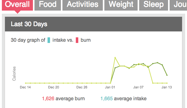
Sync colours on intake vs. burn graph

Intake vs burn graph

So intake on this legend is blue, and burn is red. But the two colours on the graph are yellow and green.


That makes no sense.


New idea: make the lines on the graph match the legend.


Edit: Wow, this idea is over two years old. A bug that should be a very simple aesthetic fix hasn't been done in over two years.

Moderator Edit: Edited post title, labels 

20 Comments
Eric_Abbott
Recovery Runner
Not having the graph elements not match the graph key sounds like a programming oversight.
rottengeek
Jogger

hehe - yep.  I had to "lol" this one, as I'm a developer.  I know that is poor forum etiquette, but...well...it is funny.

limjooha
First Steps
In graph at top of profiles the legend color codes does not match the actual graph colors. Blue n red in legend and dark green and light green in graph. Misleading and confusing. It says 30 day GRAPH in legend when actually referring to AVERAGE??
PurpleMartin
Keeping Pace

I noticed that just last week. Was wondering if it was just an odd bug with my computer but apparently note.


So here we are almost four months after the original report and no fix, no acknowledgement even.


Yo Fitbit! how about the courtesy of an acknowledgment, and notice you'll get this low-priority fix into a future update cycle?

My_2_cents
Recovery Runner

Even more interesting than the lack of response is that it seems to have been fixed in my account...Good work fitbit, even if you found it yourselves without seeing this.

This may be just for me, but if I go to Profile>Overall> the Last 30 Days colors are incorrect.

The key shows: 30 day praph of (blue) intake vs. (red) burn. However, the lines are different shades of green.

Then, at the bottom has the blue and red colors again.

See below:

Capture.PNG


Moderator edit: added labels

ChrisCA
Sprinter

Go to Log, and view your profile.

Click the Overall tab.

At top, the Last 30 days Calories...

Intake blue but the line in the graph is light green.

Burn is red but the line in the graph is dark green.


Make the line colors in the graph match the label colors...


colors.jpg

Status changed to: Under Consideration
AmritaFitbit
Premium User
Progression Runner

Thanks for this feedback! Our team will be taking a closer look at this bug soon. While we don't have an ETA for a fix, rest assured that it's on our to-do list.

EmilyMB
Jogger

"Under consideration"?  My 4th grader knows that the colors in the legend of the graph have to match the actual graph elements.  Fitbit has to think about whether to fix this?  For months?

rckoegel
Recovery Runner

somewhere in the settings for creating that graph there are color options, it should be an easy change to make.... but it's been onver a year, and, uh, nope....


lame fitbit devs, really lame.

graph colors.jpg


This has been wrong for several years... The colors on the graph don't match the colors on the legend. I found another thread about it, but it's been a year since anyone posted that it was "under consideration". Can this be fixed?? It's driving me nuts. 

BikerMike777
Jogger

Yes, I have the same issue. I sent an e-mail to the support team, but they told me to go here instead. So, I'm here, now what. This is frustrating as you have to move your mouse cursor on one of the green lines to find out if it is intake or burn. Fitbit team, please correct this.

A_AVL
Runner

I was noticing that and I also have seen on my graph that the "burn" is lower than the "intake" even though I have been operating at a caloric deficit of around 300 to 500 daily.

So this is also confusing???  Is it ever going to be fixed, because ...

like you, i went looking for the "burn vs intake" issues, and saw that it was an OLD problem over a year ago. 

the graph not only has the wrong colors, but you can see it says intake is higher than the burn on the bottom of that graph.
burn vs intake errors 2.jpgbut if you look at the second graph, showing food eaten vs caleries OUT you see that the intake is UNDER the calories burned..

So which is it????
And is it going to be fixed?

And Steam Punk Muppet (GREAT NAME BTW)
thank you so much for posting this question!
A

Squeak_Kitty
Base Runner

Could you PLEASE stop plotting the graph of intake vs. burn with yesterday's results, rather than plotting today's numbers, which will always be incorrect / incomplete until end of day.  And while you're at it, could you move this into the Dashboard Activity and Stats graph, as well as correct the line colors to match the legend colors?

mark_lamarre
Recovery Runner

On the PC Dashboard "View Profile" page,

Section "Overall",

Sub Section "Last 30 Days" -

can you make the diagram colours correspond with the "intake" V "burn" colours please.


Moderator edit: added labels

stal
Jogger

Yes! And please put this graph on the dashboard!

cbess
Recovery Runner

I am shocked this hasn't been fixed already. What are they doing over there?

Status changed to: Reviewed By Moderator
LizFitbit
Premium User
Fitbit Moderator
Fitbit Moderator
 
Status changed to: Under Consideration
LizFitbit
Premium User
Fitbit Moderator
Fitbit Moderator

Hi everyone, there are plans to rebuild this section of the dashboard, which would involve improvements to the graph and key. Thanks @Cassian for sharing this with us. Do continue to vote for this feature suggestion whilst it’s under consideration.


Please note that if something is under consideration and chosen for development, it can be a while until it's released or until I have any news to share. Please watch this space for any updates! Thanks for your patience.

Cassian
Runner

Six. Years.

To comment, you must first accept the terms of the Idea and Feedback Submission policy.