Join us on the Community Forums!
-
Community Guidelines
The Fitbit Community is a gathering place for real people who wish to exchange ideas, solutions, tips, techniques, and insight about the Fitbit products and services they love. By joining our Community, you agree to uphold these guidelines, so please take a moment to look them over. -
Learn the Basics
Check out our Frequently Asked Questions page for information on Community features, and tips to make the most of your time here. -
Join the Community!
Join an existing conversation, or start a new thread to ask your question. Creating your account is completely free, and takes about a minute.
Not finding your answer on the Community Forums?
- Mark Topic as New
- Mark Topic as Read
- Float this Topic for Current User
- Bookmark
- Subscribe
- Mute
- Printer Friendly Page
New Dashboard
- Mark Topic as New
- Mark Topic as Read
- Float this Topic for Current User
- Bookmark
- Subscribe
- Mute
- Printer Friendly Page
05-25-2016
08:34
- last edited on
05-25-2017
14:37
by
KateFitbit
![]()
- Mark as New
- Bookmark
- Subscribe
- Permalink
- Report this post
 Community Moderator Alumni are previous members of the Moderation Team, which ensures conversations are friendly, factual, and on-topic. Moderators are here to answer questions, escalate bugs, and make sure your voice is heard by the larger Fitbit team. Learn more
05-25-2016
08:34
- last edited on
05-25-2017
14:37
by
KateFitbit
![]()
- Mark as New
- Bookmark
- Subscribe
- Permalink
- Report this post
Fitbit Update 5/25/2017
Thank you for taking the time to share feedback. I can assure you the comments have been and continued to be reviewed and shared with our iOS team.
As a reminder, I'm including our help article on the Fitbit app here.
Overwhelmingly, recent posts share the sentiment of no longer being able to revert back to the original dashboard and not having the option to choose. At this time there are no plans to revert access to the old Dashboard, but we always appreciate feedback on how to improve our app.
As a reminder, Please remember to keep your posts respectful and on-topic, per our Community Guidelines. This thread will be better for everyone as a constructive conversation.
Fitbit Update 8/17/2016
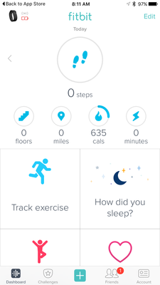
Beginning with version 2.26 of the Fitbit app for iOS, the new Fitbit app dashboard with an updated look is now fully implemented. You can no longer return to the old design. We're constantly striving to improve Fitbit products and services, and we appreciate all of the feedback we receive from our customers.
You can find information about the new app dashboard and how to start using it by clicking here.
Fitbit Update 5/25/2016
I'm very pleased to announce that iOS users who have updated to version 2.23 of the Fitbit iOS App are now able to opt-in to use a preview of a new design of the Fitbit iOS dashboard!
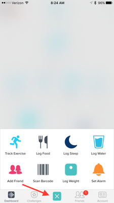
One of my favorite features for this new dashboard preview is the quick log button in the bottom-center of the iOS App. This feature allows users to quickly: track an exercise, log food, log sleep, log water, send a friend request, scan a food barcode (if you are using the US food database), log their weight, or set an alarm.
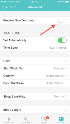
Users can opt-in to use the new iOS dashboard design by:
1. Updating to version 2.23 of the Fitbit iOS App, click here to be redirected to the iOS App Store.
2. Click the Account button in the bottom right-hand corner.
3. Scroll down and click the Advanced Settings button.
4. Toggle the Preview New Dashboard button at the top of the page on.
Click here for more details and let me know if you have any questions!
Moderator Edit: Edited thread title.
06-22-2016 14:31
- Mark as New
- Bookmark
- Subscribe
- Permalink
- Report this post
SunsetRunner
06-22-2016 14:31
- Mark as New
- Bookmark
- Subscribe
- Permalink
- Report this post
 Best Answer
06-22-2016 14:33
- Mark as New
- Bookmark
- Subscribe
- Permalink
- Report this post
06-22-2016 14:33
- Mark as New
- Bookmark
- Subscribe
- Permalink
- Report this post
FitBit - have you not heard enough feedback from your user base that we do not like your new design? And yet now you blind us with a pink banner every time we enter the app!!?
At least make the new dashboard functional. How hard is it to populate prior day's data??!! You have it all and you did it with the old dashboard so what's the programming complexity around this??
I could live with the new design if you just made it functional for use!!!
Please address this massive design flaw!!
Sent from my iPhone
06-22-2016 18:23
- Mark as New
- Bookmark
- Subscribe
- Permalink
- Report this post
06-22-2016 18:23
- Mark as New
- Bookmark
- Subscribe
- Permalink
- Report this post
Fitbit Software Editors: Do NOT force us to use the new and useless tiled version!
06-22-2016 18:32
- Mark as New
- Bookmark
- Subscribe
- Permalink
- Report this post
06-22-2016 18:32
- Mark as New
- Bookmark
- Subscribe
- Permalink
- Report this post
06-22-2016 18:44
- Mark as New
- Bookmark
- Subscribe
- Permalink
- Report this post
06-22-2016 18:44
- Mark as New
- Bookmark
- Subscribe
- Permalink
- Report this post
This is a terrible update!
06-22-2016 18:52
- Mark as New
- Bookmark
- Subscribe
- Permalink
- Report this post
06-22-2016 18:52
- Mark as New
- Bookmark
- Subscribe
- Permalink
- Report this post
Please go back to old dash or give the option. Thank you
06-22-2016 22:57
- Mark as New
- Bookmark
- Subscribe
- Permalink
- Report this post
SunsetRunner
06-22-2016 22:57
- Mark as New
- Bookmark
- Subscribe
- Permalink
- Report this post
06-23-2016 00:14
- Mark as New
- Bookmark
- Subscribe
- Permalink
- Report this post
06-23-2016 00:14
- Mark as New
- Bookmark
- Subscribe
- Permalink
- Report this post
06-23-2016 00:16
- Mark as New
- Bookmark
- Subscribe
- Permalink
- Report this post
06-23-2016 00:16
- Mark as New
- Bookmark
- Subscribe
- Permalink
- Report this post
06-23-2016 04:59
- Mark as New
- Bookmark
- Subscribe
- Permalink
- Report this post
06-23-2016 04:59
- Mark as New
- Bookmark
- Subscribe
- Permalink
- Report this post
06-23-2016 05:30
- Mark as New
- Bookmark
- Subscribe
- Permalink
- Report this post
06-23-2016 05:30
- Mark as New
- Bookmark
- Subscribe
- Permalink
- Report this post
pay attention to the forum posts? I would also like to see time references
on the sleep graph. It would be helpful to more easily identify times that
are more restless or where your sleep pattern is altered.
06-23-2016 05:57
- Mark as New
- Bookmark
- Subscribe
- Permalink
- Report this post
SunsetRunner
06-23-2016 05:57
- Mark as New
- Bookmark
- Subscribe
- Permalink
- Report this post
While working out, I check my progress on my FitBit iOS app. Because I do no wear my glasses while working out, I am unable to make out the reduced size data font/graphics in the new Dashboard. The new Dashboard is useless to me while excercising without my glasses.
Request: ...with the new Dashboard, PLEASE do not take away the option for the former Dashboard!
Also, with the current app, if I choose to stay with the old Dashboard, please allow me to remove the nag bar and have all of my Dashboard features back. Right now, the nag bar eliminates the top row of data which for me is the Steps bar.
06-23-2016 07:46
- Mark as New
- Bookmark
- Subscribe
- Permalink
- Report this post
06-23-2016 07:46
- Mark as New
- Bookmark
- Subscribe
- Permalink
- Report this post
06-23-2016 08:06
- Mark as New
- Bookmark
- Subscribe
- Permalink
- Report this post
06-23-2016 08:06
- Mark as New
- Bookmark
- Subscribe
- Permalink
- Report this post
06-23-2016 08:18
- Mark as New
- Bookmark
- Subscribe
- Permalink
- Report this post
06-23-2016 08:18
- Mark as New
- Bookmark
- Subscribe
- Permalink
- Report this post
BIg thanks to everyone who posted about the stupid pink banner ad that won't go away for the new dashboard--you saved me from downloading the new version of the app and rage smashing my fitbit.
From what I've read, there are no good features to this upate that I am missing out on, correct?
Also, for those who have sampled the new dashboard since the update, they do not seem to have addressed ANY of the issues brought up in this forum or in the feedback in the app store. Is this also correct?
Thanks again.
06-23-2016 08:48
- Mark as New
- Bookmark
- Subscribe
- Permalink
- Report this post
06-23-2016 08:48
- Mark as New
- Bookmark
- Subscribe
- Permalink
- Report this post
Patricia
Sent from my iPhone
06-23-2016 08:58 - edited 06-23-2016 09:01
- Mark as New
- Bookmark
- Subscribe
- Permalink
- Report this post
SunsetRunner
06-23-2016 08:58 - edited 06-23-2016 09:01
- Mark as New
- Bookmark
- Subscribe
- Permalink
- Report this post
Very disappointed in 'new' dashboard design. You have obviously figured out that the key information —steps, miles, cals, floors abd active minutes— should be at the top BUT they are now SO SMALL and the typestyle in general is SO LIGHTWEIGHT that it makes them hard to read on an iPhone 6s. Fitbit needs to put some designers over the age of 45 on staff so they can 'get' something so fundamental to UX/UI design!! Form shoudl follow function!! If this isn't improved I'm very likely to move to another tracker brand when this ChargeHR dies and by most accounts they don't last more than 12-18 months so I am guessing it won't be long.
06-23-2016 09:07
- Mark as New
- Bookmark
- Subscribe
- Permalink
- Report this post
06-23-2016 09:07
- Mark as New
- Bookmark
- Subscribe
- Permalink
- Report this post
 Best Answer
06-23-2016 09:13
- Mark as New
- Bookmark
- Subscribe
- Permalink
- Report this post
06-23-2016 09:13
- Mark as New
- Bookmark
- Subscribe
- Permalink
- Report this post
permanently 😞
 Best Answer
06-23-2016 09:19
- Mark as New
- Bookmark
- Subscribe
- Permalink
- Report this post
06-23-2016 09:19
- Mark as New
- Bookmark
- Subscribe
- Permalink
- Report this post
Sent from my iPhone
 Best Answer


