Fitbit app charts improvement (grid underneath the graphs)

I have spoken to different FITBIT users about heart rate charts, and we all come to the conclusion that CHARTS should have MORE guidelines. Add granularity to the time axis.


Original FITBIT heart rate chart and guidelines are placed at 132 - 94 - 40
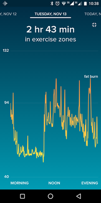


chart.png


What we suggest and why, more guidelines will help for a more accurate chart reading, I want to know how often and how much my heart rate is over 90 BPM, 80 BPM, 110 BPM, this will help us to be much more accurate.chart2.jpg
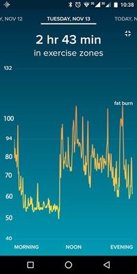


Hope this will be addressed, and come in a future update.


Moderator edit: Updated subject for clarity.

38 Comments
Status changed to: Reviewed By Moderator
MarcelBK
Premium User
Moderator Alum
Moderator Alum

Nice suggestion, thanks for sharing. We look forward to hearing what other community members think.

scholl
Base Runner

Maybe look at some of the running-watch websites for some ideas on visualization?

This was over the course of a run/walk I did last weekend. The arrow is the average, the 177 is the peak. 
HR1.jpg

HR2.jpg


This one's a summary. This was only over an hour, but could be extended for the day

Gweiller
Recovery Runner

The heartrate display is to compressed for me,  would be good to zoom, scroll, or at least use in landscape. 

mle_ii
First Steps

Please add landscape orientation for the HR information.  Some of the other UIs support it on the Android app, but this one does not.  Without landscape it's a pain to read the trend/data for HR and I'd like to see it in more detail that landscape would allow.

Asifhussain
Jogger

Also id like to know my highest and lowest HR as opposed to my resting HR on this screenScreenshot_20181123-220028_Fitbit.jpg


deepxtz
Recovery Runner

Beside resting bpm, will be nice to see daily Maximum bpm and the Lowest bpm.

rickyagodich
Recovery Runner

On the heart-rate graph, the time axis shows only "morning - noon - evening". There is no way to see when a spike occurred. Even noon is, at best, guesswork. Can we please have a grid underneath the graph, so we can at least see hours (or 2/3 hours, depending on screen resolution; but on a table in landscape, definitely at least hourly granularity).

YojanaFitbit
Moderator Alum
Moderator Alum

Hi @rickyagodich, thanks for explaining why you would like to have this option. I've moved it into a similar suggestion which has a lot of votes. As the more votes and comments an idea has the more visibility and momentum it gains. You can learn more about how Fitbit decides what suggestions get released in our FAQs.

peperazzi
Recovery Runner

Is it possible to add a (horizontal) line to the daily heart rate graph indicating what the RHR is for that day?


Related, please can you fix the y-axis for the heart rate graph to have fixed decade interval indicators (50,60,70,80, etc.) instead of the seemingly random numbers?

peperazzi
Recovery Runner

An example of the HR graph I proposed.


example of proposed heart rate graphexample of proposed heart rate graph

rickyagodich
Recovery Runner

As a first step in getting it to be more useful, it could be brought in line with the other detailed graphs - the ones that auto-landscape, and have every second hour marked on the tiem axis… Just make it consistent!

YojanaFitbit
Moderator Alum
Moderator Alum

Hi @peperazzi! Nice suggestion, thanks for sharing, hopefully we will have support from other users since more votes and comments an idea has the more visibility and momentum it gains.  I've moved it into a similar suggestion.

kuso_trevor
Stepping Up

Calculating total nutrition for a food item instead of showing the single serving nutritional information would be helpful in mobile apps.


Calculating total nutrition consumed for the day as a click through Macros sections would be awesome!


Calculating net carbs for those with a low carb diet goal would be awesome.


Being able to see values as you select different parts of a chart (heart rate, calories, macros, etc). I think this is in line with data granularity.


All suggestions above are for mobile app.


Tabletoo78
First Steps

I would love to see a low heart rate value or RHR on the graph because it's all good and well seeing what your maximum heart rate is during a high intensity cardio workout but when i'm doing something like a Yoga class and I select the Yoga App workout on my watch, when i'm in my Meditation session, it would be interesting to see what my heart rate has lowered to. I cannot just break a meditation session just to glance at my heart rate at that time, it defeats the object of meditation. I would like to see this feature added in the fitbit app, maximum and minimum heart rate values on the graphs. Thank you, keep up the good work Smiley Very Happy

rickyagodich
Recovery Runner

There are dozens of improvements that could be made to the heart-rate - and other - graphs.


What is really needed is for Fitbit to hire - or at least consult with - someone who understands data visualisation; someone who can look at the concept of the graph within a wider context than a single snapshot of one day, and make a series of simple adjustments and standardisation that capture 95% of everything mentioned hereabove. And then to standardise the improved graphing across all platforms, with the same features and presentation within each. (It's not rocket science.)


The core of problem is that these graphs are being presented in isolation: this one day's graph without consideration of surrounding data. It's a visualisation designed for the appearance of maximum range impact, but which is intended (to be intended) to overemphasise certain aspects of data. But, when we're talking about fitness data, this flashy approach is uninformative; it makes the real, meaningful, information harder to find.

goblintoes
First Steps

Just got my Charge 3 and I would also support more detailed heart rate charts. I'd like to be able to zoom in, see specific times, etc. Basically something like the way it is displayed on Strava (website version) or other running/cycling apps. Seems odd to pay a premium for the HR functionality but then in the app it's almost an afterthought.


Thanks!

SunsetRunner
Not applicable

Also i don't like the HR drawer when i click the heart button option in the app

imgt
Keeping Pace

Yes please try to add resolution to your chart system. stronger color variation would be cool to. but first and foremost resolution.

I mean cell phones may be a little tough for viewing real estate, but the screen can be expanded. now when using a tablet or your web interface there is tons of room.   


also  YojanaFitbit  I haven't had any luck finding other thread you talked about in your post. is your link broken or am I missing something?


Tim1023
Jogger

Seeing a more detailed timeline would also be nice. Morning, noon, evening is a bit vague! It makes it difficult to match activities with HR, e.g. a call with a difficult customer, five minutes spent meditating, etc.

EliasL
Recovery Runner

Hi,


I've been using my Fitbit charge 2 nor for half a year. Before this I had a Jawbone up.
What I miss in the Fitbit app is a more detailed view of your information at a given time.
For example:

Activity in a day is only given in blocks every 15min. This isn't only inaccurate, but very hard to read because it's very small to tap a precise bar to view the time and time is only given every hour which makes it even harder to guess at what time every bar is located which leaves us to guessing at what time the bar sits or trying to tap a tiny specific bar.
The workout display is even worse. I see a nice graph with the begin and end time, but everything inbetween is left very unclear.

Solution?
What i would like to see in the graphs is a nice view on my data every 1-5 minutes (1 minute for workouts and maybe 5 minutes for daily acitvity etc which needs less accuracy) and a timeslider which can be dragged across the graph that shows me the exact time at which the slider is located
something like this where a red line can give me an easy and very precise time:

So in short: a more accurate and easier way to view acitivity at a specific time for all graphs.
A simplified version can still be present, but at least a more accurate detailed version should be available, this is the entire point why we buy and wear the hardware.

45 > 49?  I agree the grid under the HR graph could use some work.45 > 49? I agree the grid under the HR graph could use some work.

I agree, The grid under the HR graph could use some work.

Emberr
Jogger

I was told to come here and "suggest" a change for a serious issue with the HR graph. It isn't accurate at all, and I find it ridiculous that I was told to come here to suggest a change instead of Fitbit acknowledging that it is a bug and advising they would attempt to fix it. This is the 2nd issue I've had with Fitbit support poorly handling issues in the last four months. Been using Fitbit since 2014 but they may lose me to the iWatch. 


Anyway, issue is apparent in the pictures attached. The graph lines are not accurate to the numbers. Eg. 73 being above 75? Please fix!


C6BAD9C0-14BB-4236-8F6B-26C46E8388B1.png


F030BD19-CC9E-42B5-AC3F-F8CCD6D66F9F.jpeg


Bushy2
Stepping Up

This should be applie to all of the charts. It's very difficult on most of the charts to identify accurately either the x axis (time) or y axis value.

deepxtz
Recovery Runner

Moderator edit: Updated subject for clarity. ????????????


dvdman
First Steps

The graphs shown by the Fitbit apps are very poor quality.  For example, who wants a heart rate graph with a y-axis that starts at 0?  The graphs should at least scale from the minimum value to the maximum value, with intelligently spaced tic marks.  Better yet, make the graphs interactively zoomable based on the spreading of the user's fingers.

To comment, you must first accept the terms of the Idea and Feedback Submission policy.