Join us on the Community Forums!
-
Community Guidelines
The Fitbit Community is a gathering place for real people who wish to exchange ideas, solutions, tips, techniques, and insight about the Fitbit products and services they love. By joining our Community, you agree to uphold these guidelines, so please take a moment to look them over. -
Learn the Basics
Check out our Frequently Asked Questions page for information on Community features, and tips to make the most of your time here. -
Join the Community!
Join an existing conversation, or start a new thread to ask your question. Creating your account is completely free, and takes about a minute.
Not finding your answer on the Community Forums?
- Mark Topic as New
- Mark Topic as Read
- Float this Topic for Current User
- Bookmark
- Subscribe
- Mute
- Printer Friendly Page
New Dashboard
- Mark Topic as New
- Mark Topic as Read
- Float this Topic for Current User
- Bookmark
- Subscribe
- Mute
- Printer Friendly Page
05-25-2016
08:34
- last edited on
05-25-2017
14:37
by
KateFitbit
![]()
- Mark as New
- Bookmark
- Subscribe
- Permalink
- Report this post
 Community Moderator Alumni are previous members of the Moderation Team, which ensures conversations are friendly, factual, and on-topic. Moderators are here to answer questions, escalate bugs, and make sure your voice is heard by the larger Fitbit team. Learn more
05-25-2016
08:34
- last edited on
05-25-2017
14:37
by
KateFitbit
![]()
- Mark as New
- Bookmark
- Subscribe
- Permalink
- Report this post
Fitbit Update 5/25/2017
Thank you for taking the time to share feedback. I can assure you the comments have been and continued to be reviewed and shared with our iOS team.
As a reminder, I'm including our help article on the Fitbit app here.
Overwhelmingly, recent posts share the sentiment of no longer being able to revert back to the original dashboard and not having the option to choose. At this time there are no plans to revert access to the old Dashboard, but we always appreciate feedback on how to improve our app.
As a reminder, Please remember to keep your posts respectful and on-topic, per our Community Guidelines. This thread will be better for everyone as a constructive conversation.
Fitbit Update 8/17/2016
Beginning with version 2.26 of the Fitbit app for iOS, the new Fitbit app dashboard with an updated look is now fully implemented. You can no longer return to the old design. We're constantly striving to improve Fitbit products and services, and we appreciate all of the feedback we receive from our customers.
You can find information about the new app dashboard and how to start using it by clicking here.
Fitbit Update 5/25/2016
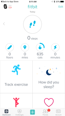
I'm very pleased to announce that iOS users who have updated to version 2.23 of the Fitbit iOS App are now able to opt-in to use a preview of a new design of the Fitbit iOS dashboard!
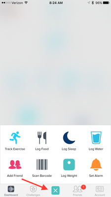
One of my favorite features for this new dashboard preview is the quick log button in the bottom-center of the iOS App. This feature allows users to quickly: track an exercise, log food, log sleep, log water, send a friend request, scan a food barcode (if you are using the US food database), log their weight, or set an alarm.
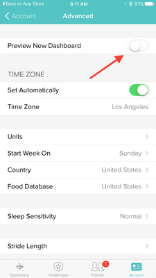
Users can opt-in to use the new iOS dashboard design by:
1. Updating to version 2.23 of the Fitbit iOS App, click here to be redirected to the iOS App Store.
2. Click the Account button in the bottom right-hand corner.
3. Scroll down and click the Advanced Settings button.
4. Toggle the Preview New Dashboard button at the top of the page on.
Click here for more details and let me know if you have any questions!
Moderator Edit: Edited thread title.
06-25-2016 19:37
- Mark as New
- Bookmark
- Subscribe
- Permalink
- Report this post
06-25-2016 19:37
- Mark as New
- Bookmark
- Subscribe
- Permalink
- Report this post
But then you still get the big banner across the top suggesting "check out the new Fitbit Dashboard" which I did, but I hate it and I'd like to switch back without having the banner push one of my tiles off the bottom of the screen.
06-25-2016 19:39
- Mark as New
- Bookmark
- Subscribe
- Permalink
- Report this post
06-25-2016 19:39
- Mark as New
- Bookmark
- Subscribe
- Permalink
- Report this post
But how do you get rid of the banner at the top of your dashboard? I checked out the new Dashboard and don't like it, but when I switch back to the old, the banner comes back all huge and hot pink at the top of my page.
06-25-2016 19:46
- Mark as New
- Bookmark
- Subscribe
- Permalink
- Report this post
06-25-2016 19:46
- Mark as New
- Bookmark
- Subscribe
- Permalink
- Report this post
I've checked out the new Dashboard, don't like it at all and switched back to the old, but that brings the banner back across the top of my Dashboard, how do I get rid of it? Phone screens are small and it pushes all the tiles down, which I specifically ordered so I can see what's most important to me as it first loads without scrolling. Please tell me I don't have to keep staring at a big pink banner continuing to offer me something I tried and decided against.
06-26-2016 04:55
- Mark as New
- Bookmark
- Subscribe
- Permalink
- Report this post
06-26-2016 04:55
- Mark as New
- Bookmark
- Subscribe
- Permalink
- Report this post
Agree, Please give us an opt-out opportunity. This new dashboard is horrible.
06-26-2016 12:25
- Mark as New
- Bookmark
- Subscribe
- Permalink
- Report this post
06-26-2016 12:25
- Mark as New
- Bookmark
- Subscribe
- Permalink
- Report this post
Ban the Banner!!! Ban the Banner!!!
06-26-2016 12:30
- Mark as New
- Bookmark
- Subscribe
- Permalink
- Report this post
06-26-2016 12:30
- Mark as New
- Bookmark
- Subscribe
- Permalink
- Report this post
Has anyone else noticed that the tiles show historical data on the website version? I'm not a computer programmer but I feel like it can't be that difficult to duplicate this on the phone app. If it is, then it needs to be an option. Oh, and...
Ban the Banner!!!
Ban the Banner!!!!
06-26-2016 12:51
- Mark as New
- Bookmark
- Subscribe
- Permalink
- Report this post
06-26-2016 12:51
- Mark as New
- Bookmark
- Subscribe
- Permalink
- Report this post
It's not terrible.... but I would like the colour progression back instead of everything in a cool ignore me blue until suddenly achieved. I would like to be able to remove the tile (there is only one) that I don't use.
But my biggest pet peeve is why the <expletive deleted> do the graphics now go backwards? The plate icon, as you eat it now fills up, on the web app it empties, the weight progress now goes right to left whereas on the web app it goes left to right.
Everything is MUCH easier to read when you are internally consistant! The food especially, every time I look at it I think there has been a reporting glitch.
06-26-2016 21:22
- Mark as New
- Bookmark
- Subscribe
- Permalink
- Report this post
06-26-2016 21:22
- Mark as New
- Bookmark
- Subscribe
- Permalink
- Report this post
I'm going to come in and say the same thing as everyone else. I wanted to love the new dashboard, I really did, but there are two dealbreakers for me
1)Viewing previous days and not being able to see ALL the previous days data
2)Not being able to swap items between the top and bottom tiles. I don't care about calories, or distance walked, but my heart rate and water consumption is very important to me. (I feel like fixing this would fix the scrolling issue people mention too.
Number three is not an absolute dealbreaker but it would be nice o have some sort of colour variation as you approached a target, rather than just "met" or "not met"
I really love everything else about it, but I cannot stand using it with these issues, so I'm stuck on the old one for now
06-27-2016 00:00
- Mark as New
- Bookmark
- Subscribe
- Permalink
- Report this post
06-27-2016 00:00
- Mark as New
- Bookmark
- Subscribe
- Permalink
- Report this post
06-27-2016 11:40
- Mark as New
- Bookmark
- Subscribe
- Permalink
- Report this post
06-27-2016 11:40
- Mark as New
- Bookmark
- Subscribe
- Permalink
- Report this post
06-27-2016 16:00
- Mark as New
- Bookmark
- Subscribe
- Permalink
- Report this post
06-27-2016 16:00
- Mark as New
- Bookmark
- Subscribe
- Permalink
- Report this post
I don't care for it either. Too busy for the small screen. I hope we will ALWAYS be able to use the prior version if we choose.
06-27-2016 23:27
- Mark as New
- Bookmark
- Subscribe
- Permalink
- Report this post
06-27-2016 23:27
- Mark as New
- Bookmark
- Subscribe
- Permalink
- Report this post
Hate that you cannot move Heart rate, or whatever, into the top section. Why should we be restricted as to which tiles can be up top?
For those not interested in floors, active minutes, or km, for example, why can't we put something else there, like heart rate or calories in/out?
06-28-2016 09:16 - edited 06-28-2016 09:20
- Mark as New
- Bookmark
- Subscribe
- Permalink
- Report this post
06-28-2016 09:16 - edited 06-28-2016 09:20
- Mark as New
- Bookmark
- Subscribe
- Permalink
- Report this post
- I do wish this new dashboard remains optional. I value function over form and am absolutely happy with the quick insight the current dashboard gives me. Sure the circles look pretty apart from missing the colors to indicate progress but it does not allow me to do a quick glance at all. Besides that not allowing me to set the tiles to my liking and the fact several tiles remain on the value of today makes it a worse experience to me. I wish you would invest the money and time into adding value and functions not fluff. For instance I love the new 250 steps/hour option. Why not bring the notifications you give on the Alta to my Flex as well?
Here's hoping you don't shove the new dashboard down our collective throats and keep it optional and ow yeah. Remove the annoying pink try me now banner as soon as possible please!
06-28-2016 15:38
- Mark as New
- Bookmark
- Subscribe
- Permalink
- Report this post
SunsetRunner
06-28-2016 15:38
- Mark as New
- Bookmark
- Subscribe
- Permalink
- Report this post
I don't want you he new dashboard. How do I get rid of the irritating notice at the top of the existing dashboard asking to try the new dashboard? No way of deleting it!
06-29-2016 03:25
- Mark as New
- Bookmark
- Subscribe
- Permalink
- Report this post
06-29-2016 03:25
- Mark as New
- Bookmark
- Subscribe
- Permalink
- Report this post
1) it lasted less than a year before the strap started bubbling
2) I cannot get out my own data in an easy way from the website
3) a lot of historical data are not available (eg heart rate)
4) it seems we will be forced to use a failed UI in the app even if this thread has plenty requests for fixes and small corrections. None are difficult or expensive for Fitbit to do. Only reason seems to be arrogance towards us, the users of the products.
Obviously Fitbit are free to do what they want. But I'm as free to not buy and use their products. Right now, it's thumbs down from me. Sorry. I really liked using my Fitbit. But I'm going to wait a while to see where this is going.
06-29-2016 14:12
- Mark as New
- Bookmark
- Subscribe
- Permalink
- Report this post
06-29-2016 14:12
- Mark as New
- Bookmark
- Subscribe
- Permalink
- Report this post
 Best Answer
06-29-2016 18:23
- Mark as New
- Bookmark
- Subscribe
- Permalink
- Report this post
06-29-2016 18:23
- Mark as New
- Bookmark
- Subscribe
- Permalink
- Report this post
I have problems with the new dashboard as well. It is frustrating that when I view the dashboard for yesterday it is picking up todays calories in, water consumption and sleep. It makes it really hard to track actual data. The graphs are great but they don't really tell me how many calories in v's out for the day like the current dashboard.
And I agree with other comments I want to be able to customise my top three tiles. I don't care how many km's I do in a day but I do care about my water consumption and my calories in compared to calories out. The screen real estate means that I have to scroll down to actually see some of this data.
I'm assuming the fact that yesterday is picking up todays data for calories in, water and sleep is a bug and it seems that every time something new is rolled out it messes with data consistency. I hope that you guys have learnt from previous rollouts and that's why the new dashboard is in preview mode only so you can identify and fix bugs before a full roll out.
But I agree with others. The current dashboard suits my needs and I would like the option to choose to stay with it please.
Thanks.
06-29-2016 18:33
- Mark as New
- Bookmark
- Subscribe
- Permalink
- Report this post
06-29-2016 18:33
- Mark as New
- Bookmark
- Subscribe
- Permalink
- Report this post
oh and another thing. Under the current dashboard it tells me how many KG to get to goal. The new dashboard has a graph that shows my current weight and my goal weight but doesn't do the calculation for me. As a weight loss tool seeing how mcu you had left to lose to get to goal was the biggest motivator.
Please allow us to keep the current dashboard.
06-30-2016 10:12
- Mark as New
- Bookmark
- Subscribe
- Permalink
- Report this post
06-30-2016 10:12
- Mark as New
- Bookmark
- Subscribe
- Permalink
- Report this post
I was so excited to see a new version of the IOS app just now.
But guess what:
- the stupid pink banner urging us to try the new preview dashboard is still there
- the colours in the dashboard tiles still don't change as you get nearer the goal
Guys, how come you do not have the decency to even acknowledge the myriad of complaints and comments about these two issues and how hard would it be to actually listen to your users?
I have been a loyal Fitbit user for 3.5 years now, worn it every single day and night and am seriously looking to throw it in the pond now, due to this incomprehensible arrogance from developers and lack of acknowledgement on this board to the feedback.
Utterly disgruntled.
06-30-2016 10:57
- Mark as New
- Bookmark
- Subscribe
- Permalink
- Report this post
06-30-2016 10:57
- Mark as New
- Bookmark
- Subscribe
- Permalink
- Report this post
In the last two years from what I've seen, complaints, suggestions and comments do not seem to do anything or get any results. I've yet to see a change as a result of the complaints. Fitbit has their own agenda and we are either on board for the long haul or we will get so frustrated we will begrudgingly go elsewhere.
Patricia
Sent from my iPhone


