Join us on the Community Forums!
-
Community Guidelines
The Fitbit Community is a gathering place for real people who wish to exchange ideas, solutions, tips, techniques, and insight about the Fitbit products and services they love. By joining our Community, you agree to uphold these guidelines, so please take a moment to look them over. -
Learn the Basics
Check out our Frequently Asked Questions page for information on Community features, and tips to make the most of your time here. -
Join the Community!
Join an existing conversation, or start a new thread to ask your question. Creating your account is completely free, and takes about a minute.
Not finding your answer on the Community Forums?
- Mark Topic as New
- Mark Topic as Read
- Float this Topic for Current User
- Bookmark
- Subscribe
- Mute
- Printer Friendly Page
New Dashboard
- Mark Topic as New
- Mark Topic as Read
- Float this Topic for Current User
- Bookmark
- Subscribe
- Mute
- Printer Friendly Page
05-25-2016
08:34
- last edited on
05-25-2017
14:37
by
KateFitbit
![]()
- Mark as New
- Bookmark
- Subscribe
- Permalink
- Report this post
 Community Moderator Alumni are previous members of the Moderation Team, which ensures conversations are friendly, factual, and on-topic. Moderators are here to answer questions, escalate bugs, and make sure your voice is heard by the larger Fitbit team. Learn more
05-25-2016
08:34
- last edited on
05-25-2017
14:37
by
KateFitbit
![]()
- Mark as New
- Bookmark
- Subscribe
- Permalink
- Report this post
Fitbit Update 5/25/2017
Thank you for taking the time to share feedback. I can assure you the comments have been and continued to be reviewed and shared with our iOS team.
As a reminder, I'm including our help article on the Fitbit app here.
Overwhelmingly, recent posts share the sentiment of no longer being able to revert back to the original dashboard and not having the option to choose. At this time there are no plans to revert access to the old Dashboard, but we always appreciate feedback on how to improve our app.
As a reminder, Please remember to keep your posts respectful and on-topic, per our Community Guidelines. This thread will be better for everyone as a constructive conversation.
Fitbit Update 8/17/2016
Beginning with version 2.26 of the Fitbit app for iOS, the new Fitbit app dashboard with an updated look is now fully implemented. You can no longer return to the old design. We're constantly striving to improve Fitbit products and services, and we appreciate all of the feedback we receive from our customers.
You can find information about the new app dashboard and how to start using it by clicking here.
Fitbit Update 5/25/2016
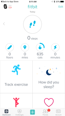
I'm very pleased to announce that iOS users who have updated to version 2.23 of the Fitbit iOS App are now able to opt-in to use a preview of a new design of the Fitbit iOS dashboard!
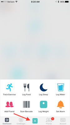
One of my favorite features for this new dashboard preview is the quick log button in the bottom-center of the iOS App. This feature allows users to quickly: track an exercise, log food, log sleep, log water, send a friend request, scan a food barcode (if you are using the US food database), log their weight, or set an alarm.
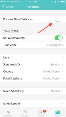
Users can opt-in to use the new iOS dashboard design by:
1. Updating to version 2.23 of the Fitbit iOS App, click here to be redirected to the iOS App Store.
2. Click the Account button in the bottom right-hand corner.
3. Scroll down and click the Advanced Settings button.
4. Toggle the Preview New Dashboard button at the top of the page on.
Click here for more details and let me know if you have any questions!
Moderator Edit: Edited thread title.
10-03-2016 09:31
- Mark as New
- Bookmark
- Subscribe
- Permalink
- Report this post
 Fitbit Product Experts Alumni are retired members of the Fitbit Product Expert Program. Learn more
10-03-2016 09:31
- Mark as New
- Bookmark
- Subscribe
- Permalink
- Report this post
You're misinformed. The Charge was been retired; the Charge HR is still available.
You can still see it on the product page.
Frank | Washington, USA
Fitbit One, Ionic, Charge 2, Alta HR, Blaze, Surge, Flex, Flex 2, Zip, Ultra, Flyer, Aria, Aria 2 - Windows 10, Windows Phone
Take a look at the Fitbit help site for further assistance and information.
10-03-2016 09:37
- Mark as New
- Bookmark
- Subscribe
- Permalink
- Report this post
 Platinum Fitbit Product Experts share support knowledge on the forums and advocate for the betterment of Fitbit products and services. Learn more
10-03-2016 09:37
- Mark as New
- Bookmark
- Subscribe
- Permalink
- Report this post
Yes!!! Android finally has the new desktop option!!!!
10-03-2016 09:39
- Mark as New
- Bookmark
- Subscribe
- Permalink
- Report this post
10-03-2016 09:39
- Mark as New
- Bookmark
- Subscribe
- Permalink
- Report this post
@PureEvil wrote:
You're misinformed. The Charge was been retired; the Charge HR is still available.
You can still see it on the product page.
If you click on the button that says "BUY NOW $129.95" it takes you to the Charge 2 for $149.95. From there, if you hover over products you can see a link for Charge HR. That also goes to Charge 2. I consider that discontinued. I just think they have not updated all their web pages yet.
 Best Answer
10-03-2016 09:46
- Mark as New
- Bookmark
- Subscribe
- Permalink
- Report this post
 Fitbit Product Experts Alumni are retired members of the Fitbit Product Expert Program. Learn more
10-03-2016 09:46
- Mark as New
- Bookmark
- Subscribe
- Permalink
- Report this post
That's fair. I never tried to add it to my cart.
Frank | Washington, USA
Fitbit One, Ionic, Charge 2, Alta HR, Blaze, Surge, Flex, Flex 2, Zip, Ultra, Flyer, Aria, Aria 2 - Windows 10, Windows Phone
Take a look at the Fitbit help site for further assistance and information.
 Best Answer
10-03-2016 10:00
- Mark as New
- Bookmark
- Subscribe
- Permalink
- Report this post
 Platinum Fitbit Product Experts share support knowledge on the forums and advocate for the betterment of Fitbit products and services. Learn more
10-03-2016 10:00
- Mark as New
- Bookmark
- Subscribe
- Permalink
- Report this post
I just hit but now from the page @PureEvil provided, yup it took me to the Charge 2, yes it is the same price the Charge HR was a few months ago. I notice target stopped selling the Charge months ago, but still has the HR, I can up date with the price later today
 Best Answer
10-03-2016 12:24 - edited 10-03-2016 12:25
- Mark as New
- Bookmark
- Subscribe
- Permalink
- Report this post
10-03-2016 12:24 - edited 10-03-2016 12:25
- Mark as New
- Bookmark
- Subscribe
- Permalink
- Report this post
Your post is extremely ignorant. The new fitbit dashboard removes a lot of the functionality that the old dashboard provided and requires users to jump through more hoops and screens to display the data that they need. The new dashboard also removes the functionality of comparing relative data in an efficient manner because before you could see all the data with one swipe of a finger, now you have to click through 4 different screens to get to your destination.
- You could display 6 pieces of information in-line that was 100% customizable and easy to read. The information you didn't want displayed could easily be seen by swiping downward to see the rest of your data.
On the new dashboard you can really only see 4 pieces of useful information and it's not even fully customizable. - The squares take up too much space and they are cut off. The text is also significantly smaller and makes it difficult to read while I am running or exercising.
- The "track exercise" tile doesn't tell me what exercise activity I completed that day. I don't care to see HOW MANY times I've exercise. I want to know WHAT EXERCISE I DID. I have to click through 3 different links to find information about my tracked exercise. On the old dashboard the information was readily available at a single glance of the screen without needing to click 3 different links to find that info.
4. On the old dashboard I only had to swipe once through the days to compare all of my data easily. On the new dashboard swiping through the days only changes the TOP tile, not the bottom tiles. It mixes data which is terrible. NEVER MIX DATA.
5. On the old dashboard I could compare data relative to my other data by simply swiping through the screens. I could see that I burned 2000 calories and ate 1500 Day 1 with 11,000 steps or burned 2200 calories and ate 1800 calories day 2 + a 30min Run with 8,000 steps. I could tell how the data differed from day to day simply at a single glance and swipe of a finger and how my steps + exercise influenced my calories burned or Resting Heartrate. With the new dashboard I cannot do this because of what I mentioned in #4, and also because it forces you to click through 10 different links to get to the data you need. And when you do find the history for your data you can only compare it relative to itself, instead of relative to other figures.
Seeing a list of all my calories burned like this is useless because I don't know why my burn is higher on Wednesday or lower on Thursday. Did I exercise? Did I walk more steps? This data is useless without being able to functionally compare other data sets with it.
6. The new dashboard no longer provides tiles that I want to see, nor does it allow me to view the data I WANT on ONE PAGE. There is very limited customibility.
7. On the old fitbit app there was information that instantly showed what your targets were.
On the new app I have no idea what number I have to reach in order for the "blue" progress circle to change to "green".
8. When I want to see what my calorie deficit was for each day by swiping through individual days, the new dashboard only shows me the calorie intake for TODAY on previous days. I cannot quickly compute my calorie deficits at a quick glance like I could with the old dashboard:
On the new dash I have to flip through 10 different screens, WRITE THE NUMBERS DOWN, and then calculate the deficit on PAPER. This is completely inconvenient when swiping through each day and viewing the data displayed on the old dashboard was wonderful.
All in all, the new dashboard is absolute trash. The only people who like the new dashboard are those who do not use the Fitbit App to its full functionality. They are the people who get a kick from adding the number of glasses of water you drink in a day and only care that your steps reach 10k rather than utilizing the Fitbit App for sports and deficit tracking.
The new dashboard is a completely disaster in both DESIGN and FUNCTIONALITY. Who wants to go through 10 different hoops just to find and compare data? No one. Who wants to see the calories they ate TODAY when they're viewing March 24, 2016 s data? No one.
I understand the main complaint of the old dashboard was the color scheme. The solution to that issue is to make the theme monochromatic, not destroy the functionality of a good app to the point where loyal fitbit customers no longer want to use the product because the app itself is no longer functional.
10-03-2016 14:42
- Mark as New
- Bookmark
- Subscribe
- Permalink
- Report this post
SunsetRunner
10-03-2016 14:42
- Mark as New
- Bookmark
- Subscribe
- Permalink
- Report this post
PLEASE, Fitbit! Reinstate the option for the former dashboard!!!
 Best Answer
10-03-2016 15:02 - edited 10-03-2016 15:04
- Mark as New
- Bookmark
- Subscribe
- Permalink
- Report this post
 Platinum Fitbit Product Experts share support knowledge on the forums and advocate for the betterment of Fitbit products and services. Learn more
10-03-2016 15:02 - edited 10-03-2016 15:04
- Mark as New
- Bookmark
- Subscribe
- Permalink
- Report this post
In not sure who your addressing @strawberry_, see how I put an "@" before your name.. In any case I'll address some of your pounts.
You say you can only see 5 pieces of data at once but your screen shot shows 7.
As for seeing all your exercises for the day directly in the dashboard, the old one never showed more than one walk/run etc or told me how many minutes of exercise. Tapping once on any tile brings up the sum arty screens just like the old dashboard did, and being cut off that is what the scroll is for.
On android we don't have a track exercise tile, but one click on the weekly exercise brings up the exercise symmetry. I also never found any Fitbit dashboard able to compare between days.
I do remember 2 years ago when people where complaining about the new dashboard which is now the old dashboard.
10-03-2016 15:27
- Mark as New
- Bookmark
- Subscribe
- Permalink
- Report this post
10-03-2016 15:27
- Mark as New
- Bookmark
- Subscribe
- Permalink
- Report this post
The bottom line is, aside the change from bars to tiles, Fitbit removed key features that allowed individuals to put the different sections in their own unique order. Fitbit only allows certain sections to change as we browse through previous days. Could you adjust to that? Yes. Is it a hassle? Yes! I personally at least 3 previous days before every meal, when I want to see how my hydration level is, and when I wonder why I feel tired. Do I want to click on 3 different sections multiple times per day for each previous day I choose to reflect on? Of course not! Had I only been introduced to the app in that manner, then it would be a different story. However, they downgraded.
I am sure if I spend more time with the new dashboard, I can find more things that lack the functionality of the old dashboard, but I honestly don't care to give it a shot anymore. The specific things I use the dashboard for habe Bern booted to the bottom of the tile selection. I honestly don't care how many floors I've climbed, especially since driving in the hills causes it to register floors. Why I earth would I want that in the top 5?
So, yes, it is possible to adjust if you used to only use the bare basics that the old dashboard offered. That; however, is not what people arguing for the return of the old dashboard have purchased the Fitbit for. Those wanting the old dashboard back used the old dashboard for all of its customizability and functionality. Both of which the new dashboard lacks.
10-03-2016 16:40 - edited 10-03-2016 22:11
- Mark as New
- Bookmark
- Subscribe
- Permalink
- Report this post
 Fitbit Product Experts Alumni are retired members of the Fitbit Product Expert Program. Learn more
10-03-2016 16:40 - edited 10-03-2016 22:11
- Mark as New
- Bookmark
- Subscribe
- Permalink
- Report this post
Hello @strawberry_,
I wasn't sure if you referring to my post as extremely ignorant.
I think we can all agree that 'easy to read' is a bit like saying 'beautiful'. It's all in the eye of the beholder, so I can't really tell you that it's not and have any of it make any sense.
So instead, I'll focus on elements that I can measure.
Okay, I know enough folks have complained about the new dashboard taking significantly more space than the old dashboard, so I was a bit curious to see if that was the case. I have an older handset which still loads the older dashboard (granted both the new and old devices are running Windows), but I think the comparison still holds. In the interest of fairness, I stitched the dashboards so that they were contiguous and standardized them to the same width (in this case 360 pixels) put them side by side and...
That's right. The older dashboard it's bigger (longer) than the newer one... not by much, but still. I trust that puts to rest any more debates about the newer dashboard taking up more room. It doesn't.
Also, look at the two dashboard side by side, the tiled dashboard consistently shows the same information either further up or at roughly the same location. In other words, you typically need to scroll less to get to the information that you want.
The new dashboard is fully customizable within each section; yes, I concede that it's slightly less configurable (although the old dashboard is not configurable in Windows). Yes, the top section and bottom sections are static, but tiles within each of them are customizable.
For whatever it's worth, the old dashboard also cut off whatever what off the bottom of the screen. On my original screenshots, that was right around the active minutes bar on the old dashboard.
With the exception of the smaller circular gauges, the text on the new dashboard is actually larger than (or occasionally the same as) the old dashboard. And I'll point out that among the top five stats, you can designate which one gets top billing that that one does use larger text.
You mention that you want to check your stats while you're running or exercising and proceed to point out that the text is too small on the dashboard (which as I have demonstrated above, it's not). However, the stats are not reliable (they reflect your last sync, not your current stats) unless you're persistently connected. Yes, you can run this way (persistent connection), but it'll suck down the battery on your Fitbit (I've drained a fully charged Fitbit One in a few hours this way). Indepedent of dashboard version, it's just more reliable to actually look at your tracker which has the latest stats, than it is to look at the dashboard on your app.
I do care about how many times I've exercised this week and that is more important than what I actually did (because when I do work out, I do a very similar workout), so in this respect the new dashboard caters to folks like me more than folks like you, but that isn't, in and of itself, wrong. So on the old dashboard you got more details about your last workout, but didn't get the number of workouts that week.
Now, I normally don't track the incoming or burned calories as carefully as other folks do (or at all in my case). So to that I really can't speak about the workflow on how to accomplish that...
However, considering how many assertions you've made that turn out to be misinformed, such as:
- The old dashboard shows more information on the screen. It doesn't.
- The old dashboard text is larger and thus more readable. It isn't (typically larger and looks like the same font).
To be perfectly blunt, I'm not inclined to believe your assertions until I tried them myself. Specifically, I'm not going to debate that it takes you X taps to get to Y. However, there may be a better way to get to the same information so you don't need to write it down or so that you can see them on the screen at once... though honestly, I don't care enough about tracking my caloric intake to give you an informed counterpoint.
Just my 2¢.
Frank | Washington, USA
Fitbit One, Ionic, Charge 2, Alta HR, Blaze, Surge, Flex, Flex 2, Zip, Ultra, Flyer, Aria, Aria 2 - Windows 10, Windows Phone
Take a look at the Fitbit help site for further assistance and information.
 Best Answer
10-03-2016 23:58
- Mark as New
- Bookmark
- Subscribe
- Permalink
- Report this post
10-03-2016 23:58
- Mark as New
- Bookmark
- Subscribe
- Permalink
- Report this post
If you tap on the exercise tile you can see all of the activities you have completed for the day, plus you can scroll down to see your activity for past weeks.
I'm not sure what data you see on one page. Are you saying you see mix data on one page? I can see all data for each activity and scroll to view past days but its on for each activity.
If you move your food tile to the top you would be able to compare your food intake with your calories burned with one glance.
I find most of the activity circles and tiles are pretty well covered for basic data stats.
All of the activity circles show what you have completed for the day. When you configure your activity goals (under your account go to activity and tap on daily activity there you set your goal for each activity) each circle shows you where you are for the day. You know what your goal is for each activity, so you should be able to see how much more you need to meet your goal. When you meet your goal you will get the green circle. You can tap on any circle to get your stats and it will list the history of your data. You have to tap each circle for each activity to get your data.
So if you know your goal for each activity I don't think you need a graph bar that shows you what you set your goal to. So are you saying that the old dashboard calculated the difference between your goal setting and what you completed for each activity?
So far I just tap on each circle or tile to see my data. I would like to know what steps you take to get 10 links to find your data. That's a lot compared to one tap and scrolling down to see history. I use the iPhone 6plus. I'm not sure if using iPhone is easier. Any how trying to understand the difference.
10-04-2016 05:19
- Mark as New
- Bookmark
- Subscribe
- Permalink
- Report this post
10-04-2016 05:19
- Mark as New
- Bookmark
- Subscribe
- Permalink
- Report this post
Our complaints are legitimate and we are being ignored by Fitbit!
Most of us will not be staying with the family of devices, we'll be showing our appreciation to Fitbit with our wallets
10-04-2016 05:31
- Mark as New
- Bookmark
- Subscribe
- Permalink
- Report this post
10-04-2016 05:31
- Mark as New
- Bookmark
- Subscribe
- Permalink
- Report this post
I changed back to Android because of the new dash in IOS - sadly, as a beta user I have it there now too lol. I'm not ranting, just expressing what I miss. I have learned from this lengthy thread though how to get heard and am now discussing much the same items with a Mod in the Android section here!
I liked being able to hide fields on the old one so mine fit the screen perfectly with only the tabs I wanted to see and no faffing required.
I count cals and watch my weight so the loss of the "cals in vs out" tile and the inability to move the new tiles of "cals burned" vs "food in" next to each other to compensate is annoying. I often flick back trhough the days to see my ongoing calorie deficit, again, this can no longer be done at a glance.
I also want to see what wt is left to lose (I use it to maintain within a given range) so it telling me what I've lost since a random date and a graphic which works backwards and tells me nothing is just annoying.
I have no problem with change within Fitbit or the app, I do hate losing or complicating the very functions I use it for though.
Also occ posting as Blokeypoo
10-04-2016 08:33
- Mark as New
- Bookmark
- Subscribe
- Permalink
- Report this post
10-04-2016 08:33
- Mark as New
- Bookmark
- Subscribe
- Permalink
- Report this post
@Poo, I don't know if the Fitbit app is different between android or apple . But with my iPhone I can still hide anything i want from my dashboard. From the dashboard on the top right there is an edit tab. When you tap on the edit tab, you will be able to hide any item on the dashboard and you can return any item back. (You will see an X symbol to remove and a + symbol to add) You can also move your tile anywhere within the tile space, just drag the tile to its new location. The same for the circles, you can move them in any order you want just drag them to any location within there space.
Anyhow I have been learning a lot about using the Fitbit app and how to correct something when I don't know what to do. The community post is a good resource and very helpful.
10-04-2016 08:45
- Mark as New
- Bookmark
- Subscribe
- Permalink
- Report this post
10-04-2016 08:45
- Mark as New
- Bookmark
- Subscribe
- Permalink
- Report this post
Most of us are advanced users! Don't you think we know what we are talking about!
The app makes things more difficult to navigate! I'm a software designer myself and an efficiency expert, in addition I consult with the top 10 companies in the US, so change is something I preach for a living.
@Poo,the app doesn't provide the same functionality as before! It has nothing to do with change!! Do you have working knowledge of the previous version?????
 Best Answer
10-04-2016 08:45
- Mark as New
- Bookmark
- Subscribe
- Permalink
- Report this post
10-04-2016 08:45
- Mark as New
- Bookmark
- Subscribe
- Permalink
- Report this post
Hi @Aclobos,
There is an edit option by pressing/holding a tile but it only allows one to move tiles, not hide them. I must add that, as this is the Beta version, there is still a chance that things might change before wider release - hopefully!
It's not enough to make me change fitness tracker or flounce or anything. It's just faffy when it didn't used to be ![]()
Also occ posting as Blokeypoo
 Best Answer
10-04-2016 08:48
- Mark as New
- Bookmark
- Subscribe
- Permalink
- Report this post
10-04-2016 08:48
- Mark as New
- Bookmark
- Subscribe
- Permalink
- Report this post
@D_Silva wrote:
@Poo,the app doesn't provide the same functionality as before! It has nothing to do with change!! Do you have working knowledge of the previous version?????
Hi @D_Silva,
Yes, I've been using Android and IOS (mainly Android) for nearly 4yrs, first with my One and now Blaze. I don't disagree with you - the functionality loss is what I've raised, I thought....
Also occ posting as Blokeypoo
 Best Answer
10-04-2016 11:40
- Mark as New
- Bookmark
- Subscribe
- Permalink
- Report this post
 Fitbit Product Experts Alumni are retired members of the Fitbit Product Expert Program. Learn more
10-04-2016 11:40
- Mark as New
- Bookmark
- Subscribe
- Permalink
- Report this post
Whoa... While I understand that you're frustrated, there's no need to ask "why do you butt in?"
@Aclobos has as much right to be here and voice an opinion as you do, just because that opinion does not necessarily align with yours there's no need for you (or anyone else) to effectively tell them to shut up.
Allow me to point out that this is a community and there are guidelines, and one of the first things they instruct is to "please be polite and respectful in your interactions with other members".
Just because this thread has deteriorated to, putting it bluntly, a whinefest about the new dashboard, doesn't mean that other opinions can't be expressed.
Just my 2¢.
Frank | Washington, USA
Fitbit One, Ionic, Charge 2, Alta HR, Blaze, Surge, Flex, Flex 2, Zip, Ultra, Flyer, Aria, Aria 2 - Windows 10, Windows Phone
Take a look at the Fitbit help site for further assistance and information.
10-04-2016 16:36
- Mark as New
- Bookmark
- Subscribe
- Permalink
- Report this post
 Platinum Fitbit Product Experts share support knowledge on the forums and advocate for the betterment of Fitbit products and services. Learn more
10-04-2016 16:36
- Mark as New
- Bookmark
- Subscribe
- Permalink
- Report this post
Yes I liked the ability to hide fields, so I must now put them at the bottom no biggie deal.
10-05-2016 18:15
- Mark as New
- Bookmark
- Subscribe
- Permalink
- Report this post
 Fitbit Product Experts Alumni are retired members of the Fitbit Product Expert Program. Learn more
10-05-2016 18:15
- Mark as New
- Bookmark
- Subscribe
- Permalink
- Report this post
I found that I could move, but also disable just about everything. The only thing you need to keep is one or the circular gauges on the top, this is the minimal dashboard:
Is this not what you're seeing?
Frank | Washington, USA
Fitbit One, Ionic, Charge 2, Alta HR, Blaze, Surge, Flex, Flex 2, Zip, Ultra, Flyer, Aria, Aria 2 - Windows 10, Windows Phone
Take a look at the Fitbit help site for further assistance and information.
 Best Answer
