Join us on the Community Forums!
-
Community Guidelines
The Fitbit Community is a gathering place for real people who wish to exchange ideas, solutions, tips, techniques, and insight about the Fitbit products and services they love. By joining our Community, you agree to uphold these guidelines, so please take a moment to look them over. -
Learn the Basics
Check out our Frequently Asked Questions page for information on Community features, and tips to make the most of your time here. -
Join the Community!
Join an existing conversation, or start a new thread to ask your question. Creating your account is completely free, and takes about a minute.
Not finding your answer on the Community Forums?
- Community
- Platform
- Android App
- Android Dashboard Redesign Feedback
- Mark Topic as New
- Mark Topic as Read
- Float this Topic for Current User
- Bookmark
- Subscribe
- Mute
- Printer Friendly Page
- Community
- Platform
- Android App
- Android Dashboard Redesign Feedback
Android Dashboard Redesign Feedback
- Mark Topic as New
- Mark Topic as Read
- Float this Topic for Current User
- Bookmark
- Subscribe
- Mute
- Printer Friendly Page
10-04-2016 11:32 - edited 04-24-2017 13:30
- Mark as New
- Bookmark
- Subscribe
- Permalink
- Report this post
 Community Moderator Alumni are previous members of the Moderation Team, which ensures conversations are friendly, factual, and on-topic. Moderators are here to answer questions, escalate bugs, and make sure your voice is heard by the larger Fitbit team. Learn more
10-04-2016 11:32 - edited 04-24-2017 13:30
- Mark as New
- Bookmark
- Subscribe
- Permalink
- Report this post
Fitbit Update 04/24/2017: Hi everyone -- Our Android team appreciates everyone's feedback in this thread and are working to fully implement the new Android Dashboard in the upcoming 2.48 release.
I am closing this thread as all feedback has been captured and reviewed by our team. Thanks again for all of your constructive feedback as we continue to improve Fitbit products and services.
Fitbit Update 10/04/2016: Hello Android Community! Some of you may have took notice that your Fitbit app has updated and you now have the option to view the new Android Dashboard (see screenshot below).
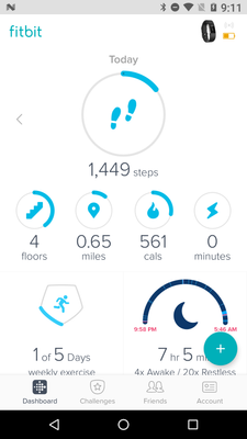
For those of you in the beta, feel free to share your feedback so I can pass it along. I will have a more concrete timeline of official release to share with everyone when I get a confirmed date. We're taking our time to make sure the features are all working up-to-par. Thank you in advance for the feedback!
11-30-2016 22:40
- Mark as New
- Bookmark
- Subscribe
- Permalink
- Report this post
11-30-2016 22:40
- Mark as New
- Bookmark
- Subscribe
- Permalink
- Report this post
The new dashboard stinks..it's hard to see information clearly and quickly.. The color scheme doesn't help visibility either.
. One of the main selling points of Fitbit was the phone app.. There are much better trackers out there but I have stuck with Fitbit because of the app. When my current device dies I will jump ship. How can Fitbit push its users away like this?
11-30-2016 23:14
- Mark as New
- Bookmark
- Subscribe
- Permalink
- Report this post
11-30-2016 23:14
- Mark as New
- Bookmark
- Subscribe
- Permalink
- Report this post
@Poo wrote:
https://community.fitbit.com/t5/Feature-Suggestions/Regain-Lost-Features-Android-Dashboard/idi-p/165...
Please add votes and views to this in order to be heard by those who matter. Helen
Just a reminder to vote for this feature request or add your own comments to it guys. Allegedly that was the dealbreaker in IOS - that nobody voted.
That doesn't of course account for those who just kept the old dash, left Fitbit or simply aren't users of this forum. Not a single one of my friends or patients uses the forum or website - just the app - so the forum is possibly only representative of the angry, happy or inquisitive - not the masses neccessarily. That cuts both ways of course - 50/50 of those not here may love/hate the new dash.
I don't hate it, I just miss my system. I've used the new dash in IOS and Beta Android long enough to know it doesn't work in the same way so am tiring of being told to get used to it. I got used to it but in a bad way - I used it less and couldn't use it for what I want.
I'm not an angry flouncer nor demanding time stands still but, if one chooses a car and someone takes the steering wheel away a few years later, one has the right to wonder how it is still fit for the purposes it was used for. Unlike my analogy the changes don't affect everyone but they do affect some and in a significant way so we are saying so as requested.
If I'm going to be completely honest, because it has changed how I use my Fitbit to just being a posh pedometer, I'm not sure why I'm still seeking change as I think I've gone past it but I'm taking the Mods at their word and being bright and perky for now ![]()
Also occ posting as Blokeypoo
11-30-2016 23:16 - edited 12-01-2016 04:30
- Mark as New
- Bookmark
- Subscribe
- Permalink
- Report this post
 Platinum Fitbit Product Experts share support knowledge on the forums and advocate for the betterment of Fitbit products and services. Learn more
11-30-2016 23:16 - edited 12-01-2016 04:30
- Mark as New
- Bookmark
- Subscribe
- Permalink
- Report this post
@Elena_Iv. wrote:@ErickFitbit, thank you for your reassurance that all feedback is getting gathered and presented to the developers. It's very important to know that one's concerns and thoughts are being heard.
A general request to other moderators of this thread: I do understand your passion about the product and that you may personally find the new design lovely, attractive and easy to use. However please try to be more considerate to the complaints of the people who don't think in the same way as you do, and please don't tell them that they just need to get used to it. This is really not very productive. We are adults who bought an expensive device for our own specific purposes and needs, and many of the users have selected this product because it was doing what they wanted it do. When this stops being the case, they have a very valid reason to air their concerns.
Now, to my more detailed feedback.
As it's been stated many times, different people have different purposes and requirement and they use their trackers in their own specific ways. Thanks to the versatility of Fitbit trackers, they help people to focus on specific things of their interest.
I own a Blaze and I use it primarily for watching my daily activity and controlling my calories intake. I don't do long walks (although I have my daily step goal) nor long excercises. Things I'm interested in mostly are: step count, calories burned and calories intake (and their balance), water intake, and hourly activity. Things I'm interested less: heart bpm, active minutes, sleep, weight . Of no interest at all: the distance (it's a derivative parameter calculated from steps multiplied by stride length) and floors (I work from home, and I rarely have to climb any floors at all).
As a result, my opening screen on the old Android dashboard looks this way, screenshot 1:
Spoiler
Old Design Page 01
Old Design Page 02
New Design Page 01
New Design Page 02
New Design Page 01 Finished
All important information for the current day is visible to me at once, and I can take it in with a single glace. By swiping left I can watch all this information for any of the previous days, in all entirety, and track my progress over the last several days.
All less important parameters, which I access less often or don't need at all, are collected on the second screen. (Old Design Page 02)
Now, in the new design, to get all the information I need, I should remove three (!) out of the five tiles on the upper panel, which will result in a following look:
Screenshot New Design Page 01.
As a result, the first opening screen contains only four out of the six items interesting to me. For two of them, I need to swipe down. (Screenshot New Design Page 02).
The huge plus sign, which partly covers the lower right tile, is very intrusive and hides important data.
I can no longer swipe left to see the whole statistics for my previous days. This has been discussed in this thread several times: firstly, the swipe has been replaced with a small arrow (need to tap instead of swiping but I can live with this); and secondly, much more important, getting back to the previous days doesn't give me the entire picture of these days, but only the data for the tiles in the upper pane of the screen. For getting the past data for all other parameters I should go through each tile separately, and I am not able to get a full picture for the selected day anyway.
In addition, removing irrelevant tiles has created a huge empty blindingly white space on my screen, which is very straining on the eyes. Even if the developers give us an option to customize the background and choose any non-white soft colors, this wouldn't remove the vast amount of empty wasted screen space. (Screenshot New Design Page 01 Finished)
Things that would make me accept and actually start using the new Android dashboard design:
1. Treat all tiles equally (no more division between upper and lower pane) and allow the users to rearrange them as they wish, to reflect the parameters they specifically need, exactly how it's done now in the old design.
1a. Allow the users to select their "main" tile, be it steps, or bpm, or calories (eaten/consumed/left).
2. Swiping left (or tapping) to view information for the previous days should display the data for that specific day on all tiles, not just the tiles from the upper pane.
I can live with tiles instead of horizontal bars, as long as
(a) I can see all info for the current day important to *me* on one screen at one glance, and
(b) I can see all info for the past day(s) important to *me* on one screen at one glance.
After several days of trying to "get used" to the new design, I reverted back to the old one, because it suits my needs better.
Otherwise, please don't push this change and allow users to choose whichever design they want to use.
P.S. Apologies for the mess with the screenshots, I haven't been able to put them in the spots I wanted them to be. Not sure how to do that, sorry!
I like what you have written and the way you have expressed yourself. I dont share your needs/wants but I understand that a lot of people do. I feel Fitbit should take these thoughts seriously and redesign the new dashboard so that most of these features can be retained in the new look (which I like, but function for the majority of users is more important than how it looks!)
I too appreciate ericfitbits willingness to listen and the way you express yourself.
Sorry for the huge quote! couldnt seem to edit most of it out!

Helen | Western Australia
Want to discuss ways to increase your activity? Visit Get Moving in the Lifestyle Discussion Forum.
12-01-2016 03:46
- Mark as New
- Bookmark
- Subscribe
- Permalink
- Report this post
12-01-2016 03:46
- Mark as New
- Bookmark
- Subscribe
- Permalink
- Report this post
While trying to post thus issue, more showed themselves. can you guys make the load bar for syncing thicker so it is easier to see? what the hell happened to the an auto reply box in the forums?!? it took me 5 tries to type this because I couldn't find a box and forum pages kept jumping around on me. trying to post something it wants me to quote stuff. change the forums back to how they were 2 weeks ago, please.
 Best Answer
12-01-2016 05:50
- Mark as New
- Bookmark
- Subscribe
- Permalink
- Report this post
12-01-2016 05:50
- Mark as New
- Bookmark
- Subscribe
- Permalink
- Report this post
Elena_Iv, you hit the nail on the head. Your suggestions are exactly what I want, too. I agree that being able to customize the whole page, not just an upper and lower part would be huge. That would eliminate any blinding white spots being vacated by stuff someone may not use, also. Like said, everyone uses the app differently, so why not make the whole page customizable to what each person uses. If you're going to have all the different options available for helping one lose weight, walk more, etc, then you shouldn't pick one particular option as a favorite when it's not everyone's favorite. By having the steps at the top alone, you are picking a favorite for those of us that don't want it as our favorite, and especially not all the little tiles below the main step. I feel that as I get closer to my goal weight, I feel that I may even want to change what is more important to me for that main tile. It'd be nice to be able to do that. I don't mind having to scroll down to see everything I want on the page because I do that now on the old dashboard. I also have tried the new dashboard for a while, but think I will switch back to the old one for now. What I miss most is not being able to swipe back to my previous days stats without having to go into each tile. The new look is nice, but it needs to be more customizable like the old dashboard & easier to use, not more cumbersome.
12-05-2016 10:10
- Mark as New
- Bookmark
- Subscribe
- Permalink
- Report this post
12-05-2016 10:10
- Mark as New
- Bookmark
- Subscribe
- Permalink
- Report this post
I hate it! Since the new updates and change, I have had nothing but trouble. The app crashes daily when I log my walks, I lose my routes and then today, I lost my steps. I walked 3.11 and it said I had only 286 steps (and yes my GPS is functioning correctly). I want to return to the old app. HOW PLEASE? I hate this new one!
12-05-2016 10:19
- Mark as New
- Bookmark
- Subscribe
- Permalink
- Report this post
12-05-2016 10:19
- Mark as New
- Bookmark
- Subscribe
- Permalink
- Report this post
Go to account on the bottom, advanced settings & there should be a line at the top to allow you to switch back to the old one. Good luck!
 Best Answer
12-05-2016 10:33
- Mark as New
- Bookmark
- Subscribe
- Permalink
- Report this post
12-05-2016 10:33
- Mark as New
- Bookmark
- Subscribe
- Permalink
- Report this post
 Best Answer
12-05-2016 10:39
- Mark as New
- Bookmark
- Subscribe
- Permalink
- Report this post
12-05-2016 10:39
- Mark as New
- Bookmark
- Subscribe
- Permalink
- Report this post
option for returning to previous dashboard.
12-05-2016 10:41
- Mark as New
- Bookmark
- Subscribe
- Permalink
- Report this post
12-05-2016 10:41
- Mark as New
- Bookmark
- Subscribe
- Permalink
- Report this post
@RedsMom wrote:I hate it! Since the new updates and change, I have had nothing but trouble. The app crashes daily when I log my walks, I lose my routes and then today, I lost my steps. I walked 3.11 and it said I had only 286 steps (and yes my GPS is functioning correctly). I want to return to the old app. HOW PLEASE? I hate this new one!
If the update has installed itself on extend memory (sd card) move it into internal memory. It will stop the exercise tracking from crashing.
12-05-2016 10:53
- Mark as New
- Bookmark
- Subscribe
- Permalink
- Report this post
 Platinum Fitbit Product Experts share support knowledge on the forums and advocate for the betterment of Fitbit products and services. Learn more
12-05-2016 10:53
- Mark as New
- Bookmark
- Subscribe
- Permalink
- Report this post
Good point @LesleyJW, oll also add that a simple restart after an app update could possibly stop the crashing.
If that doesnt fix it, tgen remove the app and install a fresh copy from tge play store.
 Best Answer
12-05-2016 12:12
- Mark as New
- Bookmark
- Subscribe
- Permalink
- Report this post
12-05-2016 12:12
- Mark as New
- Bookmark
- Subscribe
- Permalink
- Report this post
When I did have it on the internal memory, it crashed several times a day. Since I moved it to the external, it did not crash until I did the new version. Then it started crashing daily, and losing my info. Ex: Last week, I walked 3.23 miles at lunch. It recorded my steps, calories burned, my pace...everything. When it gave me the little "pep talk message" it crashed. No longer had my route and pace but all other info was there (steps and all). Today, I walked 3.11 miles and it gave me 286 steps. They tried to tell me it was my GPS but it worked fine on everything else.
I am not back the original app/format. I uninstalled the app and reinstalled it to make sure it was correct. I will be testing it over the next 24 hours to see if everything is back to normal.
 Best Answer
12-05-2016 12:18
- Mark as New
- Bookmark
- Subscribe
- Permalink
- Report this post
 Platinum Fitbit Product Experts share support knowledge on the forums and advocate for the betterment of Fitbit products and services. Learn more
12-05-2016 12:18
- Mark as New
- Bookmark
- Subscribe
- Permalink
- Report this post
General, at least for me, the update loads the proofread into internal memory, engineering is the program was in external.
 Best Answer
12-05-2016 12:46
- Mark as New
- Bookmark
- Subscribe
- Permalink
- Report this post
12-05-2016 12:46
- Mark as New
- Bookmark
- Subscribe
- Permalink
- Report this post
luck
12-05-2016
19:56
- last edited on
12-06-2016
16:00
by
MariamV
![]()
- Mark as New
- Bookmark
- Subscribe
- Permalink
- Report this post
12-05-2016
19:56
- last edited on
12-06-2016
16:00
by
MariamV
![]()
- Mark as New
- Bookmark
- Subscribe
- Permalink
- Report this post
It may not have a link to revert back if the app was deleted and the new one was installed instead of the old app.
 Best Answer
12-05-2016 20:05
- Mark as New
- Bookmark
- Subscribe
- Permalink
- Report this post
12-05-2016 20:05
- Mark as New
- Bookmark
- Subscribe
- Permalink
- Report this post
The previous version of the app is out there for download. I've even uploaded it and several friends, family, co-workers, users here and thousands of various FitBit users out there have downloaded it.
 Best Answer
12-05-2016
21:19
- last edited on
12-06-2016
16:02
by
MariamV
![]()
- Mark as New
- Bookmark
- Subscribe
- Permalink
- Report this post
12-05-2016
21:19
- last edited on
12-06-2016
16:02
by
MariamV
![]()
- Mark as New
- Bookmark
- Subscribe
- Permalink
- Report this post
I deleted Version 2.38 and installed 2.37. My problems have been solved.
Moderator edit: format
 Best Answer
12-05-2016 23:13
- Mark as New
- Bookmark
- Subscribe
- Permalink
- Report this post
 Platinum Fitbit Product Experts share support knowledge on the forums and advocate for the betterment of Fitbit products and services. Learn more
12-05-2016 23:13
- Mark as New
- Bookmark
- Subscribe
- Permalink
- Report this post
@StevenDon64worth the latest ago the user can choose which dashboard to use. Now when it comes to, as you say app data, there is no success thing. You're tracker syncs it's data straightly to the web. All settings are stored on the web . The app is only ab interface to the web data amd settings.
12-06-2016 02:12
- Mark as New
- Bookmark
- Subscribe
- Permalink
- Report this post
12-06-2016 02:12
- Mark as New
- Bookmark
- Subscribe
- Permalink
- Report this post
Would be nice if they just left it alone... I have the flex 2 and the new dashboard just doesnt work at all for my wristband. I mean it does work but i cant see things that i could in the old dashboard. I dont have a screen on the flex 2 so i rely on the app to show me my steps & battery life. Love the old dashboard dont take it away 😞
12-06-2016
04:34
- last edited on
12-06-2016
16:04
by
MariamV
![]()
- Mark as New
- Bookmark
- Subscribe
- Permalink
- Report this post
12-06-2016
04:34
- last edited on
12-06-2016
16:04
by
MariamV
![]()
- Mark as New
- Bookmark
- Subscribe
- Permalink
- Report this post
The only positive thing I can say about the new dashboard is that I can view it horizontally as well as vertically. Otherwise, I much prefer the older version. It was and is (I'm retaining it on two devices as long as I can) faster to read, use and organize conceptually while speeding through daily tasks. I wish we had a choice to retain the older design.
Moderator edit: format
