Join us on the Community Forums!
-
Community Guidelines
The Fitbit Community is a gathering place for real people who wish to exchange ideas, solutions, tips, techniques, and insight about the Fitbit products and services they love. By joining our Community, you agree to uphold these guidelines, so please take a moment to look them over. -
Learn the Basics
Check out our Frequently Asked Questions page for information on Community features, and tips to make the most of your time here. -
Join the Community!
Join an existing conversation, or start a new thread to ask your question. Creating your account is completely free, and takes about a minute.
Not finding your answer on the Community Forums?
- Mark Topic as New
- Mark Topic as Read
- Float this Topic for Current User
- Bookmark
- Subscribe
- Mute
- Printer Friendly Page
New Dashboard
- Mark Topic as New
- Mark Topic as Read
- Float this Topic for Current User
- Bookmark
- Subscribe
- Mute
- Printer Friendly Page
05-25-2016
08:34
- last edited on
05-25-2017
14:37
by
KateFitbit
![]()
- Mark as New
- Bookmark
- Subscribe
- Permalink
- Report this post
 Community Moderator Alumni are previous members of the Moderation Team, which ensures conversations are friendly, factual, and on-topic. Moderators are here to answer questions, escalate bugs, and make sure your voice is heard by the larger Fitbit team. Learn more
05-25-2016
08:34
- last edited on
05-25-2017
14:37
by
KateFitbit
![]()
- Mark as New
- Bookmark
- Subscribe
- Permalink
- Report this post
Fitbit Update 5/25/2017
Thank you for taking the time to share feedback. I can assure you the comments have been and continued to be reviewed and shared with our iOS team.
As a reminder, I'm including our help article on the Fitbit app here.
Overwhelmingly, recent posts share the sentiment of no longer being able to revert back to the original dashboard and not having the option to choose. At this time there are no plans to revert access to the old Dashboard, but we always appreciate feedback on how to improve our app.
As a reminder, Please remember to keep your posts respectful and on-topic, per our Community Guidelines. This thread will be better for everyone as a constructive conversation.
Fitbit Update 8/17/2016
Beginning with version 2.26 of the Fitbit app for iOS, the new Fitbit app dashboard with an updated look is now fully implemented. You can no longer return to the old design. We're constantly striving to improve Fitbit products and services, and we appreciate all of the feedback we receive from our customers.
You can find information about the new app dashboard and how to start using it by clicking here.
Fitbit Update 5/25/2016
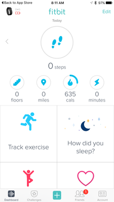
I'm very pleased to announce that iOS users who have updated to version 2.23 of the Fitbit iOS App are now able to opt-in to use a preview of a new design of the Fitbit iOS dashboard!
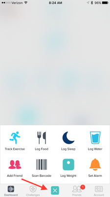
One of my favorite features for this new dashboard preview is the quick log button in the bottom-center of the iOS App. This feature allows users to quickly: track an exercise, log food, log sleep, log water, send a friend request, scan a food barcode (if you are using the US food database), log their weight, or set an alarm.
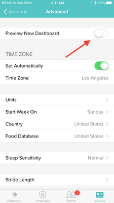
Users can opt-in to use the new iOS dashboard design by:
1. Updating to version 2.23 of the Fitbit iOS App, click here to be redirected to the iOS App Store.
2. Click the Account button in the bottom right-hand corner.
3. Scroll down and click the Advanced Settings button.
4. Toggle the Preview New Dashboard button at the top of the page on.
Click here for more details and let me know if you have any questions!
Moderator Edit: Edited thread title.
06-15-2016 09:22
- Mark as New
- Bookmark
- Subscribe
- Permalink
- Report this post
06-15-2016 09:22
- Mark as New
- Bookmark
- Subscribe
- Permalink
- Report this post
 Best Answer
06-15-2016 13:41
- Mark as New
- Bookmark
- Subscribe
- Permalink
- Report this post
06-15-2016 13:41
- Mark as New
- Bookmark
- Subscribe
- Permalink
- Report this post
06-15-2016 13:49 - edited 06-15-2016 13:50
- Mark as New
- Bookmark
- Subscribe
- Permalink
- Report this post
06-15-2016 13:49 - edited 06-15-2016 13:50
- Mark as New
- Bookmark
- Subscribe
- Permalink
- Report this post
I think the reboot suggestion was probably a response to some other issue on the thread or just plain wrong.
The lower tiles being stuck on current day is DESIGN BUG not a code bug meaning that the app works as designed but the design is WRONG.
I just hope they listen to us and change this.
06-15-2016 15:00
- Mark as New
- Bookmark
- Subscribe
- Permalink
- Report this post
06-15-2016 15:00
- Mark as New
- Bookmark
- Subscribe
- Permalink
- Report this post
Sent from Susan's iPad
 Best Answer
06-15-2016 15:06
- Mark as New
- Bookmark
- Subscribe
- Permalink
- Report this post
06-15-2016 15:06
- Mark as New
- Bookmark
- Subscribe
- Permalink
- Report this post
Sent from Susan's iPad
 Best Answer
06-15-2016 16:59
- Mark as New
- Bookmark
- Subscribe
- Permalink
- Report this post
06-15-2016 16:59
- Mark as New
- Bookmark
- Subscribe
- Permalink
- Report this post
Sorry didn't meant to come off as attacking you.
Do you know if you have the LATEST version of the app?
Because I'm 95% sure it used to let you flip thru past days and see all tiles update the data for the selected day up until the update last week when someone apparently thought they had a "good idea". They were wrong.
06-15-2016 17:18
- Mark as New
- Bookmark
- Subscribe
- Permalink
- Report this post
06-15-2016 17:18
- Mark as New
- Bookmark
- Subscribe
- Permalink
- Report this post
Sent from Susan's iPad
 Best Answer
06-15-2016 23:30
- Mark as New
- Bookmark
- Subscribe
- Permalink
- Report this post
06-15-2016 23:30
- Mark as New
- Bookmark
- Subscribe
- Permalink
- Report this post
 Best Answer
06-16-2016 07:06
- Mark as New
- Bookmark
- Subscribe
- Permalink
- Report this post
06-16-2016 07:06
- Mark as New
- Bookmark
- Subscribe
- Permalink
- Report this post
06-16-2016 08:49
- Mark as New
- Bookmark
- Subscribe
- Permalink
- Report this post
06-16-2016 08:49
- Mark as New
- Bookmark
- Subscribe
- Permalink
- Report this post
I have the Charge HR.
I think it's the app that's badly designed which is not model specific.
I did contact support and they told me they'll escalate but they told me to submit a post here because that's their primary means of receiving feedback. I hope they really read it.
06-18-2016 09:37
- Mark as New
- Bookmark
- Subscribe
- Permalink
- Report this post
06-18-2016 09:37
- Mark as New
- Bookmark
- Subscribe
- Permalink
- Report this post
 Best Answer
06-18-2016 09:45
- Mark as New
- Bookmark
- Subscribe
- Permalink
- Report this post
06-18-2016 09:45
- Mark as New
- Bookmark
- Subscribe
- Permalink
- Report this post
 Best Answer
06-20-2016 21:39
- Mark as New
- Bookmark
- Subscribe
- Permalink
- Report this post
06-20-2016 21:39
- Mark as New
- Bookmark
- Subscribe
- Permalink
- Report this post
 Best Answer
06-22-2016 08:43
- Mark as New
- Bookmark
- Subscribe
- Permalink
- Report this post
06-22-2016 08:43
- Mark as New
- Bookmark
- Subscribe
- Permalink
- Report this post
 Best Answer
06-22-2016 09:00
- Mark as New
- Bookmark
- Subscribe
- Permalink
- Report this post
06-22-2016 09:00
- Mark as New
- Bookmark
- Subscribe
- Permalink
- Report this post
I agree TOTALLY. It was great when it had no cutesy little icons: all on one screen, I could sneak a quick peek and get back to my life. HOW DO I GET MY OLD SCREEN BACK?????????
 Best Answer
06-22-2016 09:04
- Mark as New
- Bookmark
- Subscribe
- Permalink
- Report this post
06-22-2016 09:04
- Mark as New
- Bookmark
- Subscribe
- Permalink
- Report this post
Go to "Account" (bottom right of your main screen)
Scroll all the way down to Advanced Settings"
Uncheck "preview new dashboard"
And "POOF" the ugly monster is gone!
 Best Answer
06-22-2016 09:15
- Mark as New
- Bookmark
- Subscribe
- Permalink
- Report this post
06-22-2016 09:15
- Mark as New
- Bookmark
- Subscribe
- Permalink
- Report this post
Another "NO" vote.
I used to be able to take a quick peek at everything neatly onganized on one screen an know how I was doing and get back to my life. The new dashboard is not as well organized and is harder to read on the fly.
I am visually oriented to LISTS, not space-wasting pictures that someone else has decided are attractive.I don't want or need big cartoony icons (which is why I don't use the desktop dashboard.)
PLEASE, PLEASE, PLEASE give us a choice!!!!
06-22-2016 09:54 - edited 06-22-2016 14:27
- Mark as New
- Bookmark
- Subscribe
- Permalink
- Report this post
06-22-2016 09:54 - edited 06-22-2016 14:27
- Mark as New
- Bookmark
- Subscribe
- Permalink
- Report this post
Overall I like the new design. I can see more info at a glance without having to scroll down, and when I switched back to the list format briefly I realized how much more I like the new look. I do wish that the sleep goal indicated from the main screen if it was achieved like the other goals do. I do miss the changing color of the circles as I get closer to my goal, as it was always a little more motivation when I saw it kick into another level. I also wish we could customize the water bottle quick add, as I have water bottles that are 17oz and 20oz. It would be great if I could make those my default options.
 Best Answer
06-22-2016 13:05 - edited 06-22-2016 13:06
- Mark as New
- Bookmark
- Subscribe
- Permalink
- Report this post
SunsetRunner
06-22-2016 13:05 - edited 06-22-2016 13:06
- Mark as New
- Bookmark
- Subscribe
- Permalink
- Report this post
Given that the latest update for the iOS app - now includes a non-removable obnoxious banner to "Check out the new dashboard" - am I to assume that the "classic" look will soon no longer be an option?
I'm a numbers guy - for me its easier to quickly reference numbers, than to sit and process "cute tiles" who's primary emphasis is on a chart, than the actual number.
I pray to the programming gods, that we will have a choice - on how we want our data presented and NOT be forced to use these new tiles.
I respect those that like the tiles. Please respect those that dont.
06-22-2016 14:25
- Mark as New
- Bookmark
- Subscribe
- Permalink
- Report this post
SunsetRunner
06-22-2016 14:25
- Mark as New
- Bookmark
- Subscribe
- Permalink
- Report this post
 Best Answer


