Join us on the Community Forums!
-
Community Guidelines
The Fitbit Community is a gathering place for real people who wish to exchange ideas, solutions, tips, techniques, and insight about the Fitbit products and services they love. By joining our Community, you agree to uphold these guidelines, so please take a moment to look them over. -
Learn the Basics
Check out our Frequently Asked Questions page for information on Community features, and tips to make the most of your time here. -
Join the Community!
Join an existing conversation, or start a new thread to ask your question. Creating your account is completely free, and takes about a minute.
Not finding your answer on the Community Forums?
- Community
- Platform
- Android App
- Android Dashboard Redesign Feedback
- Mark Topic as New
- Mark Topic as Read
- Float this Topic for Current User
- Bookmark
- Subscribe
- Mute
- Printer Friendly Page
- Community
- Platform
- Android App
- Android Dashboard Redesign Feedback
Android Dashboard Redesign Feedback
- Mark Topic as New
- Mark Topic as Read
- Float this Topic for Current User
- Bookmark
- Subscribe
- Mute
- Printer Friendly Page
10-04-2016 11:32 - edited 04-24-2017 13:30
- Mark as New
- Bookmark
- Subscribe
- Permalink
- Report this post
 Community Moderator Alumni are previous members of the Moderation Team, which ensures conversations are friendly, factual, and on-topic. Moderators are here to answer questions, escalate bugs, and make sure your voice is heard by the larger Fitbit team. Learn more
10-04-2016 11:32 - edited 04-24-2017 13:30
- Mark as New
- Bookmark
- Subscribe
- Permalink
- Report this post
Fitbit Update 04/24/2017: Hi everyone -- Our Android team appreciates everyone's feedback in this thread and are working to fully implement the new Android Dashboard in the upcoming 2.48 release.
I am closing this thread as all feedback has been captured and reviewed by our team. Thanks again for all of your constructive feedback as we continue to improve Fitbit products and services.
Fitbit Update 10/04/2016: Hello Android Community! Some of you may have took notice that your Fitbit app has updated and you now have the option to view the new Android Dashboard (see screenshot below).
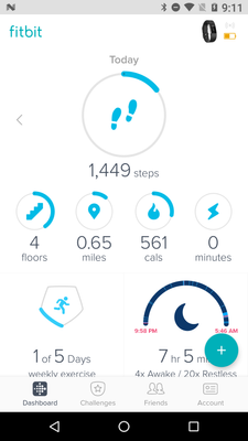
For those of you in the beta, feel free to share your feedback so I can pass it along. I will have a more concrete timeline of official release to share with everyone when I get a confirmed date. We're taking our time to make sure the features are all working up-to-par. Thank you in advance for the feedback!
10-12-2016 23:42
- Mark as New
- Bookmark
- Subscribe
- Permalink
- Report this post
10-12-2016 23:42
- Mark as New
- Bookmark
- Subscribe
- Permalink
- Report this post
Hi.
I mainly use Fitbit to control my weight having lost a few stone 4yrs back and being determined it was the last time I did it. I do track activity but it's a cals in/out thing. I can see that it might muddy the waters to have conveyed feedback from others/IOS etc. and that my key points might get lost so I want to remedy that.
Having used the new Beta dash for a week these are my observations:
1. Each day I log calories in on MFP and maintain a small daily deficit all week in order to relax a little food-wise at w/e's. Every day I used to swipe back through the week to check how I was doing ie. cals in vs cals earned/burned and do a quick mental tot up. I can no longer do this. I can see cals burned if I flick back each day but have to write it all down and then go into the cals in tile and check each day, write it down and then do the maths. Whilst this won't kill me it's clearly quite a leap from a quick glance process and a bit of mental arithmetic that I could do anytime/anywhere.
2. I can no longer glance at my weight alongside the above data to gauge the impact of ongoing food or exercise choices because the screen just tells me what I've lost since a random date (whenever last updated manually) rather than what I actually weigh which is more useful, up or down it's still good data.
3. I don't like the layout but don't care about it, horses for courses - it's the existing tools above being made inefficient which really matter to me.
Whatever the rights and wrongs of my system in other's eyes it's worked for me for yrs and I have already found this week a bit demotivating as I can't see my, generally positive, figures.
Thanks for listening. Over and out! ![]()
Also occ posting as Blokeypoo
10-13-2016 11:06
- Mark as New
- Bookmark
- Subscribe
- Permalink
- Report this post
10-13-2016 11:06
- Mark as New
- Bookmark
- Subscribe
- Permalink
- Report this post
10-14-2016 13:38
- Mark as New
- Bookmark
- Subscribe
- Permalink
- Report this post
 Community Moderator Alumni are previous members of the Moderation Team, which ensures conversations are friendly, factual, and on-topic. Moderators are here to answer questions, escalate bugs, and make sure your voice is heard by the larger Fitbit team. Learn more
10-14-2016 13:38
- Mark as New
- Bookmark
- Subscribe
- Permalink
- Report this post
@Poo @Blokeypoo Yes, "the fact that when you go back through previous days (using an arrow now as swiping screen doesn't work)" has been a largely talked about subject in the iOS board and is definitely the type of feedback that I will be sharing with our Android team.
@Tao75 @werionae Yes, the current production version of the Fitbit app for Android does not adjust to the online Dashboard setting for the day the week starts on. Thanks for the feedback, I will make sure to pass that along.
@Tao75 @bajcmartinez I don't have a confirmed release date for the redesigned Dashboard release to 100% of the Android userbase yet but will keep you posted when I find out here.
@nikonswife Thank you for your feedback! To clarify, the reason behind the "start over for a weight goal" is because we are hoping our users track their progress towards a body fat goal and/or a goal for losing, gaining, or maintaining weight.
@markce Actually, our Android team is closely monitoring this thread for feedback and is interested in what users in the beta have to say. Is there anything specific that you like or dislike about the current beta version of the new Dashboard redesign for Android? Like I said here, it is still a work in progress.
10-14-2016 13:49
- Mark as New
- Bookmark
- Subscribe
- Permalink
- Report this post
10-14-2016 13:49
- Mark as New
- Bookmark
- Subscribe
- Permalink
- Report this post
Thanks @ErickFitbit, do you know if there is any chance to get access to the beta app?
 Best Answer
10-14-2016 15:20 - edited 10-14-2016 15:22
- Mark as New
- Bookmark
- Subscribe
- Permalink
- Report this post
10-14-2016 15:20 - edited 10-14-2016 15:22
- Mark as New
- Bookmark
- Subscribe
- Permalink
- Report this post
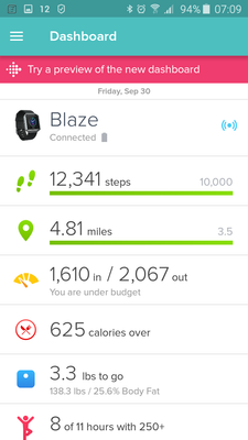
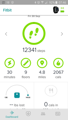
The one on the left is sooooooooo much nicer.
I'm an Android user and never used the IOS version. But litterally everyone I know with an iPhone and a FitBit perfers the old version of the app. For its looks and ease of use. When I still had my Blaze, they we all jealous that I still had the "old" version.
10-14-2016 17:14
- Mark as New
- Bookmark
- Subscribe
- Permalink
- Report this post
 Platinum Fitbit Product Experts share support knowledge on the forums and advocate for the betterment of Fitbit products and services. Learn more
10-14-2016 17:14
- Mark as New
- Bookmark
- Subscribe
- Permalink
- Report this post
I have to disagree, the left looks like it was designed by someone who was thinking this is the way we always I be done it.. All the numbers are on the left. Oh look at the empty space to the to the right, let's throw in a status bar to fill the blank. Everything is in line top to bottom, this is unnatural we read left to right, ok some languages are read in columns and not lines.
The old one requires the eyes to sweep down the screen.
The right one is easy to see the percentage of the days goal in one simple glance, the circles are condensed and easy to read, the eyes don't have to move.
10-15-2016 00:43 - edited 10-18-2016 01:20
- Mark as New
- Bookmark
- Subscribe
- Permalink
- Report this post
10-15-2016 00:43 - edited 10-18-2016 01:20
- Mark as New
- Bookmark
- Subscribe
- Permalink
- Report this post
Good news, thanks for letting us know. I really miss new look from my previous iPhone and I can't get used old one again. I can´t wait for redesigned version for android devices.
Note 10 Aura White | Galaxy Watch 3 Silver | Buds+ White
10-15-2016 01:39
- Mark as New
- Bookmark
- Subscribe
- Permalink
- Report this post
10-15-2016 01:39
- Mark as New
- Bookmark
- Subscribe
- Permalink
- Report this post
Most of those that are allowed, I'm not interested in. Waste of space.
10-15-2016 04:54
- Mark as New
- Bookmark
- Subscribe
- Permalink
- Report this post
10-15-2016 04:54
- Mark as New
- Bookmark
- Subscribe
- Permalink
- Report this post
 Best Answer
10-15-2016 06:11
- Mark as New
- Bookmark
- Subscribe
- Permalink
- Report this post
10-15-2016 06:11
- Mark as New
- Bookmark
- Subscribe
- Permalink
- Report this post
 Best Answer
10-15-2016 08:17
- Mark as New
- Bookmark
- Subscribe
- Permalink
- Report this post
10-15-2016 08:17
- Mark as New
- Bookmark
- Subscribe
- Permalink
- Report this post
I agree. The layout is great for those whose focus is on the tiles in the top section or who just want to view the colours/progress but pretty grim for those of us who don't use those tiles in isolation and want data over graphics.
It's sad to, effectively, remove things which people use. It's hard to understand by those who aren't affected and has resulted in some pretty unpleasant exchanges in the IOS dashboard forum.
Also occ posting as Blokeypoo
10-15-2016 09:16 - edited 10-15-2016 09:22
- Mark as New
- Bookmark
- Subscribe
- Permalink
- Report this post
10-15-2016 09:16 - edited 10-15-2016 09:22
- Mark as New
- Bookmark
- Subscribe
- Permalink
- Report this post
Shame, I'm a long time fitbit user (since the Ultra) but rarely get on the forums (until recently), so didn't know anything about the beta.. and I've been waiting for this update since it hit iOS. 😞
Since I don't have it, I will reply with why I like it. Personally, to me, it seems more streamlined. It also matches the website layout, which I love. I wouldn't have to scroll down to see everything, as everything is in the same area. Overall, I just think it looks nicer and will give us a better/more seamless transfer, especially for those of us that may use the phone application and the web layout.
With that said, I know it's not everybodies cup of tea, so I'd still like an option that would allow users to chose which dashboard they'd like to use.
10-15-2016 16:02
- Mark as New
- Bookmark
- Subscribe
- Permalink
- Report this post
10-15-2016 16:02
- Mark as New
- Bookmark
- Subscribe
- Permalink
- Report this post
10-16-2016 14:25
- Mark as New
- Bookmark
- Subscribe
- Permalink
- Report this post
10-16-2016 14:25
- Mark as New
- Bookmark
- Subscribe
- Permalink
- Report this post
10-17-2016 06:49
- Mark as New
- Bookmark
- Subscribe
- Permalink
- Report this post
10-17-2016 06:49
- Mark as New
- Bookmark
- Subscribe
- Permalink
- Report this post
Many thanks 😙
10-17-2016 15:32
- Mark as New
- Bookmark
- Subscribe
- Permalink
- Report this post
 Community Moderator Alumni are previous members of the Moderation Team, which ensures conversations are friendly, factual, and on-topic. Moderators are here to answer questions, escalate bugs, and make sure your voice is heard by the larger Fitbit team. Learn more
10-17-2016 15:32
- Mark as New
- Bookmark
- Subscribe
- Permalink
- Report this post
@bajcmartinez Currently, our Android team is not looking to add any more users to the beta program. I will keep this thread updated if that changes at any time in the future.
@MikeS1971 @werionae Thanks for your feedback! Do you just not like the looks of the new one or anything specific about the functionality of it?
@markce What do you have in mind that you'd like to see available in the top section of the new Dashboard?
@Cissyk Sounds like you had a widget on your home screen. Check out this article for more info.
@ValerieAnne Thank you for taking the time to share your feedback! I will make sure to pass it along to our Android team.
 Best Answer
10-18-2016 02:36
- Mark as New
- Bookmark
- Subscribe
- Permalink
- Report this post
10-18-2016 02:36
- Mark as New
- Bookmark
- Subscribe
- Permalink
- Report this post
Thanks for asking...
What I am interested in, so that I can
a) view at a glance, and
b) swipe between days
- Sleep
- Bpm
- Calories in/out (big plus for the android version)
- Steps or distance
- Exercise
(And I want to see the most recent exercise, either workout or walk,
without having to click through. Not the heptagon. I do more than 1 per
day.)
Thanks
10-18-2016 03:58
- Mark as New
- Bookmark
- Subscribe
- Permalink
- Report this post
10-18-2016 03:58
- Mark as New
- Bookmark
- Subscribe
- Permalink
- Report this post
1)Will new Fitbit app bring any changes for widget settings? ex. more options for customization, and show more data on home screen, not only goal.
2) Also, if Fitbit devs could consider add option for set dark theme. Black or dark theme is less glaring on the eyes and for those of us using AMOLED screens, black helps to save battery power. My most frequently used applications on my devices are working in dark mode, except Fitbit app.
Note 10 Aura White | Galaxy Watch 3 Silver | Buds+ White
10-18-2016 12:45
- Mark as New
- Bookmark
- Subscribe
- Permalink
- Report this post
SunsetRunner
10-18-2016 12:45
- Mark as New
- Bookmark
- Subscribe
- Permalink
- Report this post
 Best Answer
10-18-2016 13:21
- Mark as New
- Bookmark
- Subscribe
- Permalink
- Report this post
10-18-2016 13:21
- Mark as New
- Bookmark
- Subscribe
- Permalink
- Report this post
@SunsetRunner
Hiya, I think it's only the dash which is different - much like the website - the front page changed but the details are the same.
Happy though to check and can post tomorrow night - do say if any particular graph you're interested in but, as above, I think they're unchanged ![]()
Also occ posting as Blokeypoo

