Join us on the Community Forums!
-
Community Guidelines
The Fitbit Community is a gathering place for real people who wish to exchange ideas, solutions, tips, techniques, and insight about the Fitbit products and services they love. By joining our Community, you agree to uphold these guidelines, so please take a moment to look them over. -
Learn the Basics
Check out our Frequently Asked Questions page for information on Community features, and tips to make the most of your time here. -
Join the Community!
Join an existing conversation, or start a new thread to ask your question. Creating your account is completely free, and takes about a minute.
Not finding your answer on the Community Forums?
- Community
- Platform
- Android App
- Estimated Oxygen Variation graph is broken
- Mark Topic as New
- Mark Topic as Read
- Float this Topic for Current User
- Bookmark
- Subscribe
- Mute
- Printer Friendly Page
- Community
- Platform
- Android App
- Estimated Oxygen Variation graph is broken
Estimated Oxygen Variation graph is broken
ANSWERED- Mark Topic as New
- Mark Topic as Read
- Float this Topic for Current User
- Bookmark
- Subscribe
- Mute
- Printer Friendly Page
07-21-2022
10:45
- last edited on
07-22-2022
15:00
by
LizzyFitbit
![]()
- Mark as New
- Bookmark
- Subscribe
- Permalink
- Report this post
07-21-2022
10:45
- last edited on
07-22-2022
15:00
by
LizzyFitbit
![]()
- Mark as New
- Bookmark
- Subscribe
- Permalink
- Report this post
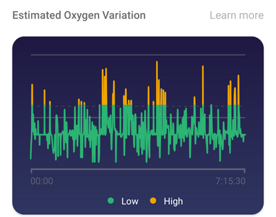
Hi, I just noticed that the green and yellow lines have changed and now are all over the place on the graph. All graphs for different days start with a 0:00 hrs. The fluctuations are not at all in line with what I was reading up until today. Anyone experienced this issue?? Thanks
Moderator Edit: Clarified subject
Answered! Go to the Best Answer.
Accepted Solutions
08-12-2022
15:36
- last edited on
08-03-2024
08:14
by
MarreFitbit
![]()
- Mark as New
- Bookmark
- Subscribe
- Permalink
- Report this post
 Community Moderators ensure that conversations are friendly, factual, and on-topic. We're here to answer questions, escalate bugs, and make sure your voice is heard by the larger Fitbit team. Learn more
08-12-2022
15:36
- last edited on
08-03-2024
08:14
by
MarreFitbit
![]()
- Mark as New
- Bookmark
- Subscribe
- Permalink
- Report this post
Hi everyone.
Thanks for taking the time to share your feedback, as well as the steps tried on your own. I'm happy to share with you that our team has released the Android app 3.65 version (Android 8.0 OS or higher) which includes improvements for the Estimated Oxygen Levels graph. Because this is a progressive roll out, if you don't see it available yet, check later.
Your feedback and patience are truly appreciated. Please don't hesitate to let me know if the issue persists so I can keep our team informed.
07-21-2022 15:39
- Mark as New
- Bookmark
- Subscribe
- Permalink
- Report this post
07-21-2022 15:39
- Mark as New
- Bookmark
- Subscribe
- Permalink
- Report this post
I woke up to the new look sleep data on my Versa 3 and when I looked at my oxygen variation data it had heaps of yellow (high variation) throughout the night. I NEVER have any yellow, at most one tiny peak at the beginning of my sleep. Yet when I looked back at previous days/weeks (where I know there was only green (low variations) the data looks erratic like last night's, showing heaps of yellow. What's going on?
07-21-2022 16:36
- Mark as New
- Bookmark
- Subscribe
- Permalink
- Report this post
07-21-2022 16:36
- Mark as New
- Bookmark
- Subscribe
- Permalink
- Report this post
ME TOO! I've been messaging with Fitbit help all day on Facebook messenger!
They had restart my Versa 3, my phone, clear cache, uninstall, reinstall EVERYTHING.
Meanwhile, I've been sat having a health anxiety OCD spike thinking I've been oxygen starved for months & what does this mean???
I have just got a new phone so interestingly, I could see the same nights sleep on both my old not yet updated app & my new with updated app - old looked 'normal' all green, a fine up & down graph in which the times matched the times that I slept - 2.50a.m to 10.31 a.m - this is the only anomaly I can spot - on the updated app graph the times no longer match - they say (for the same 2.50 - 10.31 sleep) 00.00 - 7.57.06 ... weird!
No clue how or why or what the heck is going on but, reassured that I'm not the only one this is happening to. I'm assuming (hoping) that it's a glitch/issue that will be sorted out and not that we've all had sleep apnea for months & the fitbit app didn't tell us 😉
07-21-2022 18:26
- Mark as New
- Bookmark
- Subscribe
- Permalink
- Report this post
07-21-2022 18:26
- Mark as New
- Bookmark
- Subscribe
- Permalink
- Report this post
Me too. In fact I looked back and they all changed. Obviously the update is glitches.
07-22-2022 02:32
- Mark as New
- Bookmark
- Subscribe
- Permalink
- Report this post
07-22-2022 02:32
- Mark as New
- Bookmark
- Subscribe
- Permalink
- Report this post
Yes, if you look, the time you fell asleep & woke up, no longer matches the times on the oxygen variation graph - today I slept from 1:20a.m to 10:21a.m but the graph says 00:00 - 08:32:15
All day yesterday fitbit help had me jumping hoops then telling me to see what it read this morning & wouldn't accept that it was tech issues their end.
07-22-2022 05:24
- Mark as New
- Bookmark
- Subscribe
- Permalink
- Report this post
07-22-2022 05:24
- Mark as New
- Bookmark
- Subscribe
- Permalink
- Report this post
Same here. Fitbit had me reinstall and restart, without any change. They won't accept it is a problem on their end. I'm waiting for an email to help resolve MY case...
07-22-2022 06:28
- Mark as New
- Bookmark
- Subscribe
- Permalink
- Report this post
07-22-2022 06:28
- Mark as New
- Bookmark
- Subscribe
- Permalink
- Report this post
And the oxygenation chart looks scary to me today!☹️
07-22-2022 07:11
- Mark as New
- Bookmark
- Subscribe
- Permalink
- Report this post
07-22-2022 07:11
- Mark as New
- Bookmark
- Subscribe
- Permalink
- Report this post
Today all of my historical oxygen variation data changed to an alarming high variation spikes all through the night going back to when I starting wearing my versa 2. I know this is incorrect as I check the graph after waking each night and there are hardly ever any high variation spikes. What is causing this? Were the graphs i was looking at previously incorrect and I the new ones that have popped up correct, if so then there is something seriously worrying going kn with my health.
07-22-2022 07:27
- Mark as New
- Bookmark
- Subscribe
- Permalink
- Report this post
07-22-2022 07:27
- Mark as New
- Bookmark
- Subscribe
- Permalink
- Report this post
The new oxygen variation chart shows that much of my night has 'high variation.' This is a very drastic change from the previous charts, which only very rarely showed high oxygen variation (maybe once every 4 or 5 days, and only briefly).
How should I interpret this? Nights recorded prior to this update now show I had frequent high variation, too. Should I go see a physician right away to deal with my apparent sleep apnea??? Or is this another Fitbit goof?
07-22-2022 07:45
- Mark as New
- Bookmark
- Subscribe
- Permalink
- Report this post
07-22-2022 07:45
- Mark as New
- Bookmark
- Subscribe
- Permalink
- Report this post
After the change to the graphs last night, I noticed that my 02 saturation graph (in the sleep metrics) changed drastically. For years it has shown my fluctuations to be in normal range (always a green line). Since the update, it shows high (yellow lines) throughout the night, for every night, since having the app (years). Anyone else notice this change? Should I talk to my doctor about sleep apnea? Or is this a Fitbit bug? I'm really confused.
07-22-2022 09:31
- Mark as New
- Bookmark
- Subscribe
- Permalink
- Report this post
07-22-2022 09:31
- Mark as New
- Bookmark
- Subscribe
- Permalink
- Report this post
Charge 5 running the latest firmware. Got an app notice this morning that charts had been updated. My oxygen variation charts in the old version used to show minimal to no "high" variation - where it spikes up into yellow. After the update, all of my previous oxygen saturation charts now show like half or more of my sleep in the yellow. is this a known bug with the new charts or were the old charts incorrectly displaying the variation?
07-22-2022
09:42
- last edited on
09-10-2022
13:01
by
DavideFitbit
![]()
- Mark as New
- Bookmark
- Subscribe
- Permalink
- Report this post
07-22-2022
09:42
- last edited on
09-10-2022
13:01
by
DavideFitbit
![]()
- Mark as New
- Bookmark
- Subscribe
- Permalink
- Report this post
I'm seeing the same thing.
Same in a family member too, who DOES have sleep apnea which is well controlled. Prior to this update, they had NO significant oxygen variation. And now their graphs looks like yours.
Clearly something is broken here.
Estimate Oxygen Variation is totally broken, I agree.
07-22-2022 10:07
- Mark as New
- Bookmark
- Subscribe
- Permalink
- Report this post
07-22-2022 10:07
- Mark as New
- Bookmark
- Subscribe
- Permalink
- Report this post
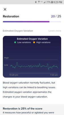
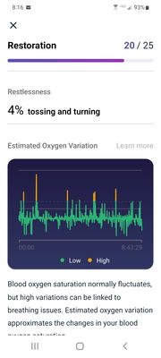
Attachments to show a graph of the same day before the update and then after.
07-22-2022 10:42
- Mark as New
- Bookmark
- Subscribe
- Permalink
- Report this post
07-22-2022 10:42
- Mark as New
- Bookmark
- Subscribe
- Permalink
- Report this post
I noticed the same thing this morning. My partner has the same watch, but uses an iphone, and his oxygen variation chart still looks like mine did before this recent change. Maybe it's an Android issue only?
07-22-2022 11:31
- Mark as New
- Bookmark
- Subscribe
- Permalink
- Report this post
07-22-2022 11:31
- Mark as New
- Bookmark
- Subscribe
- Permalink
- Report this post
Wearing a Chg 4, am dealing with same issue- however, my android phone app looks the same as always (exactly like your top capture) but my tablet app shows the bottom screen and all past graphs since I started the app (over a year) have now changed as well - so much orange!!! I really wish this would be explained to us; is it a glitch, a more sensitive reading, or lowering of the threshold bar... Hope someone explains soon.
07-22-2022 12:51
- Mark as New
- Bookmark
- Subscribe
- Permalink
- Report this post
07-22-2022 12:51
- Mark as New
- Bookmark
- Subscribe
- Permalink
- Report this post
The oxygen variation chart is outright broken. With the older charts, I would almost never see high oxygen variation. The new charts go into orange for every single night I've recorded over the past 2 years.
Then there is the sleeping heart rate graph. The older charts had labeled horizontal lines which allowed users to see, at a glance, their highest and lowest heart rate for the night. The new charts fully scrapped this feature.
The full screen feature for charts, which was also extremely useful, is also gone.
Please work on fixing this, or at the very least, allow users to roll back to older versions.
07-22-2022 13:15
- Mark as New
- Bookmark
- Subscribe
- Permalink
- Report this post
07-22-2022 13:15
- Mark as New
- Bookmark
- Subscribe
- Permalink
- Report this post
Same here. I would like to know how you turn this Estimated Oxygen Variation feature OFF but still retain the Sleep Stages. This feature is an example of TMI which I don't want/need stressing me out at night.
07-22-2022 13:24
- Mark as New
- Bookmark
- Subscribe
- Permalink
- Report this post
07-22-2022 13:24
- Mark as New
- Bookmark
- Subscribe
- Permalink
- Report this post
Either that, or make it reflect reality.
Everyone I've talked to that is on Android has said they ALL have high variation now. Clearly something is broken in the app.
07-22-2022 13:51 - edited 07-22-2022 13:53
- Mark as New
- Bookmark
- Subscribe
- Permalink
- Report this post
07-22-2022 13:51 - edited 07-22-2022 13:53
- Mark as New
- Bookmark
- Subscribe
- Permalink
- Report this post
With the recent color-scheme changes I noticed in my sleep data under "Estimated Oxygen Variation" the graph shown looks different from before. It does not show "High" or "Low" on the left side. Also, I have been looking at the results daily now for about a week. Previously, my results usually only showed perhaps one to three events in the high range and normally did not show any events in this range. Now the same results show that I had many events in the high range. Did the algorithm change that is used to determine high oxygen variation or is there a bug?
Thank you,
Peter
07-22-2022 14:05
- Mark as New
- Bookmark
- Subscribe
- Permalink
- Report this post
07-22-2022 14:05
- Mark as New
- Bookmark
- Subscribe
- Permalink
- Report this post
Have peoples estimated oxygen variation levels gone very high with recent luxe changes in dashboard.


