Join us on the Community Forums!
-
Community Guidelines
The Fitbit Community is a gathering place for real people who wish to exchange ideas, solutions, tips, techniques, and insight about the Fitbit products and services they love. By joining our Community, you agree to uphold these guidelines, so please take a moment to look them over. -
Learn the Basics
Check out our Frequently Asked Questions page for information on Community features, and tips to make the most of your time here. -
Join the Community!
Join an existing conversation, or start a new thread to ask your question. Creating your account is completely free, and takes about a minute.
Not finding your answer on the Community Forums?
- Community
- Platform
- Android App
- Re: Estimated Oxygen Variation graph is broken
- Mark Topic as New
- Mark Topic as Read
- Float this Topic for Current User
- Bookmark
- Subscribe
- Mute
- Printer Friendly Page
- Community
- Platform
- Android App
- Re: Estimated Oxygen Variation graph is broken
Estimated Oxygen Variation graph is broken
ANSWERED- Mark Topic as New
- Mark Topic as Read
- Float this Topic for Current User
- Bookmark
- Subscribe
- Mute
- Printer Friendly Page
07-21-2022
10:45
- last edited on
07-22-2022
15:00
by
LizzyFitbit
![]()
- Mark as New
- Bookmark
- Subscribe
- Permalink
- Report this post
07-21-2022
10:45
- last edited on
07-22-2022
15:00
by
LizzyFitbit
![]()
- Mark as New
- Bookmark
- Subscribe
- Permalink
- Report this post
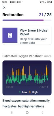
Hi, I just noticed that the green and yellow lines have changed and now are all over the place on the graph. All graphs for different days start with a 0:00 hrs. The fluctuations are not at all in line with what I was reading up until today. Anyone experienced this issue?? Thanks
Moderator Edit: Clarified subject
Answered! Go to the Best Answer.
08-11-2022 19:17
- Mark as New
- Bookmark
- Subscribe
- Permalink
- Report this post
08-11-2022 19:17
- Mark as New
- Bookmark
- Subscribe
- Permalink
- Report this post
When will this get fixed?
08-11-2022 19:25
- Mark as New
- Bookmark
- Subscribe
- Permalink
- Report this post
08-11-2022 19:25
- Mark as New
- Bookmark
- Subscribe
- Permalink
- Report this post
Totally agree. At this point they have lost so much consumer confidence i know for myself the sooner I can switch to something else I will. It's things like this that show whether a company is concerned about their customers. We know how that turned out. I don't trust the watch, software, or the company. Management should be fired for not handling this properly.
08-12-2022 00:49
- Mark as New
- Bookmark
- Subscribe
- Permalink
- Report this post
08-12-2022 00:49
- Mark as New
- Bookmark
- Subscribe
- Permalink
- Report this post
I didn't take any screenshots or whatever of a couple of my EOV charts prior to receiving the 3.65 update at 1am yesterday... So I can't confirm if the new graph layout shows a different amount of variations (but, variations from what reference point??). All I can say is that I no longer see any yellow coloured spikes, BUT.... I do have a couple of days from last week or so where 'my values' were all over the place, at the far bottom and near the far top of the 'range' - but with no yellow. peaks.
OK, I just checked last night's and I do have a little couple of yellow peaks.... the graph lines themselves do seem to be smoother than they were pre 3.65 update, but not as smooth as they were when EOV charting was first implemented and up to the point at which they were 'improved'.
08-12-2022 01:17
- Mark as New
- Bookmark
- Subscribe
- Permalink
- Report this post
08-12-2022 01:17
- Mark as New
- Bookmark
- Subscribe
- Permalink
- Report this post
Mine are still all over the place. A LOT.
But the weird part is that not only the new ones but also the old ones have changed, which does not make any sense and probably shows that the issue is not with the measurement but with reading and graphic representation.
Still hoping for the bug to be fixed ASAP
08-12-2022 01:25
- Mark as New
- Bookmark
- Subscribe
- Permalink
- Report this post
08-12-2022 01:25
- Mark as New
- Bookmark
- Subscribe
- Permalink
- Report this post
your comment about the old ones having changed is spot on - the graph layouts (when they change) could be termed as being 'global overlays' - i.e. THAT is the only display type that will be seen once changes have been made. The graphs still read and use your same raw data, as logged by your device and synced to the Fitbit servers, but they'll all only display as the 'new/improved' graphical output.
Yep, looking forward to lots of things being fixed ASAP ::D 😄
08-12-2022 06:43
- Mark as New
- Bookmark
- Subscribe
- Permalink
- Report this post
08-12-2022 06:43
- Mark as New
- Bookmark
- Subscribe
- Permalink
- Report this post
High variations are associated with breathing issues when oxygen levels drop and then recover when we move or wake. Sleep apnea is the classic case but many of is get occasional blockages esp if we are prone to snoring on occasions.
 Best Answer
08-12-2022 07:09
- Mark as New
- Bookmark
- Subscribe
- Permalink
- Report this post
08-12-2022 07:09
- Mark as New
- Bookmark
- Subscribe
- Permalink
- Report this post
I completely understand that mistakes and glitches happen however, the length of time it is taking to address this issue has me concerned about the accuracy of the rest of my data.
08-12-2022 07:41
- Mark as New
- Bookmark
- Subscribe
- Permalink
- Report this post
08-12-2022 07:41
- Mark as New
- Bookmark
- Subscribe
- Permalink
- Report this post
I have an android our oxygen is gone haywire and it has changed data even from last year that was fine to spikes a d variations everywhere ho to fitbit community guess all 1000 of us are just imagine all of this
 Best Answer
08-12-2022 08:36
- Mark as New
- Bookmark
- Subscribe
- Permalink
- Report this post
08-12-2022 08:36
- Mark as New
- Bookmark
- Subscribe
- Permalink
- Report this post
crazy looking. I don't know how to read these broken lines
08-12-2022 08:50
- Mark as New
- Bookmark
- Subscribe
- Permalink
- Report this post
08-12-2022 08:50
- Mark as New
- Bookmark
- Subscribe
- Permalink
- Report this post
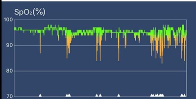
@Kasulke Funny you should site this non-Fitbit device because it's SpO2 graphic looks pretty much identical to what everyone is complaining about that FITBIT has done to the EOV graph (minus the Y-axis label). Lots of instantaneous measures that look quit disconcerting. I would prefer that we just have the option to TURN off monitoring that we don't feel is that useful (or causes more anxiety than good). The old style EOV graph is "better" not because it is necessarily more accurate but rather, because it is less stressful. 😃
08-12-2022 09:00
- Mark as New
- Bookmark
- Subscribe
- Permalink
- Report this post
08-12-2022 09:00
- Mark as New
- Bookmark
- Subscribe
- Permalink
- Report this post
I just did the new ios/app update and the Sense firmware update 8/10/22. I didn't have an issue with the EOV prior to that. Now however, it looks like I had an EOV through the roof the entire night. I've always tried to watch for a relationship between that and snoring. The snoring is way down to mild (possibly accurate). Regardless I can say for sure the EOV has not gotten better with the update. It's gotten significantly worst. Note Fitbit notified me of the firmware update and was relentless in making me do it however because it didn't offer any clue as to what it did I went searching. That's how I found out about the software update. So it's possible that was available closer to 7/22 when people started complaining.
 Best Answer
08-12-2022 09:24
- Mark as New
- Bookmark
- Subscribe
- Permalink
- Report this post
08-12-2022 09:24
- Mark as New
- Bookmark
- Subscribe
- Permalink
- Report this post
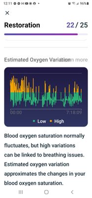
Wow, it gets worst. I thought it only effected EOV data since the update. It EFFECTS ALL DATA (ALL HISTORY). First screen shot is before update, 2nd one is after. I can't believe fitbit is actually changing historical raw data with an update! Please tell me that's not true. It never looked like either one of these b4.
 Best Answer
08-12-2022 09:25
- Mark as New
- Bookmark
- Subscribe
- Permalink
- Report this post
08-12-2022 09:25
- Mark as New
- Bookmark
- Subscribe
- Permalink
- Report this post
the night, whereas the ring device shows a few dips, but nothing serious.
Also, it gives actual % which are a match to my fingertip oximeter.
08-12-2022 09:27
- Mark as New
- Bookmark
- Subscribe
- Permalink
- Report this post
08-12-2022 09:27
- Mark as New
- Bookmark
- Subscribe
- Permalink
- Report this post
@Kasulke Can you upload (copy/paste) the graphs so that we can see the other device compared to the fitbit EOV on the same night (with the same data)?
 Best Answer
08-12-2022 09:42
- Mark as New
- Bookmark
- Subscribe
- Permalink
- Report this post
08-12-2022 09:42
- Mark as New
- Bookmark
- Subscribe
- Permalink
- Report this post
The ring on the left and Fitbit on the right.
The Fitbit graph makes it look like I had some serious drops, while the
ring only has one with any significance and the rest are minor.
The biggest thing for me is the amount of data I can get from the ring
which Fitbit won't offer.
Seeing the actual percentage of oxygen saturation makes the data much more
insightful.
Also, having the information on the extent of any drops, number per hour
and total time at less than 90% (a threshold you can choose) makes the ring
data much more useful. It provides context.
Knowing that in this case, I only dipped lower than my chosen threshold for
a total of 2 minutes over the whole night, puts my mind at ease. The
overall score of 9.3 is also great. The app suggests that if you dip into
the yellow range you should talk to your doctor about a possible apnea
issue.
[image: image.png]
08-12-2022 09:44
- Mark as New
- Bookmark
- Subscribe
- Permalink
- Report this post
08-12-2022 09:44
- Mark as New
- Bookmark
- Subscribe
- Permalink
- Report this post
What do you mean? Even on 3.65 you have these high variations?
 Best Answer
08-12-2022 09:55
- Mark as New
- Bookmark
- Subscribe
- Permalink
- Report this post
08-12-2022 09:55
- Mark as New
- Bookmark
- Subscribe
- Permalink
- Report this post
I don't think they are changing the actual data, just how it is displayed on the graph.
08-12-2022 10:15
- Mark as New
- Bookmark
- Subscribe
- Permalink
- Report this post
08-12-2022 10:15
- Mark as New
- Bookmark
- Subscribe
- Permalink
- Report this post
The last update makes things appear like wild variations. Not helpful to me. The old style graph was easier to tell if you had a period of time when O2 levels dropped. Now it's like a scribble.
08-12-2022 10:22
- Mark as New
- Bookmark
- Subscribe
- Permalink
- Report this post
08-12-2022 10:22
- Mark as New
- Bookmark
- Subscribe
- Permalink
- Report this post
And the data has changed if you ho back even a year on older phone it's totally different days that are normal days with oxygen variation with this new date its totally different??? Everyone is freaked put its mit a medical device I get that but is the previous data right or the new data and a thousand of us need to make dr appointments
 Best Answer
08-12-2022 11:41
- Mark as New
- Bookmark
- Subscribe
- Permalink
- Report this post
08-12-2022 11:41
- Mark as New
- Bookmark
- Subscribe
- Permalink
- Report this post
The display for my EOV is showing high variations multiple times every night. I've never had high variations. When i look back at the past they now all show high variations which they did not show previously.


