Join us on the Community Forums!
-
Community Guidelines
The Fitbit Community is a gathering place for real people who wish to exchange ideas, solutions, tips, techniques, and insight about the Fitbit products and services they love. By joining our Community, you agree to uphold these guidelines, so please take a moment to look them over. -
Learn the Basics
Check out our Frequently Asked Questions page for information on Community features, and tips to make the most of your time here. -
Join the Community!
Join an existing conversation, or start a new thread to ask your question. Creating your account is completely free, and takes about a minute.
Not finding your answer on the Community Forums?
- Mark Topic as New
- Mark Topic as Read
- Float this Topic for Current User
- Bookmark
- Subscribe
- Mute
- Printer Friendly Page
New Dashboard
- Mark Topic as New
- Mark Topic as Read
- Float this Topic for Current User
- Bookmark
- Subscribe
- Mute
- Printer Friendly Page
05-25-2016
08:34
- last edited on
05-25-2017
14:37
by
KateFitbit
![]()
- Mark as New
- Bookmark
- Subscribe
- Permalink
- Report this post
 Community Moderator Alumni are previous members of the Moderation Team, which ensures conversations are friendly, factual, and on-topic. Moderators are here to answer questions, escalate bugs, and make sure your voice is heard by the larger Fitbit team. Learn more
05-25-2016
08:34
- last edited on
05-25-2017
14:37
by
KateFitbit
![]()
- Mark as New
- Bookmark
- Subscribe
- Permalink
- Report this post
Fitbit Update 5/25/2017
Thank you for taking the time to share feedback. I can assure you the comments have been and continued to be reviewed and shared with our iOS team.
As a reminder, I'm including our help article on the Fitbit app here.
Overwhelmingly, recent posts share the sentiment of no longer being able to revert back to the original dashboard and not having the option to choose. At this time there are no plans to revert access to the old Dashboard, but we always appreciate feedback on how to improve our app.
As a reminder, Please remember to keep your posts respectful and on-topic, per our Community Guidelines. This thread will be better for everyone as a constructive conversation.
Fitbit Update 8/17/2016
Beginning with version 2.26 of the Fitbit app for iOS, the new Fitbit app dashboard with an updated look is now fully implemented. You can no longer return to the old design. We're constantly striving to improve Fitbit products and services, and we appreciate all of the feedback we receive from our customers.
You can find information about the new app dashboard and how to start using it by clicking here.
Fitbit Update 5/25/2016
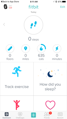
I'm very pleased to announce that iOS users who have updated to version 2.23 of the Fitbit iOS App are now able to opt-in to use a preview of a new design of the Fitbit iOS dashboard!
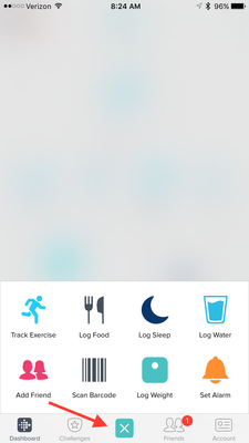
One of my favorite features for this new dashboard preview is the quick log button in the bottom-center of the iOS App. This feature allows users to quickly: track an exercise, log food, log sleep, log water, send a friend request, scan a food barcode (if you are using the US food database), log their weight, or set an alarm.
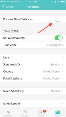
Users can opt-in to use the new iOS dashboard design by:
1. Updating to version 2.23 of the Fitbit iOS App, click here to be redirected to the iOS App Store.
2. Click the Account button in the bottom right-hand corner.
3. Scroll down and click the Advanced Settings button.
4. Toggle the Preview New Dashboard button at the top of the page on.
Click here for more details and let me know if you have any questions!
Moderator Edit: Edited thread title.
05-24-2017 12:54
- Mark as New
- Bookmark
- Subscribe
- Permalink
- Report this post
05-24-2017 12:54
- Mark as New
- Bookmark
- Subscribe
- Permalink
- Report this post
Sent from my Verizon, Samsung Galaxy smartphone
05-25-2017
14:39
- last edited on
12-02-2024
07:05
by
MarreFitbit
![]()
- Mark as New
- Bookmark
- Subscribe
- Permalink
- Report this post
 Community Moderator Alumni are previous members of the Moderation Team, which ensures conversations are friendly, factual, and on-topic. Moderators are here to answer questions, escalate bugs, and make sure your voice is heard by the larger Fitbit team. Learn more
05-25-2017
14:39
- last edited on
12-02-2024
07:05
by
MarreFitbit
![]()
- Mark as New
- Bookmark
- Subscribe
- Permalink
- Report this post
Hi Everyone,
Thank you for taking the time to share feedback. I can assure you the comments have been and continued to be reviewed and shared with our iOS team.
As a reminder, I'm including our help article on the Fitbit app here.
Overwhelmingly, recent posts share the sentiment of no longer being able to revert back to the original dashboard and not having the option to choose. At this time there are no plans to revert access to the old Dashboard, but we always appreciate feedback on how to improve our app.
As a reminder, Please remember to keep your posts respectful and on-topic, per our Community Guidelines. This thread will be better for everyone as a constructive conversation.
Actively managing your weight? Find accountability buddies on the Manage Weight board
05-25-2017 18:25
- Mark as New
- Bookmark
- Subscribe
- Permalink
- Report this post
05-25-2017 18:25
- Mark as New
- Bookmark
- Subscribe
- Permalink
- Report this post
If FitBit appreciated user feedback, FitBit would have asked users what changes they want to see in the Dashboard. If FitBit appreciated user feedback, FitBit would have given users a heads-up about the Dashboard changes prior to implementing it. If FitBit appreciated user feedback, FitBit wouldn't have taken two weeks to respond to this thread. Just sayin'...
05-25-2017 18:48
- Mark as New
- Bookmark
- Subscribe
- Permalink
- Report this post
 Platinum Fitbit Product Experts share support knowledge on the forums and advocate for the betterment of Fitbit products and services. Learn more
05-25-2017 18:48
- Mark as New
- Bookmark
- Subscribe
- Permalink
- Report this post
I would have to.do some searching, or you could, but these changes where made in response to the feature request, with many votes and posts, to have the app dashboard look more like the web based dashboard. With tiles and not just line entries.
 Best Answer
05-25-2017
21:24
- last edited on
05-26-2017
13:08
by
YojanaFitbit
![]()
- Mark as New
- Bookmark
- Subscribe
- Permalink
- Report this post
05-25-2017
21:24
- last edited on
05-26-2017
13:08
by
YojanaFitbit
![]()
- Mark as New
- Bookmark
- Subscribe
- Permalink
- Report this post
So what you are saying is thanks for talking but we really don't care about what you said or what you want. We did what we wanted and you have to live with it. Correct me if I am wrong. I agree wholeheartedly. Fitbit did not consider for one minute what users wanted. They did what was best/easiest and most likely mist profiable for them. The concept that Fitbit offers is great. Unfortunately the implimentation falls short.
05-25-2017
23:21
- last edited on
03-06-2026
06:23
by
MarreFitbit
![]()
- Mark as New
- Bookmark
- Subscribe
- Permalink
- Report this post
 Fitbit Product Experts Alumni are retired members of the Fitbit Product Expert Program. Learn more
05-25-2017
23:21
- last edited on
03-06-2026
06:23
by
MarreFitbit
![]()
- Mark as New
- Bookmark
- Subscribe
- Permalink
- Report this post
When Henry Ford asked users what they wanted, they responded with 'faster horses'. If he followed their advice, we wouldn't have cars.
How do you propose Fitbit would've given users a heads up before implementing it? Here in the forums? Would folks look here if they were content with their experience? Perhaps send mail describing how it would behave, since again you suggest to give users a heads up before implementing it. Does that sound practical? I don't think it does.
Fitbit appreciates constructive feedback, but the vast majority of the feedback that Fitbit is not responding to are comments that don't describe what you'd like to see changed. A comment like, "Yes, I hate the new dashboard. Yes I want the old dashboard back." Is perfectly fine if you want to vent, but doesn't really give Fitbit anything to work with. You hate it? Why?! It's not realistic to tell them to keep it the way it was forever... How would they add new features?
And speaking of new features... The old dashboard does not have any way to display heart rate nor hours of activity... Should Fitbit not add these features to the new trackers?
Just sayin'...
Frank | Washington, USA
Fitbit One, Ionic, Charge 2, Alta HR, Blaze, Surge, Flex, Flex 2, Zip, Ultra, Flyer, Aria, Aria 2 - Windows 10, Windows Phone
Take a look at the Fitbit help site for further assistance and information.
05-26-2017 03:51
- Mark as New
- Bookmark
- Subscribe
- Permalink
- Report this post
05-26-2017 03:51
- Mark as New
- Bookmark
- Subscribe
- Permalink
- Report this post
Not all change is necessarily good.
There are countless survey options in the world and I participate in many.
Perhaps that is how they could have determined what folks wanted. Surely
you don't just institute a change without seeking possible objections
first. The old dashboard Listed More in an easier to,read,way. What was
wrong with that?
 Best Answer
05-26-2017
04:08
- last edited on
03-06-2026
06:34
by
MarreFitbit
![]()
- Mark as New
- Bookmark
- Subscribe
- Permalink
- Report this post
 Platinum Fitbit Product Experts share support knowledge on the forums and advocate for the betterment of Fitbit products and services. Learn more
05-26-2017
04:08
- last edited on
03-06-2026
06:34
by
MarreFitbit
![]()
- Mark as New
- Bookmark
- Subscribe
- Permalink
- Report this post
Fitbit has a Feature request board for users to submitt their requests, one of these very popular requests, that dates back to 2015, is for a dashboard that is more like the web based dashboard with easy to read graphical tiles. I beleive Fitbit did a pretty good job of fullfilling this very popular request. Dont you agree?
As for asking what the users want, or a survey. Why would Fitbit need to, the users already made there voice heard. We want the same experience across all devices. It is stupid to have one view for web, a second dashboard for android, a third dashboard for ios, why does ios get the changes first?, Then poor windows phones, they get a forth design. Very inefficient and confusing of Fitbit.
Users also where very irate over Fitbit changing the dashboard in 2014, you never saw what a great dashboard that it was If people love it so much now, why was there so much hatred for it 2 years ago? Is it because people adapt, or because it really was no better, the newer users never experienced the pre 2015 dashboard to know what they have been missing for the past two years.
This new dashboard is in response to users requesting a change, so yes @CSTURM they did consider the users wants.
The current dashboard is the forth mobile dashboard I've had. Fitbit never once asked for my permission to change it.
I however find the latest the most intuitive and easiest. Allowing me to see at a glance where my numbers are in relation to my daily goals. Nice big graphs that are easy to view.and easy to identify. The last three dashboards required the users to actually have to read what each line entry was representing, with a stupid 1990's line graph, remember Word Perfect? Im sure @PureEvil remembers, yes they had the same arcaic graphs also.
When comparing the stats from different days, nothing has changed here you still need to tap through to a second screen, just like a user had to in the last 3 versions, actually 9 since each phone OS had their own version. Also before the current dashboard each device had their own way of navagatiing the menus. Making it more important to have the post in the correct forum, or at least say what OS the user is using. Neither of which usually happens, and requires a game of tweenty questions before real help can be given. This has almost been elimanated in the newly designed dashboard and apps. WTG Fitbit!
Saying that you can't scroll between days to compare all your data is simply nit something to hate the whole dashboard. Why throw the baby out with the bath water?
Saying that i now can't compare several days of data is wrong, the user never was able to compare several days of data on one screen of the dashboard. The new, old, and even older dashboards never had this feature. All require tapping to get to a second screen where you could see a week or more of data on the same screen. This also is not found on the web dashboard either, where it is necessary to click a tile, then click view more. Why two clicks on the web where only one tap is needed in the app. Actually it is easily unerstood why two clicks, since one click on the web tile brings up at least two options.
The only thing I've noticed that people don't like about the new dashboard is that the bottom tiles don't scroll between days, this is not something that would neccasarily cause a user to hate the whole display. It does warrant asking the developers to adjust the scrolling to include the bottom tiles. Do a search you will find that this has been suggested.. personally I feel Fitbit fell short here when they thought it was OK to not include the bottom tiles.
I have two more complaints, at first, like the old dashboards, a user could swipe between screens. Having to have to press an arrow makes me feel like im back in Dos 6.2, (year 1993). The old, dashboard, also hated by many when introduced and the one you say that you loved, reminded me of Windows 3.1 and i felt like I was back in 1994.
Please Fitbit put back in the swiping, __ oh i forgot, i need to go and vote for this allready requested feature.
Another complaint, just because iOS users can't rotate their screen, you guys don't know what your missing (LOL), doesn't mean that android users doesn't mean thatt Fitbit needs to cripple Android users by leaving this feature out, we want screen rotation back.
This feature is so cool since the app knows how the screen is rotared, and chwnges the format. The bottom tiles are removed, and the top tiles displayed full screen. It was simply fab, and made the dashboard even easier and more likeable
Yes i feel im allowed to voice my opinions, especially when this thread is in the software support forum that is designed for users to ask about their problems. The audience of this thred are the fitbit users, not the fitbit developers, If users are allowed to complain why should they not be allowed to voice their praise?
Yes I've noticed that anybody that disagrees with the haters of the new dashboard, gets the hate directed at them? Why what did we do to you?
05-26-2017 05:34
- Mark as New
- Bookmark
- Subscribe
- Permalink
- Report this post
 Platinum Fitbit Product Experts share support knowledge on the forums and advocate for the betterment of Fitbit products and services. Learn more
05-26-2017 05:34
- Mark as New
- Bookmark
- Subscribe
- Permalink
- Report this post
@Irachernes what is it that you don't like?
 Best Answer
05-26-2017 07:35
- Mark as New
- Bookmark
- Subscribe
- Permalink
- Report this post
05-26-2017 07:35
- Mark as New
- Bookmark
- Subscribe
- Permalink
- Report this post
That option is no longer available. Got a replacementCharge HR. After set up, the old Dashboard option disappeared.
 Best Answer
05-29-2017 08:38
- Mark as New
- Bookmark
- Subscribe
- Permalink
- Report this post
05-29-2017 08:38
- Mark as New
- Bookmark
- Subscribe
- Permalink
- Report this post
OPTION of either dashboard. 'Nuff said. Company's TRUE position MORE than
evident. I have adjusted my recommendation to others accordingly.
Pete
05-30-2017
15:23
- last edited on
03-06-2026
06:45
by
MarreFitbit
![]()
- Mark as New
- Bookmark
- Subscribe
- Permalink
- Report this post
 Fitbit Product Experts Alumni are retired members of the Fitbit Product Expert Program. Learn more
05-30-2017
15:23
- last edited on
03-06-2026
06:45
by
MarreFitbit
![]()
- Mark as New
- Bookmark
- Subscribe
- Permalink
- Report this post
You stated that: "If Fitbit was truly interested in making their app better, they'd put the OPTION of either dashboard"
I disagree. More options is not necessarily better.
Having two dashboard across six devices (Windows & Android & iOS, phone & tablet) means you need to maintain TWELVE sets of code, this means:
- Adding features (like heart rate and 250 steps per hour)
- Bug fixes
- Support (calls, e-mails, chats)
- Forum posts triaging
It also means that because they're maintaining two separate dashboards on six different device types, they can't deliver other features that are popular (like say, team challenges).
I think it's completely reasonable to ask them to change a particular element/behavior of the new dashboard (all tiles showing the same day, for instance). There are feature requests for that, you can search for them and vote. That's constructive feedback and I believe they listen to that.
However, telling Fitbit that they should put it back (or give you an option to put it back the say it was), without giving them any constructive feedback as to what you don't like about it, is not really giving them any actionable feedback.
I've read through your 20 posts. They're all about that you don't like the new dashboard, none of them say why you don't like the new dashboard.
You can't expect them to address what you don't like about the new dashboard if you never mention why you don't like it. Similarly, you can't blame them for 'not listening' when you're not saying what you don't like about it. Pure and simple.
Frank | Washington, USA
Fitbit One, Ionic, Charge 2, Alta HR, Blaze, Surge, Flex, Flex 2, Zip, Ultra, Flyer, Aria, Aria 2 - Windows 10, Windows Phone
Take a look at the Fitbit help site for further assistance and information.
05-30-2017 16:54
- Mark as New
- Bookmark
- Subscribe
- Permalink
- Report this post
 Fitbit Product Experts Alumni are retired members of the Fitbit Product Expert Program. Learn more
05-30-2017 16:54
- Mark as New
- Bookmark
- Subscribe
- Permalink
- Report this post
You asserted that, "The old dashboard Listed More in an easier to,read,way. What was
wrong with that?".
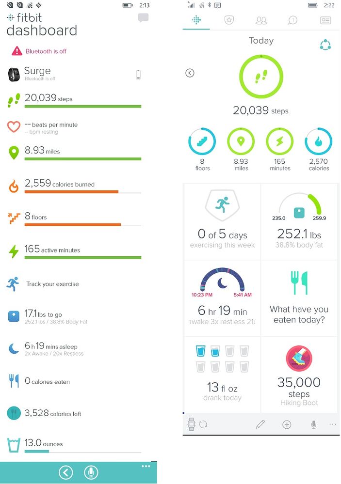
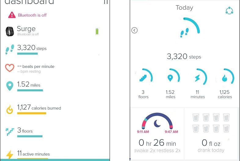
I guess the 'easier to read way' will have to be 'beauty is in the eye of the beholder', but I can tell you for sure that the 'old dashboard listed more' is a myth. I know many folks on this thread will claim that they could see more on the old dashboard (and that may be true on the iPad), but generally this is not true on the longer phone screens. Here are screenshots of the two side by side:
Which dashboard is more compact? That's right, the new one is more space efficient.
I can tell you why I prefer the circular gauges over the bar graphs. The circular shape of the gauge tells you how far along you are to your goal, full circle means 100%. I need reading glasses these days at the softer gray lines are tougher for me to read without my reading glasses, with the bar graphs, I need to see the gray lines to determine what 100% is, with the circular gauges I don't need it, this is roughly what it'd look like to me:
On the image on the left, it's nearly impossible to tell that 3320 steps is about 25%. On the image on the right (with the circular gauges), it is very easy to tell (like a '3' on an analog clock).
As to determining what 'folks wanted'... I think most Fitbit users are quite happy with the newer dashboard. They're not saying anything on this thread (why would they?) and that gives you folks a skewed view of how most people feel about it. It's a bit like surveying people at Comicon and coming to the conclusion that most folks are avid comic book enthusiasts.
Frank | Washington, USA
Fitbit One, Ionic, Charge 2, Alta HR, Blaze, Surge, Flex, Flex 2, Zip, Ultra, Flyer, Aria, Aria 2 - Windows 10, Windows Phone
Take a look at the Fitbit help site for further assistance and information.
05-30-2017
17:05
- last edited on
03-06-2026
06:45
by
MarreFitbit
![]()
- Mark as New
- Bookmark
- Subscribe
- Permalink
- Report this post
 Platinum Fitbit Product Experts share support knowledge on the forums and advocate for the betterment of Fitbit products and services. Learn more
05-30-2017
17:05
- last edited on
03-06-2026
06:45
by
MarreFitbit
![]()
- Mark as New
- Bookmark
- Subscribe
- Permalink
- Report this post
Thats what ive been saying all along @PureEvil. The old dashboard required me to scroll, it did not fit on the screen, the archaic bar graph is simply well Dos 6.0. The circles are so much easier to see your progress at a glance, and don't even require reading numbers.
Of course when the old one replaced its previous version, no one claimed to like this old one. I wonder how much better two dashboard versions ago was. I can tell you that navagation was a pain.
05-31-2017 19:33
- Mark as New
- Bookmark
- Subscribe
- Permalink
- Report this post
05-31-2017 19:33
- Mark as New
- Bookmark
- Subscribe
- Permalink
- Report this post
LONG before the version came out WITHOUT the option to switch back. And, I
am STILL using the old option because I didn't upgrade. My auto update is
turned off and I have not updated that app. On the old version, I could
view all of yesterday's stats on a single screen by using the back arrow.
Now, only some of yesterday's stats show up with today's at the bottom of
the screen.
You assume I have never contacted them. Why? I wrote, called, emailed and
posted. At this point I am just following the thread, and see that there
are still a number of people who are dissatisfied and I throw in my $0.02
when I see that. Anymore, quite frankly I don't care if they make the
option or they don't make the option. I got lip service from the fine
people at customer service.
Bottom line: 1. They are free to design the app any way they want. 2. I am
free to use it or not. 3. I am free to purchase another brand of tracker if
I choose. 4. Your assumption that 'most' people like the new dashboard is
based I'm sure on a 100% survey of everyone using the app.
Before you make judgements about who has reported what and where, consider
that there's a lot more to life than this forum.
05-31-2017 21:13
- Mark as New
- Bookmark
- Subscribe
- Permalink
- Report this post
 Fitbit Product Experts Alumni are retired members of the Fitbit Product Expert Program. Learn more
05-31-2017 21:13
- Mark as New
- Bookmark
- Subscribe
- Permalink
- Report this post
Well, I don't have visibility into your communication with support... And that said, as I read through your messages more carefully, do you mention a problem with contrast, for that I do apologize... I was skimming through your posts.
That said, I'm perplexed with that assessment since the new dashboard and old dashboard have very similar color schemes:
This is the first time you mention the 'all tiles on previous days' issue (at least on posts), but the reason why Fitbit is (your words) 'not listening' is because that feature request only has 157 votes. The top (first page) of feature suggestions have around 1000 votes.
For whatever it's worth, I never assumed one way or the other about your contacting support. I was merely making an observation about your posts.
I think it's completely reasonable to ask Fitbit to integrate the best parts of both dashboards into one (as long as the feature suggestions are popular enough, of course). I personally don't think it's reasonable to keep an option for the old dashboard. So if Fitbit were to make updates to the dashboard in 2018 and again in 2019... Should there be options to keep today's, your older dashboard, the 2018, and the 2019? Where does it end? They should pay the coding, maintenance and support cost to keep the four dashboards working on 6 platforms (Windows & Android & iOS, phone & tablet)?
Frank | Washington, USA
Fitbit One, Ionic, Charge 2, Alta HR, Blaze, Surge, Flex, Flex 2, Zip, Ultra, Flyer, Aria, Aria 2 - Windows 10, Windows Phone
Take a look at the Fitbit help site for further assistance and information.
06-01-2017 07:00
- Mark as New
- Bookmark
- Subscribe
- Permalink
- Report this post
06-01-2017 07:00
- Mark as New
- Bookmark
- Subscribe
- Permalink
- Report this post
The really cool thing about capitalism is we vote with our dollars! You like the app? Great! Keep buying Fitbit. Me, not so much. Fitbit is only one brand. When I next upgrade my phone, my tracker will be changed out too...
Sent from my iPhone
 Best Answer
06-01-2017 09:45 - edited 06-01-2017 10:23
- Mark as New
- Bookmark
- Subscribe
- Permalink
- Report this post
 Fitbit Product Experts Alumni are retired members of the Fitbit Product Expert Program. Learn more
06-01-2017 09:45 - edited 06-01-2017 10:23
- Mark as New
- Bookmark
- Subscribe
- Permalink
- Report this post
Yes, I realize that the option was there before, and to a certain degree I agree with you... It wasn't too hard to do (emphasis on the verb tense). That doesn't mean that it isn't now nor it won't be too tough to do. The issue is that as Fitbit adds more features (like HR and hours of activity), the differences are going to be greater and greater. As more phones get released, the UI may need to be tweaked. As new OS's become available, Fitbit needs to verify that the UI still all works.
It'd be like saying juggling two balls is trivial, surely you can do three or four. Or you ran a 5k, you can run a marathon... It's just more of the same. It's not.
You're also assuming that there are no maintenance costs to keeping the old dashboard running...
So are you content with never getting any new features on your dashboard? Let's say if Fitbit adds a feature like exposure to UV and makes it available on the new dashboard, are you okay with never seeing this on your dashboard? If not then that means they'll need to implement this on both dashboards? That doesn't sound like much work to you?
There are also new devices released everyday. Fitbit tries to maintain the list of devices that are compatible with their app. You might imagine that this is pretty time and resource intensive. Well, if you have two dashboards, that means you need to verify that these devices work with two dashboards. This means that it takes longer and this list won't be as complete.
Oh, and new phones come with newer displays with different resolutions and shapes... and sometimes Fitbit needs to tweak the dashboard to make sure that it displays appropriately on those devices. Now, you want them to double this work.
And then there are the support folks. Now, whenever a customer describes a problem, they need to know which dashboard you're using and they'll need to be trained on both. This drives up the costs for training and the amount of time you spend on the phone/chat/e-mail with them, which also drive up costs.
I recently introduced my friend from work to Fitbit. She got a Fitbit Alta HR. She never saw the old dashboard. She's perfectly happy with it. Seeing as though the Alta HR was just released in April 2017, you might expect the product to be getting many negative reviews if they only had this new dashboard. It isn't. All new users that started with the Alta HR have only seen this dashboard; they're not returning their Fitbit to spite the dashboard.
And I realize that there are more folks using Fitbits than there are here in the forums, while I wouldn't look a the feature request that has 157 votes and state that, "there are only 157 Fitbit users in the world that want this!" I do think that a feature request that has more votes, like Pokémon integration (with 935 votes) is significantly more popular than the one with fewer votes. To frame it appropriately, there are four times as many folks who want Pokémon integration than there are folks who want all the tiles to reflect the same day. The numbers don't lie.
So allow me to make an observation... To me, from the history of your posts, your biggest gripe is the contrast on the circular gauges, to quote you:
"Its not awful if you can see it clearly...there's not enough contrast between the wheels and the background for me to readily see it."
...yet, instead of posting a feature request (or voting for one) to address that particular issue, you simply go to "bring the old dashboard back or give us an option to use the old dashboard".
So if they were to address the contrast issue and the all-tiles-on-previous-days issue, would you be happy with the new dashboard? You stated that there were features that the old dashboard "HAD but removed." If so, that's what I would vote for... not for "allow me to use the old dashboard".
Like I said before, I think it's completely reasonable for folks to ask Fitbit to change parts of the new dashboard, like the progress colors on goal tiles. I don't think it's fair to just say "allow me to use the old dashboard." without articulating (and by that I mean vote on the appropriate feature requests) what you don't like about it.
Frank | Washington, USA
Fitbit One, Ionic, Charge 2, Alta HR, Blaze, Surge, Flex, Flex 2, Zip, Ultra, Flyer, Aria, Aria 2 - Windows 10, Windows Phone
Take a look at the Fitbit help site for further assistance and information.
06-01-2017 11:11
- Mark as New
- Bookmark
- Subscribe
- Permalink
- Report this post
06-01-2017 11:11
- Mark as New
- Bookmark
- Subscribe
- Permalink
- Report this post
anything other than high contrast bold thick lines hard to see. The color
is less critical if it's one that I can see. The shape is even less
important. But I could judge by the color my level of progress.
I'm sorry you don't like how I responded so generally. You know, for all
the suggestions of what I should put in the post you make it sound that's
the only thing they read at Fitbit. I wrote a detailed letter, I talked to
support staff, even a supervisor. I sent several emails. And in not a
single one of those back and forths did any of them suggest I post the
suggestion to the forum.
While you are noting my posts, take time to notice my general inactivity in
the forum. Presently my only level of involvement is to CONCUR with those
who do not like the new dashboard. I do not subscribe to any other threads.
I simply stand in solidarity who want Fitbit to revert back. Will they?
No. Do I expect them to cave into pressure from the forums? No.
Post what you will, Like what you want. Take apart my posts and try to
microanalyze them. It is a non-issue. Posting my thoughts to the forums
was an afterthought. I have been very specific in my correspondences with
the company even to the point of what wavelengths of light, what colors,
what color options and schemes work best for someone like me with my
vision. I'm not going to waste the effort here.
My posts of late have only been, "Me too." in response to someone saying
they don't like the new dashboard. I'm done.
06-01-2017 12:05
- Mark as New
- Bookmark
- Subscribe
- Permalink
- Report this post
SunsetRunner
06-01-2017 12:05
- Mark as New
- Bookmark
- Subscribe
- Permalink
- Report this post
When I exercise, I do not wear my glasses. In the past, I used the iOS FitBit app as a sort of exercise coach while I worked out. I could easily read the former dashboard without my glasses when I exercised and found it to be so helpful. The new dashboard is hard for me to make out without my glasses. As such, when FitBit removed the option to use the former dashboard, they lost me as a customer and I have since moved on to other means to track my exercise.
 Best Answer
