Join us on the Community Forums!
-
Community Guidelines
The Fitbit Community is a gathering place for real people who wish to exchange ideas, solutions, tips, techniques, and insight about the Fitbit products and services they love. By joining our Community, you agree to uphold these guidelines, so please take a moment to look them over. -
Learn the Basics
Check out our Frequently Asked Questions page for information on Community features, and tips to make the most of your time here. -
Join the Community!
Join an existing conversation, or start a new thread to ask your question. Creating your account is completely free, and takes about a minute.
Not finding your answer on the Community Forums?
- Mark Topic as New
- Mark Topic as Read
- Float this Topic for Current User
- Bookmark
- Subscribe
- Mute
- Printer Friendly Page
New Dashboard
- Mark Topic as New
- Mark Topic as Read
- Float this Topic for Current User
- Bookmark
- Subscribe
- Mute
- Printer Friendly Page
05-25-2016
08:34
- last edited on
05-25-2017
14:37
by
KateFitbit
![]()
- Mark as New
- Bookmark
- Subscribe
- Permalink
- Report this post
 Community Moderator Alumni are previous members of the Moderation Team, which ensures conversations are friendly, factual, and on-topic. Moderators are here to answer questions, escalate bugs, and make sure your voice is heard by the larger Fitbit team. Learn more
05-25-2016
08:34
- last edited on
05-25-2017
14:37
by
KateFitbit
![]()
- Mark as New
- Bookmark
- Subscribe
- Permalink
- Report this post
Fitbit Update 5/25/2017
Thank you for taking the time to share feedback. I can assure you the comments have been and continued to be reviewed and shared with our iOS team.
As a reminder, I'm including our help article on the Fitbit app here.
Overwhelmingly, recent posts share the sentiment of no longer being able to revert back to the original dashboard and not having the option to choose. At this time there are no plans to revert access to the old Dashboard, but we always appreciate feedback on how to improve our app.
As a reminder, Please remember to keep your posts respectful and on-topic, per our Community Guidelines. This thread will be better for everyone as a constructive conversation.
Fitbit Update 8/17/2016
Beginning with version 2.26 of the Fitbit app for iOS, the new Fitbit app dashboard with an updated look is now fully implemented. You can no longer return to the old design. We're constantly striving to improve Fitbit products and services, and we appreciate all of the feedback we receive from our customers.
You can find information about the new app dashboard and how to start using it by clicking here.
Fitbit Update 5/25/2016
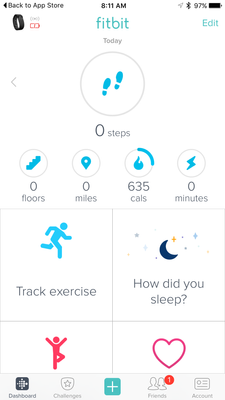
I'm very pleased to announce that iOS users who have updated to version 2.23 of the Fitbit iOS App are now able to opt-in to use a preview of a new design of the Fitbit iOS dashboard!
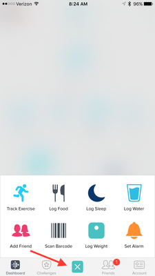
One of my favorite features for this new dashboard preview is the quick log button in the bottom-center of the iOS App. This feature allows users to quickly: track an exercise, log food, log sleep, log water, send a friend request, scan a food barcode (if you are using the US food database), log their weight, or set an alarm.
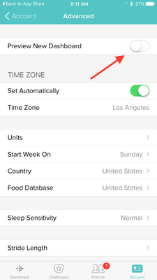
Users can opt-in to use the new iOS dashboard design by:
1. Updating to version 2.23 of the Fitbit iOS App, click here to be redirected to the iOS App Store.
2. Click the Account button in the bottom right-hand corner.
3. Scroll down and click the Advanced Settings button.
4. Toggle the Preview New Dashboard button at the top of the page on.
Click here for more details and let me know if you have any questions!
Moderator Edit: Edited thread title.
10-05-2016 18:58 - edited 10-05-2016 18:59
- Mark as New
- Bookmark
- Subscribe
- Permalink
- Report this post
10-05-2016 18:58 - edited 10-05-2016 18:59
- Mark as New
- Bookmark
- Subscribe
- Permalink
- Report this post
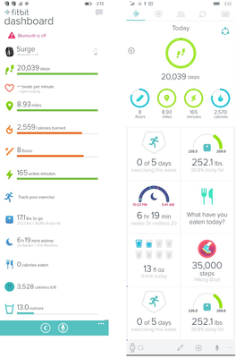
I abhor the new 'layout'. It would be different if I could change the size of the tiles and the location but it doesn't, not really. The upper 5 tiles (Steps, floors, km/miles, minutes and cals) can be moved around and even hidden/deleted but they are still going to be there in that section as I can't move the heartrate or weight tiles up to the upper section, something I could do when they were in-line.
I am also stuck with the weight graphic showing me how much I've lost since 6 Jul (a pitiful 0.7kg). What I want to see is how much do I currently weigh WITHOUT having to click through on screens. I don't have the option to change or customise how the weight information is displayed to me. Which is a failing on Fitbit's part.
I find there is a lot of white space on the screen and that eats up what you can display before you have to start scrolling. My preference for the previous dashboard was because everything was in a nice line and I could move those lines so that when I went to the dashboard the lines relevant to my interests were RIGHT THERE. I didn't have to scroll or tap on a screen to get anywhere else to then get the information. Now it's a pain and I use the app less and less. I basically sync it when I want to check my weight and have mostly abandoned it in favour of using the Surge's face to let me know the steps/distance.
It doesn't make me want to use it. And logging my food and then having to sync with myfitnesspal is also annoying, let along putting in my hydration.
10-06-2016 11:34 - edited 10-06-2016 11:35
- Mark as New
- Bookmark
- Subscribe
- Permalink
- Report this post
 Platinum Fitbit Product Experts share support knowledge on the forums and advocate for the betterment of Fitbit products and services. Learn more
10-06-2016 11:34 - edited 10-06-2016 11:35
- Mark as New
- Bookmark
- Subscribe
- Permalink
- Report this post
@PureEvil yes I'm able to move the top tiles around, but no option to disable, it's some of the bottom tiles I want removed.
In any case this dashboard is new to me, since im running the android betta, I'm not loi sing sleep over this.
 Best Answer
10-06-2016 11:42
- Mark as New
- Bookmark
- Subscribe
- Permalink
- Report this post
10-06-2016 11:42
- Mark as New
- Bookmark
- Subscribe
- Permalink
- Report this post
Hi, that's right, the Android Beta doesn't allow the same features as IOS.
We're posting in the Android forum about these features and the Mod there promises to pass on suggestions while it's still in testing so do take a look and add your views ![]()
Helen
Also occ posting as Blokeypoo
 Best Answer
10-10-2016 18:56
- Mark as New
- Bookmark
- Subscribe
- Permalink
- Report this post
10-10-2016 18:56
- Mark as New
- Bookmark
- Subscribe
- Permalink
- Report this post
"While I don't mind the new tile, I miss the green moon with star and the positive message when I met my goal."
10-10-2016 18:57
- Mark as New
- Bookmark
- Subscribe
- Permalink
- Report this post
10-10-2016 18:57
- Mark as New
- Bookmark
- Subscribe
- Permalink
- Report this post
"While I don't mind the new tile, I miss the green moon with star and the positive message when I met my goal."
10-11-2016 11:28 - edited 10-11-2016 11:29
- Mark as New
- Bookmark
- Subscribe
- Permalink
- Report this post
10-11-2016 11:28 - edited 10-11-2016 11:29
- Mark as New
- Bookmark
- Subscribe
- Permalink
- Report this post
@PureEvil
You're not getting it at all...
>I think we can all agree that 'easy to read' is a bit like saying 'beautiful'
No you're wrong. There are objective factors which allow the eye to naturally have an easier time reading text. This includes having text in a linear pattern, large font, bold font, and simple font style (no cursive or handwritten).
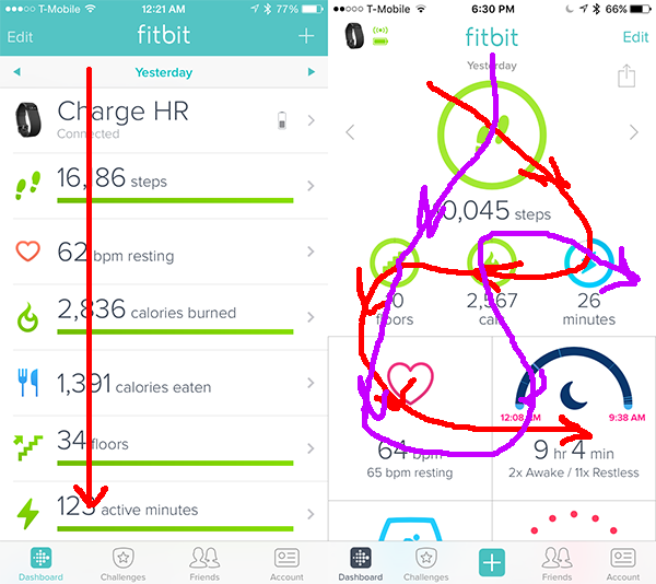
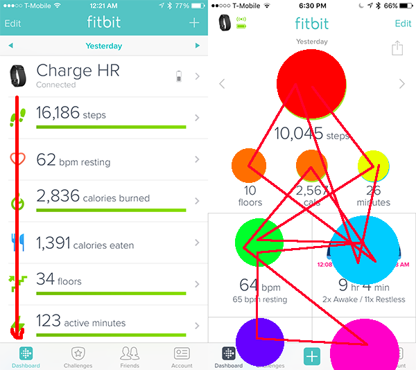
The first issue that makes it difficult to find data quickly and easily is the flow of the app. The old dashboard everything was linear, the eye only traveled up and down the page, not side to side. On the new app, the eye goes all over the place, up and down, side to side, in circles. It makes it very difficult to locate words and numbers.
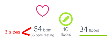
With the exception of the very top circle, the rest of the fonts are significantly smaller making it more difficult to read. On the old dashboard the font was bigger, and uniform throughout making it very easy to read. Not to mention there are 3 different sized fonts. A general rule of thumb for any publication is to stick with 2.
The third reason the new dashboard is more difficult to read is because the different sized ICONS are a huge distraction. On the old dashboard the icons were all in straight line on the edge of the screen and all the same small size. On the new dashboard the huge to small to medium sizes are not uniform and force my eye to look at the icon (on top) first, but they are also scattered all over the place making my eye jump from side to side and all over the place.
>That's right. The older dashboard it's bigger (longer) than the newer one... not by much, but still. I trust that puts to rest any more debates about the newer dashboard taking up more room. It doesn't.
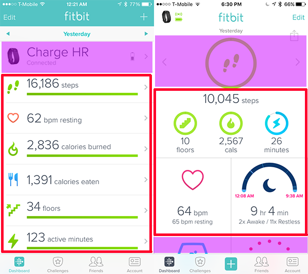
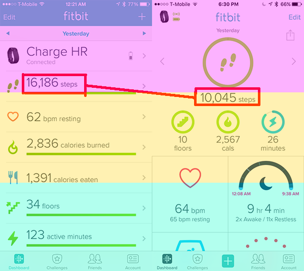
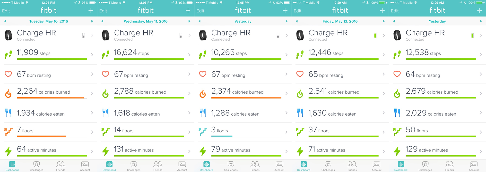
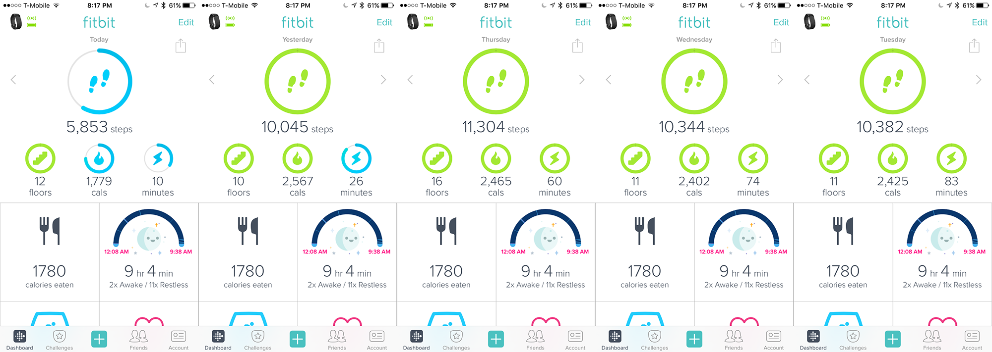
I think you have a very difficult time understanding this simple concept. You can only see so much on your cell phone screen. The images I have up are what you see on a single page. No one cares how much it takes to scroll to the bottom. That's not the issue here. The issue is that the old dashboard utilized the ENTIRE screen efficiently. It displayed 6 pieces of information nearly seemelessly without cutting off a block in the middle (for the majority of users. IIRC there were a few handles who did have the bottom piece cut off). With the new dashboard you still only see 6 pieces of information, and a big chunk of the bottom of your screen isn't utilized. There are only 2 tiles that you can view properly. The bottom 2 tiles are hidden and therefor not functional. Since you can't move tiles into the top sections, this takes away functionality because you can only PRIORITIZE and CUSTOMIZE 2 tiles. On the old dashboard you can customize ALL 6 rows.
As you can see, the red box is much bigger on the old dashboard. There is less wasted space. On the new dashboard, the dashboard has a lot more wasted space. The tiles are way too big. The purple shaded areas are where I feel the designers could optimize that space. On the old dashboard I agree the model took up too much space and looks better on the new dash. However, the huge icon no the new dashboard is unecessary is it serves zero purpose in telling us any information. The shaded area at the bottom are the 2 icons we cannot see and thus are useless to display on the page.
The old dashboard could display 2.5 rows of data whereas the new dashboard can only display 2 because it's so big with excess padding and empty space.
Also, in your screenshots the reason the new dashboard looks shorter to you is because you left out a lot of features. You have no HR tile and the Hourly Activity tiles which would make the new dashboard automatically longer than the old dashboard.This is what it would look like if you have an extra row of tiles.
>In other words, you typically need to scroll less to get to the information that you want.
It's not about scrolling. It's being able to see information on 1 page at a single glance. Besides, since I can only customize the two large tiles I'M FORCED TO SCROLL MORE IN ORDER TO FIND THE PIECES OF INFORMATION THAT ARE ACTUALLY IMPORTANT TO ME WHICH ARE HIDDEN AT THE BOTTOM OF THE PAGE.
>Also, look at the two dashboard side by side, the tiled dashboard consistently shows the same information either further up or at roughly the same location.
Wrong. You have to look LOWER on your screen to find the information you want. On the old dashboard, the information started on the top 3rd of the screen making it easy to locate. On the new dashboard, the information STARTS in the 2nd third of the screen, forcing you to guess where "the middle" is in order to find your data. This make it much harder since the layout is not in a straight line, the eye goes in zig zags after the very first number of steps. You don't if you should look to the left, or the right, or down. It's all over the place.
>The new dashboard is fully customizable within each section
Wrong. Only the 2 tiles are customizable. The top tile is not customizable, you can only REMOVE info, but you cannot prioritize a different tile into that section. On the old dashboard EVERYTHING WAS CUSTOMIZABLE. You could move rows anywhere you wanted, or you could hide them, and if you didn't want to hide it you could make it less visible by moving it lower so it wasn't shown on the first glance.
> concede that it's slightly less configurable
It's not "slightly less" configurable. It was one of the core functionalities of the old dashboard that was extremely important to users. Some people put their HR or sleep tiles at the very top, and hid calories or active minutes because they soley bought the fitbit to improve HR or to track sleep, they didn't care about the exercise function. That's why it's so important to not only hide tiles but also to where you want them so that you can personally tailor the best fitbit experience to your own personal goals and needs. It's absolutely digusting that you don't see the fundamental issue here. Not every person bought their fitbit to serve as a pedometer.
> On my original screenshots, that was right around the active minutes bar on the old dashboard.
This is a joke right? You realize that cutting off at the BOTTOM after text is clearly visible isn't the same as cutting off an entire tile with zero information visible??
>With the exception of the smaller circular gauges, the text on the new dashboard is actually larger than
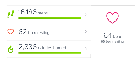
You clearly have no idea what you are talking about, and have lost credibility in your post. The largest font size on the new dashboard (steps) is the same font size as the old dashboard. After (steps) the font sizes become significantly smaller as I have already demonstrated in this screenshot:
>And I'll point out that among the top five stats, you can designate which one gets top billing that that one does use larger text.
On the old dashboard ALL OF THEM GOT LARGE TEXT which made it super easy to read. The new dashboard is a DOWNGRADE in the mixed bag of font sizes.
>You mention that you want to check your stats while you're running or exercising and proceed to point out that the text is too small on the dashboard (which as I have demonstrated above, it's not).
I already demonstrated that it is smaller. 10 floors is clearly smaller than 34 floros, unless you have impaired eyesight. The text on the tiles doesn't matter because those do not change via bluetooth, with the except of the HR tile. The rest don't change. They don't need to be seen. 10 floors, calories burned, active minutes, miles are the ones that change. And those are smaller and more difficult to read when I'm running or biking and the phone isn't steady. The old dashboard was easy to read because of the large text on all the numbers. I could even read it clearly on a bright sunny day.
>I do care about how many times I've exercised this week and that is more important than what I actually did (because when I do work out, I do a very similar workout),
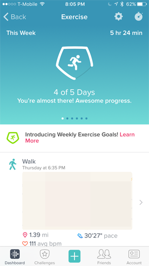
Most people don't care that they exercised because they KNOW they exercise 3-5 times a week. Most people care about HOW their exercise impacts the rest of their stats. Without displaying this information on the Track Exercise tile like the old dashboard did, users are forced to flip back and forth between screens to figure out this data. For example I want to know why my steps were higher, why my calorie intake was higher, and why my resting HR was higher a few days ago. On the old dashboard all I had to do was go to that day with a few taps of my finger and do a single glance at my screen (my old dash had Track Exercise row in place of Active Minutes). **Active Minutes does not reflect exercise, it only reflects continuous walking for 10+ sustained minutes or something like that.** On the new dashboard I have to (1) Tab into the day I'm looking at. (2) Scroll down to tile #3 (3) Click the tile (4) Scroll down to locate the date I exercised (5) Choose the correct exercise (6) Click on the exercise and scroll all the way to the bottom to figure out how many calories that exercise burned. 5 steps to find your exercise is a HASSLE. Not to mention I cannot compare my days by a single glance like I could on the old dashboard by tabbing back and forth. I'd have to go back to the main home dashboard and do the process ALL over again if I wanted to compare a separate day. The new dashboard completely took away the functionality of being able to compare stats like you could on the old dashboard.
> So on the old dashboard you got more details about your last workout, but didn't get the number of workouts that week.
You got it if you clicked the tile. It was always displayed at the very top of the screen in a huge icon. On the old dashboard you didn't have to go searching for it like we have to go searching for old workouts now on this new dashboard. Right now the # of exercises you did in the week is repeated TWICE. Once on the dash and once on the exercise page. It is reduntant information. While for people like me, the basic functionality is reduced and makes us jump through more hoops just to find the data we're looking for.
>Now, I normally don't track the incoming or burned calories as carefully as other folks do (or at all in my case). So to that I really can't speak about the workflow on how to accomplish that...
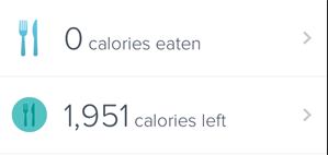
This feature has been completely removed on the new dashboard. A lot of people have trouble with basic calories in vs calories out. Fitbit is a huge weight loss tool, and removing the row that tells you how many calories you have left to eat removes a HUGE aspect of functionality for so many people. There is also no way to see your food budget on the home screen like you could on the old dashboard. The new dashboard makes calorie counting a bigger hassle, and removes the functionality of a core feature to many customers.
And one of the absolute biggest problems with the new dashboard is that it mixes old information with new information. If I change days, the bottom tiles stay the same. When I am viewing June 12, 2015 I do not want to see what I ate TODAY and how many hours I slept TODAY (October 8, 2016). I huge functionality on the old dashboard was being able to see all the different pieces of information for each day. The new dashboard lost that functionality. The new dashboard forces you to click each individual stat to view the history ONLY FOR THAT STAT. This is useless to me because it forces me to tab into 5 individual stat histories and write those stats down if I want to compare them on different days. There's no point in even opening the dashboard. Might as well just keep an excel spreadsheet on my computer for this purpose.
The bottom portion becomes utterly useless and loses its function for any purpose other than seeing it for "TODAY".
> have five circles and I can move them in any order I choose. I have two tiles I place on the top which are most useful, that gives me seven stats I can monitor with one glance.
You're missing the point completely. I don't care about the tiles at the top. I only care for 3 of them. I care for 4 of the tiles at the bottom that CAN'T BE MOVED TO THE TOP on the new dashboard. On the old dashboard you could move ALL the tiles, if you wanted water and sleep at the very very top you could do that. On the new dashboard I can only display 2 of the bottom tiles. I still want to view my mileage and active minutes, but I don't want to view it at the very top. I'm FORCED to disable it because I don't want it to be visible, forcing me to jump through extra clicks to get that information. I want to view HR at the top but I can't. I want to be able to view HR, intake, track exercise, and sleep at a single glance, but I can't because I can only view 2 of those tiles and am FORCED to prioritize which 2 I prefer to see. On the dashboard I could see all the tiles I wanted in the order that I wanted.
PLEASE BRING BACK THE OLD DASHBOARD SO THAT WE CAN HAVE OUR EASY READABILITY, FULL FUNCTIONALITY AND FULL CUSTOMABILITY BACK!
10-11-2016 11:44
- Mark as New
- Bookmark
- Subscribe
- Permalink
- Report this post
10-11-2016 11:44
- Mark as New
- Bookmark
- Subscribe
- Permalink
- Report this post
thanks for taking the time to write all of this!!
HATE the new dashboard, LOVE the old dasboard
10-11-2016 11:54
- Mark as New
- Bookmark
- Subscribe
- Permalink
- Report this post
10-11-2016 11:54
- Mark as New
- Bookmark
- Subscribe
- Permalink
- Report this post
@strawberry_ that is such a good post and I echo the thanks for the time you took. Maybe send it direct to customer service/feature requests to make sure it gets seen. I've posted a link to it in the Android dashboard thread as we're now going through the same (well, us Beta users are). I knew when I ditched my iPhone partly due to the new dash that it'd soon be on Android, sadly it seems no lessons have been learned in our version so far. I'm hoping their promise to read the feedback might help....
Also occ posting as Blokeypoo
 Best Answer
10-11-2016 12:19 - edited 10-11-2016 12:20
- Mark as New
- Bookmark
- Subscribe
- Permalink
- Report this post
10-11-2016 12:19 - edited 10-11-2016 12:20
- Mark as New
- Bookmark
- Subscribe
- Permalink
- Report this post
I have posted my comment in the Fitbit Feedback thread!
https://community.fitbit.com/t5/Feature-Suggestions/Option-to-keep-old-iOS-dashboard/idi-p/1433487
The best thing we can do is Up Vote that thread to 4k+ upvotes so that Fitbit developers will notice what the community wants.
10-11-2016 12:23
- Mark as New
- Bookmark
- Subscribe
- Permalink
- Report this post
10-11-2016 12:23
- Mark as New
- Bookmark
- Subscribe
- Permalink
- Report this post
@starwberry_ this is good work you put into demostrating what is not good about this awful new dashboard. I feel that the responses refelct a protective, denail state of thinking that cannot be penetrated even with your excellent detailing of what's is just not working fo or helpful to us, the users.
I cannot bring myself to checck it but once a week if that. There is a lack of color depth and sharpness in the icons. I cannot move what I want to see first and in what order and we cannot customize based on the user perference of the designer. It should be the other way around.
I would like to know from FitBit developers what lead them to redesign the dashboard and what user group they use for consultations. Maybe these basic user interface support 'rules' of design are missing. What else did they put off to do something we did not even need or want? How far up the organization does planning and decision making on design and feaures start and loop back and forth with?
Is there anyone really listening or just someone defending? Knock, Knock! Fitbit. It is time to really hear us without your filters and personal preferences. There is a rule in business that I will share: The customer is always right! - about what he wants and needs and what is wrong with your product for him. Unhappy customers go elsewhere. Business that do not learn this in incorporate it into the their expectations of their employees at every level become extinct and vacate buildings. Customers walk with their checkbooks in hand to businesses that will treat them well.
I am tired or reading these posts and seeing no action to meet our needs and expectations.
TigerWizards (a fearless power with soft fur)
10-11-2016 13:46 - edited 10-11-2016 13:56
- Mark as New
- Bookmark
- Subscribe
- Permalink
- Report this post
10-11-2016 13:46 - edited 10-11-2016 13:56
- Mark as New
- Bookmark
- Subscribe
- Permalink
- Report this post
I found new look of Fitbit app on iOS devices very nice and stunning and I really missing it on my second Samsung phone, so I can't wait for redesigned version for Android platform. On other hand, I think that add option for alternative "old" look in settings is way how satisfy many fitbitters and it's worth it.
Note 10 Aura White | Galaxy Watch 3 Silver | Buds+ White
10-11-2016 13:49 - edited 10-11-2016 13:53
- Mark as New
- Bookmark
- Subscribe
- Permalink
- Report this post
10-11-2016 13:49 - edited 10-11-2016 13:53
- Mark as New
- Bookmark
- Subscribe
- Permalink
- Report this post
Delete please.
Note 10 Aura White | Galaxy Watch 3 Silver | Buds+ White
 Best Answer
10-11-2016 15:34
- Mark as New
- Bookmark
- Subscribe
- Permalink
- Report this post
 Fitbit Product Experts Alumni are retired members of the Fitbit Product Expert Program. Learn more
10-11-2016 15:34
- Mark as New
- Bookmark
- Subscribe
- Permalink
- Report this post
There's a famous quote from Henry Ford:
"If I had asked people what they wanted, they would have said faster horses."
The rationale is that if he ran his business based on what consumers were telling him, he would've never designed an actual car. In other words, the customer is not always right. And people still bought his product... Happily.
The simple truth is that even if every single post on this thread was by a unique user who wants the dashboard reverted (which is not, there are many folks posting multiple times and not all posts are condeming the new dashboard). 31 pages x 20 posts per pages, that's 620 users... vs. the number of users who are using the existing dashboard and not complaining. So there are at least 78k ratings (so at least that many iOS users, but certainly much more), which if you do the math...
620 (generous estimate) / 78,000 = 0.79% users don't like the new dashboard and that's with an inflated numerator and a very conservative denominator. Less than one percent.
So would you have Fitbit revert to the older dashboard due to a very vocal minority? So which customers are right? The 620 customers on this thread or the (78,000 - 620) customers that are not complaining?
If you want to affect change, get the votes... Here are the related features suggestions:
- See previous days with all tiles - 84 votes.
- Option to keep old iOS dashboard - 95 votes.
To put it bluntly, there are a handful of you who seem to really detest the new dashboard, but really the vast majority of folks seem to be perfectly happy... If not, those feature suggestions would have far more votes, right? You want to affect change, get the votes.
Let's put it in perspective, there are nearly twice as many users asking for support for BlackBerry than there are wanting the old iOS dashboard.
Now you also can't claim on one hand that Fitbit is not listening to you, and then on the other hand try to silence/ignore the voices of the people who'll say that they don't see anything wrong and in fact, prefer it.
@Aclobos listed a positive response to the new dashboard and was asked by others "why do you butt in?"
@werionae likes the new dashboard and misses it on their other handset.
Just my 2¢.
Frank | Washington, USA
Fitbit One, Ionic, Charge 2, Alta HR, Blaze, Surge, Flex, Flex 2, Zip, Ultra, Flyer, Aria, Aria 2 - Windows 10, Windows Phone
Take a look at the Fitbit help site for further assistance and information.
 Best Answer
10-11-2016 15:55
- Mark as New
- Bookmark
- Subscribe
- Permalink
- Report this post
10-11-2016 15:55
- Mark as New
- Bookmark
- Subscribe
- Permalink
- Report this post
Patricia
Sent from my iPad
 Best Answer
10-11-2016 17:36
- Mark as New
- Bookmark
- Subscribe
- Permalink
- Report this post
10-11-2016 17:36
- Mark as New
- Bookmark
- Subscribe
- Permalink
- Report this post
Henry Ford provided the customers with a metal box that was an improvement on using horses. What Fitbit has done, is provide us with a horse with a fancy outfit whose legs have been chopped off.
That's a downgrade. It's not about building a product based on customer input only. It's about improving on a product WITHOUT losing functionality!
10-11-2016 17:43
- Mark as New
- Bookmark
- Subscribe
- Permalink
- Report this post
 Fitbit Product Experts Alumni are retired members of the Fitbit Product Expert Program. Learn more
10-11-2016 17:43
- Mark as New
- Bookmark
- Subscribe
- Permalink
- Report this post
If it's so horribly broken... A 'downgrade' as you call it... Why aren't more people voting for that feature suggestion?
Frank | Washington, USA
Fitbit One, Ionic, Charge 2, Alta HR, Blaze, Surge, Flex, Flex 2, Zip, Ultra, Flyer, Aria, Aria 2 - Windows 10, Windows Phone
Take a look at the Fitbit help site for further assistance and information.
 Best Answer
10-11-2016 19:37 - edited 10-11-2016 19:38
- Mark as New
- Bookmark
- Subscribe
- Permalink
- Report this post
10-11-2016 19:37 - edited 10-11-2016 19:38
- Mark as New
- Bookmark
- Subscribe
- Permalink
- Report this post
>So there are at least 78k ratings (so at least that many iOS users, but certainly much more), which if you do the math...
Yes, 78k users who have rated the OLD APP and gave 5 stars for the OLD APP. Everyone raved about the old app because it was great. Go read the reviews on the new app. Most of them are negative reviews.
Just because people don't care to register on an internet forum to complain about it doesn't mean that they are satisfied with the product.
10-11-2016 19:40
- Mark as New
- Bookmark
- Subscribe
- Permalink
- Report this post
10-11-2016 19:40
- Mark as New
- Bookmark
- Subscribe
- Permalink
- Report this post
@PureEvil wrote:
If it's so horribly broken... A 'downgrade' as you call it... Why aren't more people voting for that feature suggestion?
People don't know about it. I didn't even know there was a feedback forum until this morning.
 Best Answer
10-11-2016 20:03
- Mark as New
- Bookmark
- Subscribe
- Permalink
- Report this post
 Fitbit Product Experts Alumni are retired members of the Fitbit Product Expert Program. Learn more
10-11-2016 20:03
- Mark as New
- Bookmark
- Subscribe
- Permalink
- Report this post
No... Don't go twisting my words. I did not for one moment bring up the app rating, though I'm sure that you read into it that way.
Though now that you mention it, I will point out that the App Store does track a rating on the current version, and the rating on the current version is a horrific 3.5 stars (out of four). Wow, it's a nightmare... Users must be fuming...
I was merely pointing out that there are at very least 78k users of the app, by virtue of there being at least 78k ratings.
Realistically, there are far more iOS users of the Fitbit App... in the millions, which basically means that the percentage of users that think that it's broken is far smaller.
620 / 1,000,000 = 0.062%
Again, instead of continue to drone on and on about how or why things are broken. Just click on vote and be done with life. I think the reason why you're so peeved is because no matter how how frustrated and angry you may be... No matter how much you post and vent... You only get one vote.
Frank | Washington, USA
Fitbit One, Ionic, Charge 2, Alta HR, Blaze, Surge, Flex, Flex 2, Zip, Ultra, Flyer, Aria, Aria 2 - Windows 10, Windows Phone
Take a look at the Fitbit help site for further assistance and information.
 Best Answer
10-11-2016 20:12
- Mark as New
- Bookmark
- Subscribe
- Permalink
- Report this post
10-11-2016 20:12
- Mark as New
- Bookmark
- Subscribe
- Permalink
- Report this post
620 / 1,000,000 = 0.062%
You think the amount of comments is equivallent to the amount of users who prefer the old app. lmfao
And that the people who don't go out of their way to register on a forum on the internet to voice their complaints in this specific thread, or a thread burried elsewhere on this site in a suggestions forum, means they are satisfied with the new app.
You don't see how illogical your own argument is. You're an utter joke.

