Join us on the Community Forums!
-
Community Guidelines
The Fitbit Community is a gathering place for real people who wish to exchange ideas, solutions, tips, techniques, and insight about the Fitbit products and services they love. By joining our Community, you agree to uphold these guidelines, so please take a moment to look them over. -
Learn the Basics
Check out our Frequently Asked Questions page for information on Community features, and tips to make the most of your time here. -
Join the Community!
Join an existing conversation, or start a new thread to ask your question. Creating your account is completely free, and takes about a minute.
Not finding your answer on the Community Forums?
- Mark Topic as New
- Mark Topic as Read
- Float this Topic for Current User
- Bookmark
- Subscribe
- Mute
- Printer Friendly Page
Redesigned Sleep experience now in the iOS app
- Mark Topic as New
- Mark Topic as Read
- Float this Topic for Current User
- Bookmark
- Subscribe
- Mute
- Printer Friendly Page
04-12-2024
03:26
- last edited on
04-18-2024
07:09
by
LizzyFitbit
![]()
- Mark as New
- Bookmark
- Subscribe
- Permalink
- Report this post
04-12-2024
03:26
- last edited on
04-18-2024
07:09
by
LizzyFitbit
![]()
- Mark as New
- Bookmark
- Subscribe
- Permalink
- Report this post
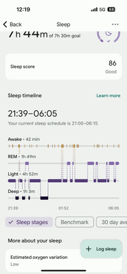
Why are the sleep scores and data displayed differently? I assume it’s the new ios update, but I preferred the former presentation.
Moderator Edit: Clarified subject
04-14-2024 17:59
- Mark as New
- Bookmark
- Subscribe
- Permalink
- Report this post
04-14-2024 17:59
- Mark as New
- Bookmark
- Subscribe
- Permalink
- Report this post
I just would like to comment on how the update on the sleep screen is awful in my opinion. I used to love the blue screen with the three options of 1. Sleep time 2. REM DEEP LIGHT 3. Restoration. I found it very user friendly. This new update is confusing and does not look good. I also do not find it user friendly. Community please comment your experiences with it too.
04-14-2024 19:10
- Mark as New
- Bookmark
- Subscribe
- Permalink
- Report this post
04-14-2024 19:10
- Mark as New
- Bookmark
- Subscribe
- Permalink
- Report this post
It is HORRIBLE........ when there is an update it should be BETTER and easier not WORSE AND REALLY HARD TO READ. Is AI making the updates? Get some real people to fix it please!!!!
04-14-2024 19:15
- Mark as New
- Bookmark
- Subscribe
- Permalink
- Report this post
04-14-2024 19:15
- Mark as New
- Bookmark
- Subscribe
- Permalink
- Report this post
Thank you!!! I opened my sleep screen today and thought it glitched because it looked so awful.
04-14-2024 23:56
- Mark as New
- Bookmark
- Subscribe
- Permalink
- Report this post
04-14-2024 23:56
- Mark as New
- Bookmark
- Subscribe
- Permalink
- Report this post
I couldnt agree more. The New design i soo bad. Before it was easy to delete one log when it was split and so easy to get an overview. Now it’s so ugly and totally useless. This will be my last Fitbit. First you destroyed the exercise tracking, and now the sleep. Bad job.
04-15-2024 01:33
- Mark as New
- Bookmark
- Subscribe
- Permalink
- Report this post
04-15-2024 01:33
- Mark as New
- Bookmark
- Subscribe
- Permalink
- Report this post
I am . I am done with Fitbit . I have issues with syncing since I bought it 2 years ago
04-15-2024 04:00
- Mark as New
- Bookmark
- Subscribe
- Permalink
- Report this post
04-15-2024 04:00
- Mark as New
- Bookmark
- Subscribe
- Permalink
- Report this post
Plus it’s not accurate
04-15-2024 04:02
- Mark as New
- Bookmark
- Subscribe
- Permalink
- Report this post
04-15-2024 04:02
- Mark as New
- Bookmark
- Subscribe
- Permalink
- Report this post
I don’t understand the bar graph sleep score screen. I want a screen that shows a continuous time line with my sleeping heart rate.
04-15-2024 04:19
- Mark as New
- Bookmark
- Subscribe
- Permalink
- Report this post
04-15-2024 04:19
- Mark as New
- Bookmark
- Subscribe
- Permalink
- Report this post
It just updated today and my Fitbit added a sleep log when I wasn't asleep. But it won't let me delete it. 🤷:female_sign:
04-15-2024 04:21
- Mark as New
- Bookmark
- Subscribe
- Permalink
- Report this post
04-15-2024 04:21
- Mark as New
- Bookmark
- Subscribe
- Permalink
- Report this post
This new sleep graph sucks!!! Very hard to read at a glance. Another Google misstep!
04-15-2024 04:22
- Mark as New
- Bookmark
- Subscribe
- Permalink
- Report this post
04-15-2024 04:22
- Mark as New
- Bookmark
- Subscribe
- Permalink
- Report this post
Can I revert back to the old graph? This graph hurts my eyes
04-15-2024 04:47
- Mark as New
- Bookmark
- Subscribe
- Permalink
- Report this post
04-15-2024 04:47
- Mark as New
- Bookmark
- Subscribe
- Permalink
- Report this post
With every change Google makes to the FitBit app… I hate it more. The performance of the app, the layout, the visuals, the data now available, etc.
04-15-2024 05:00
- Mark as New
- Bookmark
- Subscribe
- Permalink
- Report this post
04-15-2024 05:00
- Mark as New
- Bookmark
- Subscribe
- Permalink
- Report this post
It’s a confusing change and much harder to read. Why change to something which has clearly been tested by robots and not real people
04-15-2024 05:01
- Mark as New
- Bookmark
- Subscribe
- Permalink
- Report this post
04-15-2024 05:01
- Mark as New
- Bookmark
- Subscribe
- Permalink
- Report this post
it includes them but you need to be an analyst to understand it
04-15-2024 05:21
- Mark as New
- Bookmark
- Subscribe
- Permalink
- Report this post
 Diamond Fitbit Product Experts share support knowledge on the forums and advocate for the betterment of Fitbit products and services. Learn more
04-15-2024 05:21
- Mark as New
- Bookmark
- Subscribe
- Permalink
- Report this post
Hello @CGoggin and welcome to the Community. I'm sorry, but you can't revert back.
Laurie | Maryland
Sense 2, Luxe, Aria 2 | iOS | Mac OS
Take a look at the Fitbit help site for further assistance and information.
04-15-2024 05:27
- Mark as New
- Bookmark
- Subscribe
- Permalink
- Report this post
04-15-2024 05:27
- Mark as New
- Bookmark
- Subscribe
- Permalink
- Report this post
Why the change to the sleep graphics???? Definitely a downgrade. I hate it!! This was a terrible idea and even worse that I can’t go back to the former (better) format😡
04-15-2024 06:18
- Mark as New
- Bookmark
- Subscribe
- Permalink
- Report this post
04-15-2024 06:20
- Mark as New
- Bookmark
- Subscribe
- Permalink
- Report this post
04-15-2024 08:07
- Mark as New
- Bookmark
- Subscribe
- Permalink
- Report this post
04-15-2024 08:07
- Mark as New
- Bookmark
- Subscribe
- Permalink
- Report this post
It is terrible. The colors are low-contrast and hard to distinguish. The ability to see the length of each sleep segment is gone. The ability to see past nights' sleep at a glance is gone. I cancelled my premium subscription and wish I could get a refund, since the main feature I was using has been so badly downgraded.
04-15-2024 08:12
- Mark as New
- Bookmark
- Subscribe
- Permalink
- Report this post
04-15-2024 08:12
- Mark as New
- Bookmark
- Subscribe
- Permalink
- Report this post
horrible surprise after i had to re-sync my fitbit - this new screen report is so hard to read!!!!
04-15-2024 08:13
- Mark as New
- Bookmark
- Subscribe
- Permalink
- Report this post
04-15-2024 08:13
- Mark as New
- Bookmark
- Subscribe
- Permalink
- Report this post
Agree it is awful, 75% of the app updates over the past year have made it less streamlined and clunkier. It is now harder to see all your sleep and exercise data on one graph, and they took away the ability to check your pace at different points on a run. With each update I am pushed further and further back to apple.


