Join us on the Community Forums!
-
Community Guidelines
The Fitbit Community is a gathering place for real people who wish to exchange ideas, solutions, tips, techniques, and insight about the Fitbit products and services they love. By joining our Community, you agree to uphold these guidelines, so please take a moment to look them over. -
Learn the Basics
Check out our Frequently Asked Questions page for information on Community features, and tips to make the most of your time here. -
Join the Community!
Join an existing conversation, or start a new thread to ask your question. Creating your account is completely free, and takes about a minute.
Not finding your answer on the Community Forums?
- Community
- Platform
- Android App
- Android Dashboard Redesign Feedback
- Mark Topic as New
- Mark Topic as Read
- Float this Topic for Current User
- Bookmark
- Subscribe
- Mute
- Printer Friendly Page
- Community
- Platform
- Android App
- Android Dashboard Redesign Feedback
Android Dashboard Redesign Feedback
- Mark Topic as New
- Mark Topic as Read
- Float this Topic for Current User
- Bookmark
- Subscribe
- Mute
- Printer Friendly Page
10-04-2016 11:32 - edited 04-24-2017 13:30
- Mark as New
- Bookmark
- Subscribe
- Permalink
- Report this post
 Community Moderator Alumni are previous members of the Moderation Team, which ensures conversations are friendly, factual, and on-topic. Moderators are here to answer questions, escalate bugs, and make sure your voice is heard by the larger Fitbit team. Learn more
10-04-2016 11:32 - edited 04-24-2017 13:30
- Mark as New
- Bookmark
- Subscribe
- Permalink
- Report this post
Fitbit Update 04/24/2017: Hi everyone -- Our Android team appreciates everyone's feedback in this thread and are working to fully implement the new Android Dashboard in the upcoming 2.48 release.
I am closing this thread as all feedback has been captured and reviewed by our team. Thanks again for all of your constructive feedback as we continue to improve Fitbit products and services.
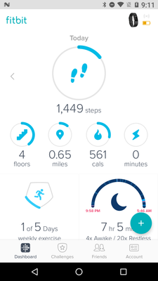
Fitbit Update 10/04/2016: Hello Android Community! Some of you may have took notice that your Fitbit app has updated and you now have the option to view the new Android Dashboard (see screenshot below).

For those of you in the beta, feel free to share your feedback so I can pass it along. I will have a more concrete timeline of official release to share with everyone when I get a confirmed date. We're taking our time to make sure the features are all working up-to-par. Thank you in advance for the feedback!
11-15-2016 19:52
- Mark as New
- Bookmark
- Subscribe
- Permalink
- Report this post
11-15-2016 19:52
- Mark as New
- Bookmark
- Subscribe
- Permalink
- Report this post
@Beaker719 wrote:
I think that it's not fair to call it a preview. You switch to the new look permanently. I don't like the new dashboard and can't switch back. I can't get the stuff I care about in one view, I have to scroll.
You can always switch back. Its pretty easy with Android. There are plenty of websites that host previous versions of Android apps. And once you do, just disable automatic updates for the FitBit app.
11-15-2016 22:49
- Mark as New
- Bookmark
- Subscribe
- Permalink
- Report this post
11-15-2016 22:49
- Mark as New
- Bookmark
- Subscribe
- Permalink
- Report this post
I'm having two issues:
1. When the day previous/current day is over and the app resets, water/sleep also reset (obviously) but the data from the prior day vanishes. When I click on the time it does show the right amount, but its gone on the dashboard itself.
2. Not as important but I can't figure out how to share in the new dashboard.
 Best Answer
11-16-2016 02:15
- Mark as New
- Bookmark
- Subscribe
- Permalink
- Report this post
11-16-2016 02:15
- Mark as New
- Bookmark
- Subscribe
- Permalink
- Report this post
Hi,
Just updated and activated the new dashboard beta, I'm liking it very much so far. I'd like to see the following (please...) -
1) a dark theme (some of us use the app at night, it would be helpful)... ![]()
2) add what we'd like to the dashboard. I removed the food-tracker tile, I'd love to replace it with a tile for alarms.
That's all for now...
Thanks,
-Jerry
11-16-2016 02:51
- Mark as New
- Bookmark
- Subscribe
- Permalink
- Report this post
11-16-2016 02:51
- Mark as New
- Bookmark
- Subscribe
- Permalink
- Report this post
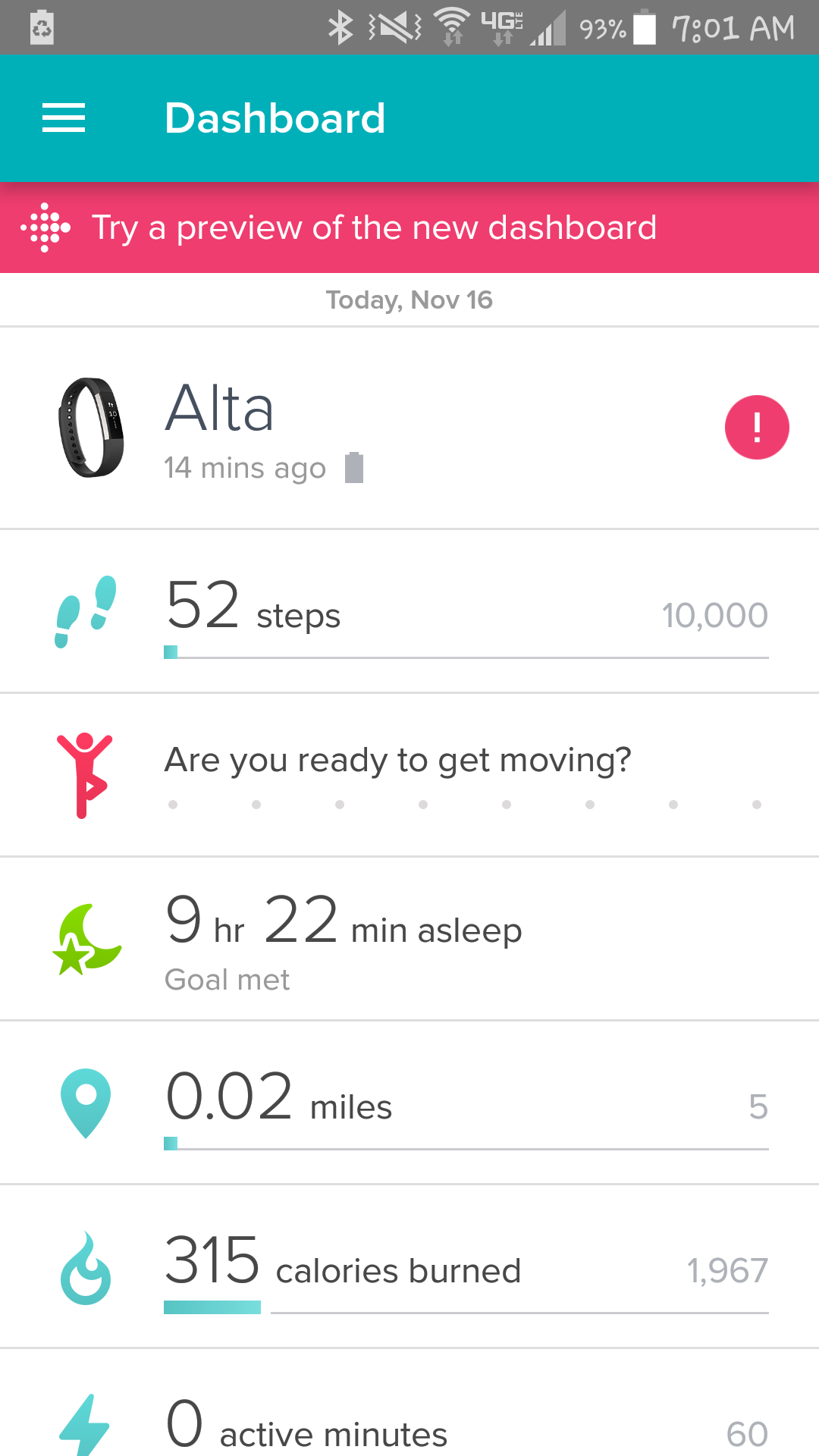
Looks like I'll be reverting to an older version. Don't like the new interface much AT ALL - advertising and that annoying bright pink banner when you go back to using the original version.
11-16-2016 03:50
- Mark as New
- Bookmark
- Subscribe
- Permalink
- Report this post
11-16-2016 03:50
- Mark as New
- Bookmark
- Subscribe
- Permalink
- Report this post
Not a huge fan of the new style, but I can cope.
Except! I see that when I go back to 'yesterday' or further back the tiles for 'hours with movement', 'sleep', 'resting HR' and 'weight' (maybe water and food too, I don't use them) show todays' values not the values as of that date. Yes, I know I can tap to get the data, I want to look at all of yesterday's numbers at once and see if it was a good day or not.
Also you used to be able to swipe left to get to yesterday, and now you have to tap the button; that's less nice.
I do like have the sleep graph rather than just sleep time; but that's the only thing I think is an improvement here, otherwise this just seems like fiddling for the sake of fiddling and you've taken away functionality that people were using, which just seems kinda mean really - taking away functionality to no good end (not even "we don't want to handle this" because the data is all still there if you look hard enough!)
11-16-2016 04:10
- Mark as New
- Bookmark
- Subscribe
- Permalink
- Report this post
11-16-2016 04:10
- Mark as New
- Bookmark
- Subscribe
- Permalink
- Report this post

11-16-2016 04:39
- Mark as New
- Bookmark
- Subscribe
- Permalink
- Report this post
11-16-2016 04:39
- Mark as New
- Bookmark
- Subscribe
- Permalink
- Report this post
11-16-2016 04:48 - edited 11-16-2016 04:49
- Mark as New
- Bookmark
- Subscribe
- Permalink
- Report this post
11-16-2016 04:48 - edited 11-16-2016 04:49
- Mark as New
- Bookmark
- Subscribe
- Permalink
- Report this post
deleted - double post
Fitbit user and forum poster since Jan 2013
One, Blaze, Android/Samsung
 Best Answer
11-16-2016
04:50
- last edited on
12-18-2016
14:14
by
MariamV
![]()
- Mark as New
- Bookmark
- Subscribe
- Permalink
- Report this post
11-16-2016
04:50
- last edited on
12-18-2016
14:14
by
MariamV
![]()
- Mark as New
- Bookmark
- Subscribe
- Permalink
- Report this post
Hi, I'm a beta user and used to have IOS so have had the new dash for quite some time. I agree, I posted lots of constructive feedback as requested by Mods in the pinned thread about it but not one thing has been tweaked for those who use the lower tiles in conjunction with steps/cals etc. Not even any feedback as to why it was not a good idea.
It's a shame to lose functions but as IOS didn't get altered in any useful way I had low expectations to be honest. They had the same issues as some of us here so nothing should be news to the designers. I have no wish to spoil things it for others but, when functions which we bought expensive gadgets to access are being made useless or just harder and less enjoyable to use, it's such a disappointment.
I never sit in the evenings scrutinising my data in the same way and watching my weekly calorie deficit vs intake vs steps/cals burned is too painful to even bother - shame.
The new dash isn't my idea of nice but I'd be fine with the change if it served its purpose still but it just doesn't.
I love Fitbit but, after 4yrs of devotion, they are currently firmly on the norty step! ![]()
Moderator edit: format
Also occ posting as Blokeypoo
11-16-2016 06:34
- Mark as New
- Bookmark
- Subscribe
- Permalink
- Report this post
11-16-2016 06:34
- Mark as New
- Bookmark
- Subscribe
- Permalink
- Report this post
I got the new Dashboard yesterday. The look is okay, but when I sync it takes a while (1-2 minutes) for everything to update once the sync is done. Is this normal?
11-16-2016 06:46
- Mark as New
- Bookmark
- Subscribe
- Permalink
- Report this post
11-16-2016 06:46
- Mark as New
- Bookmark
- Subscribe
- Permalink
- Report this post
I honestly don't care what the interface looks like, tiles, numbered lines, whatever, but my numbers are completely inaccurate!
First, all my calorie info for previous days is showing zero in the tiles. When I click on the tile to get the calorie history it's still there; thank goodness!
Second, my active synching data is completely inaccurate for the top tiles (in blue - steps, floors, calories, and exercise minutes). I'm honestly not sure what point-in-time these numbers are from, but they're at least an hour old based on my current numbers displaying on my charge 2.
Thank goodness there's a way to switch back to the old interface so I can view accurate numbers!
11-16-2016 07:08
- Mark as New
- Bookmark
- Subscribe
- Permalink
- Report this post
11-16-2016 07:08
- Mark as New
- Bookmark
- Subscribe
- Permalink
- Report this post
 Best Answer
11-16-2016
09:49
- last edited on
11-18-2016
06:05
by
HelenaFitbit
![]()
- Mark as New
- Bookmark
- Subscribe
- Permalink
- Report this post
11-16-2016
09:49
- last edited on
11-18-2016
06:05
by
HelenaFitbit
![]()
- Mark as New
- Bookmark
- Subscribe
- Permalink
- Report this post
Just received the new look. Love it.
Moderator edit: Removed personal information.
 Best Answer
11-16-2016 09:56
- Mark as New
- Bookmark
- Subscribe
- Permalink
- Report this post
SunsetRunner
11-16-2016 09:56
- Mark as New
- Bookmark
- Subscribe
- Permalink
- Report this post
Hi @NeilAndrew
Nice to meet a fellow Michigander! But....I feel like one of us missed part of a conversation somewhere! LOL
None the less, I hope you have a great afternoon.
-jeff
 Best Answer
11-16-2016 10:14
- Mark as New
- Bookmark
- Subscribe
- Permalink
- Report this post
11-16-2016 10:14
- Mark as New
- Bookmark
- Subscribe
- Permalink
- Report this post
11-16-2016 11:19
- Mark as New
- Bookmark
- Subscribe
- Permalink
- Report this post
11-16-2016 11:19
- Mark as New
- Bookmark
- Subscribe
- Permalink
- Report this post
Hi @dbolden
Yes, it's possible, to hide tiles by long pressing them and then clicking on the minus icon in the corner, you can also navigate to the bottom of the tiles where you'll find a edit button.
Remember that if you have any questions you can always contact support.
11-16-2016 11:36
- Mark as New
- Bookmark
- Subscribe
- Permalink
- Report this post
11-16-2016 11:36
- Mark as New
- Bookmark
- Subscribe
- Permalink
- Report this post
I've just tried the new dashboard on my Android phone. Two things I prefer about the old dashboard that I haven't seen mentioned:
1) The progress bars and icons turn colors (blue->yellow->orange->green) as one reaches 1/3, 2/3, and all of a goal. The new one appears to just have blue and green. I liked the intermediate steps.
2) The size of the numbers for the four secondary goals below the main goal are just a little smaller in the new dashboard. As someone with older eyes, I like the larger and slightly easier to read numbers.
11-16-2016 12:06
- Mark as New
- Bookmark
- Subscribe
- Permalink
- Report this post
11-16-2016 12:06
- Mark as New
- Bookmark
- Subscribe
- Permalink
- Report this post
11-16-2016 12:12
- Mark as New
- Bookmark
- Subscribe
- Permalink
- Report this post
11-16-2016 12:12
- Mark as New
- Bookmark
- Subscribe
- Permalink
- Report this post
Do I need to go to feature requests as the new dash seems to be live and all but unchanged with regard to the feedback?
Thanks,
Helen
Also occ posting as Blokeypoo
11-16-2016 13:04
- Mark as New
- Bookmark
- Subscribe
- Permalink
- Report this post
11-16-2016 13:04
- Mark as New
- Bookmark
- Subscribe
- Permalink
- Report this post
