Join us on the Community Forums!
-
Community Guidelines
The Fitbit Community is a gathering place for real people who wish to exchange ideas, solutions, tips, techniques, and insight about the Fitbit products and services they love. By joining our Community, you agree to uphold these guidelines, so please take a moment to look them over. -
Learn the Basics
Check out our Frequently Asked Questions page for information on Community features, and tips to make the most of your time here. -
Join the Community!
Join an existing conversation, or start a new thread to ask your question. Creating your account is completely free, and takes about a minute.
Not finding your answer on the Community Forums?
- Community
- Platform
- Android App
- Re: Android Dashboard Redesign Feedback
- Mark Topic as New
- Mark Topic as Read
- Float this Topic for Current User
- Bookmark
- Subscribe
- Mute
- Printer Friendly Page
- Community
- Platform
- Android App
- Re: Android Dashboard Redesign Feedback
Android Dashboard Redesign Feedback
- Mark Topic as New
- Mark Topic as Read
- Float this Topic for Current User
- Bookmark
- Subscribe
- Mute
- Printer Friendly Page
10-04-2016 11:32 - edited 04-24-2017 13:30
- Mark as New
- Bookmark
- Subscribe
- Permalink
- Report this post
 Community Moderator Alumni are previous members of the Moderation Team, which ensures conversations are friendly, factual, and on-topic. Moderators are here to answer questions, escalate bugs, and make sure your voice is heard by the larger Fitbit team. Learn more
10-04-2016 11:32 - edited 04-24-2017 13:30
- Mark as New
- Bookmark
- Subscribe
- Permalink
- Report this post
Fitbit Update 04/24/2017: Hi everyone -- Our Android team appreciates everyone's feedback in this thread and are working to fully implement the new Android Dashboard in the upcoming 2.48 release.
I am closing this thread as all feedback has been captured and reviewed by our team. Thanks again for all of your constructive feedback as we continue to improve Fitbit products and services.
Fitbit Update 10/04/2016: Hello Android Community! Some of you may have took notice that your Fitbit app has updated and you now have the option to view the new Android Dashboard (see screenshot below).
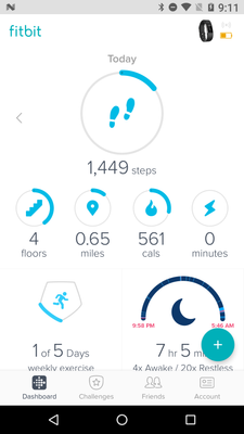
For those of you in the beta, feel free to share your feedback so I can pass it along. I will have a more concrete timeline of official release to share with everyone when I get a confirmed date. We're taking our time to make sure the features are all working up-to-par. Thank you in advance for the feedback!
11-28-2016 20:56
- Mark as New
- Bookmark
- Subscribe
- Permalink
- Report this post
11-28-2016 20:56
- Mark as New
- Bookmark
- Subscribe
- Permalink
- Report this post
That's my point, horses for courses means we're all different.
I am perfectly capable of knowing what I did yesterday too but I use my gadget to maintain significant weight loss and looking at my cumulative calorie deficit vs cals out vs weight vs steps was easier when I could see a day in its entirety.
I also liked to see this when I'm mountain walking to keep up with my calorie burn which increases dramatically when walking 80 miles in a week, we all use things differently. There is no right or wrong, just some who feel the change more keenly perhaps.
I'm just feeding back as requested.
Also occ posting as Blokeypoo
11-29-2016
05:41
- last edited on
02-06-2026
03:46
by
MarreFitbit
![]()
- Mark as New
- Bookmark
- Subscribe
- Permalink
- Report this post
 Community Moderator Alumni are previous members of the Moderation Team, which ensures conversations are friendly, factual, and on-topic. Moderators are here to answer questions, escalate bugs, and make sure your voice is heard by the larger Fitbit team. Learn more
11-29-2016
05:41
- last edited on
02-06-2026
03:46
by
MarreFitbit
![]()
- Mark as New
- Bookmark
- Subscribe
- Permalink
- Report this post
Hello, @Gillean and @Poo! It is nice to see you around. ![]() Well, in this case you can't choose a specific date to go back and check your history, you can only go back like a week and a half. This would be very useful, I agree with you, thank you for your feedback. Maybe in the next update this will be an option. In the mean time I suggest you to this directly from your online dashboard using a computer or using the Internet on your phone like Google Chrome.
Well, in this case you can't choose a specific date to go back and check your history, you can only go back like a week and a half. This would be very useful, I agree with you, thank you for your feedback. Maybe in the next update this will be an option. In the mean time I suggest you to this directly from your online dashboard using a computer or using the Internet on your phone like Google Chrome.
Thank you so much for your feedback, we will take in consideration and you are totally right, it does feel weird at first, every change, however you get use to it with time. If you want to switch back to the old dashboard just go to your advance settings.
See you around guys! ![]()
 Best Answer
11-29-2016 07:27 - edited 11-29-2016 08:48
- Mark as New
- Bookmark
- Subscribe
- Permalink
- Report this post
11-29-2016 07:27 - edited 11-29-2016 08:48
- Mark as New
- Bookmark
- Subscribe
- Permalink
- Report this post
You can remove tiles by hitting the edit button or with a long hold on the blank part of the page. It will then give "minus" symbols to just tap on for those you don't want.
Debbie
 Best Answer
11-29-2016 08:47
- Mark as New
- Bookmark
- Subscribe
- Permalink
- Report this post
11-29-2016 08:47
- Mark as New
- Bookmark
- Subscribe
- Permalink
- Report this post
Hi - I like the look of the new dashboard for Android. It has the same look as on the website. But one of the things I would like to see is having the whole screen swipe sideways to the previous days, not just the steps. This app is used for more than just how many steps you've done to compare with previous days. I use it for counting calories & watching the weight going up or down, too. It is more cumbersome to have to go into each tile to get this information instead of just being able to swipe across to see it more quickly. I would also like to see how much weight "to go" instead of just how much lost. You need to be able to see that you've gained, not just lost, without going into the back screen. Perhaps you could make the steps icon smaller, or all of them to some degree, so that everything could fit on one page instead of having to scroll down to see everything, also. Thanks.
Debbie
 Best Answer
11-29-2016 08:49
- Mark as New
- Bookmark
- Subscribe
- Permalink
- Report this post
11-29-2016 08:49
- Mark as New
- Bookmark
- Subscribe
- Permalink
- Report this post
11-29-2016 08:53
- Mark as New
- Bookmark
- Subscribe
- Permalink
- Report this post
11-29-2016 08:53
- Mark as New
- Bookmark
- Subscribe
- Permalink
- Report this post
You can switch back. Go into your account, go to advanced settings & there is a option to switch back to the old version.
11-29-2016 11:59
- Mark as New
- Bookmark
- Subscribe
- Permalink
- Report this post
11-29-2016 11:59
- Mark as New
- Bookmark
- Subscribe
- Permalink
- Report this post
easy. It it's a terrible change!
11-29-2016 12:02
- Mark as New
- Bookmark
- Subscribe
- Permalink
- Report this post
11-29-2016 12:02
- Mark as New
- Bookmark
- Subscribe
- Permalink
- Report this post
11-29-2016
15:24
- last edited on
02-06-2026
03:47
by
MarreFitbit
![]()
- Mark as New
- Bookmark
- Subscribe
- Permalink
- Report this post
 Community Moderator Alumni are previous members of the Moderation Team, which ensures conversations are friendly, factual, and on-topic. Moderators are here to answer questions, escalate bugs, and make sure your voice is heard by the larger Fitbit team. Learn more
11-29-2016
15:24
- last edited on
02-06-2026
03:47
by
MarreFitbit
![]()
- Mark as New
- Bookmark
- Subscribe
- Permalink
- Report this post
@Gillean In order to see your previous history for 1 week, 1 month, 3 months, or 1 year do the following:
- Click on the tile for the metric that you'd like to view
- Then click on the expanded graph at the top, which will then show the options for those date ranges.
11-29-2016 15:38
- Mark as New
- Bookmark
- Subscribe
- Permalink
- Report this post
SunsetRunner
11-29-2016 15:38
- Mark as New
- Bookmark
- Subscribe
- Permalink
- Report this post
I think we all know how to get to those stats, but it's just annoying having to do this, instead of having the tiles refresh to the selected days stats when you scroll through the days. Keeping the other tiles on the current day stats whilst changing the step tile is confusing.
I think all of the tiles should update to the selected days statistics for quick comparison and if you select a tile, this should have a detailed view.
11-30-2016 05:11
- Mark as New
- Bookmark
- Subscribe
- Permalink
- Report this post
11-30-2016 05:11
- Mark as New
- Bookmark
- Subscribe
- Permalink
- Report this post
11-30-2016 05:32
- Mark as New
- Bookmark
- Subscribe
- Permalink
- Report this post
11-30-2016 05:32
- Mark as New
- Bookmark
- Subscribe
- Permalink
- Report this post
@Jried I'm not certain that the development team will take any notice of what their users say about the dashboard changes. The company has invested time and money in making this new 'modern look' dashboard. To give their customers the option of using the old dashboard as an alternative choice would be admitting their error. I doubt that will ever happen!
11-30-2016 05:37 - edited 11-30-2016 05:39
- Mark as New
- Bookmark
- Subscribe
- Permalink
- Report this post
11-30-2016 05:37 - edited 11-30-2016 05:39
- Mark as New
- Bookmark
- Subscribe
- Permalink
- Report this post
Exactly, dansampayo! It doesn't do much good to change the steps if nothing else changes & you're looking at past steps with today's stats. It should be all tiles that change.
11-30-2016 07:59
- Mark as New
- Bookmark
- Subscribe
- Permalink
- Report this post
11-30-2016 07:59
- Mark as New
- Bookmark
- Subscribe
- Permalink
- Report this post
When I updated my Samsung Galaxy 6 phone to the new dashboard for my Flex Fitbit, I now have a Giant Plus Sign in the lower right hand corner. It is very annoying and covers some of the data. Is there a way to shrink it or make it go away completely? I prefer the old dashboard because of this annoyance!
11-30-2016 11:17
- Mark as New
- Bookmark
- Subscribe
- Permalink
- Report this post
11-30-2016 11:17
- Mark as New
- Bookmark
- Subscribe
- Permalink
- Report this post
11-30-2016 13:32 - edited 11-30-2016 14:29
- Mark as New
- Bookmark
- Subscribe
- Permalink
- Report this post
11-30-2016 13:32 - edited 11-30-2016 14:29
- Mark as New
- Bookmark
- Subscribe
- Permalink
- Report this post
@ErickFitbit, thank you for your reassurance that all feedback is getting gathered and presented to the developers. It's very important to know that one's concerns and thoughts are being heard.
A general request to other moderators of this thread: I do understand your passion about the product and that you may personally find the new design lovely, attractive and easy to use. However please try to be more considerate to the complaints of the people who don't think in the same way as you do, and please don't tell them that they just need to get used to it. This is really not very productive. We are adults who bought an expensive device for our own specific purposes and needs, and many of the users have selected this product because it was doing what they wanted it do. When this stops being the case, they have a very valid reason to air their concerns.
Now, to my more detailed feedback.
As it's been stated many times, different people have different purposes and requirement and they use their trackers in their own specific ways. Thanks to the versatility of Fitbit trackers, they help people to focus on specific things of their interest.
I own a Blaze and I use it primarily for watching my daily activity and controlling my calories intake. I don't do long walks (although I have my daily step goal) nor long excercises. Things I'm interested in mostly are: step count, calories burned and calories intake (and their balance), water intake, and hourly activity. Things I'm interested less: heart bpm, active minutes, sleep, weight . Of no interest at all: the distance (it's a derivative parameter calculated from steps multiplied by stride length) and floors (I work from home, and I rarely have to climb any floors at all).
As a result, my opening screen on the old Android dashboard looks this way, screenshot 1:
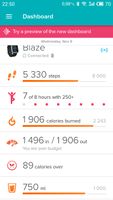
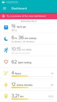
All important information for the current day is visible to me at once, and I can take it in with a single glace. By swiping left I can watch all this information for any of the previous days, in all entirety, and track my progress over the last several days.
All less important parameters, which I access less often or don't need at all, are collected on the second screen. (Old Design Page 02)
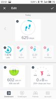
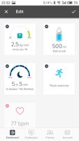
Now, in the new design, to get all the information I need, I should remove three (!) out of the five tiles on the upper panel, which will result in a following look:
Screenshot New Design Page 01.
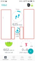
As a result, the first opening screen contains only four out of the six items interesting to me. For two of them, I need to swipe down. (Screenshot New Design Page 02).
The huge plus sign, which partly covers the lower right tile, is very intrusive and hides important data.
I can no longer swipe left to see the whole statistics for my previous days. This has been discussed in this thread several times: firstly, the swipe has been replaced with a small arrow (need to tap instead of swiping but I can live with this); and secondly, much more important, getting back to the previous days doesn't give me the entire picture of these days, but only the data for the tiles in the upper pane of the screen. For getting the past data for all other parameters I should go through each tile separately, and I am not able to get a full picture for the selected day anyway.
In addition, removing irrelevant tiles has created a huge empty blindingly white space on my screen, which is very straining on the eyes. Even if the developers give us an option to customize the background and choose any non-white soft colors, this wouldn't remove the vast amount of empty wasted screen space. (Screenshot New Design Page 01 Finished)
Things that would make me accept and actually start using the new Android dashboard design:
1. Treat all tiles equally (no more division between upper and lower pane) and allow the users to rearrange them as they wish, to reflect the parameters they specifically need, exactly how it's done now in the old design.
1a. Allow the users to select their "main" tile, be it steps, or bpm, or calories (eaten/consumed/left).
2. Swiping left (or tapping) to view information for the previous days should display the data for that specific day on all tiles, not just the tiles from the upper pane.
I can live with tiles instead of horizontal bars, as long as
(a) I can see all info for the current day important to *me* on one screen at one glance, and
(b) I can see all info for the past day(s) important to *me* on one screen at one glance.
After several days of trying to "get used" to the new design, I reverted back to the old one, because it suits my needs better.
Otherwise, please don't push this change and allow users to choose whichever design they want to use.
P.S. Apologies for the mess with the screenshots, I haven't been able to put them in the spots I wanted them to be. Not sure how to do that, sorry!
11-30-2016 14:38
- Mark as New
- Bookmark
- Subscribe
- Permalink
- Report this post
11-30-2016 14:38
- Mark as New
- Bookmark
- Subscribe
- Permalink
- Report this post
the old dashboard because it does what I want. The moderators are paid to
like the new set up. I'm not corruptible and don't like it if they were
honest I'm sure some would agree. That would be so reassuring.
11-30-2016 14:50
- Mark as New
- Bookmark
- Subscribe
- Permalink
- Report this post
11-30-2016 14:50
- Mark as New
- Bookmark
- Subscribe
- Permalink
- Report this post
 Best Answer
11-30-2016 14:58
- Mark as New
- Bookmark
- Subscribe
- Permalink
- Report this post
 Platinum Fitbit Product Experts share support knowledge on the forums and advocate for the betterment of Fitbit products and services. Learn more
11-30-2016 14:58
- Mark as New
- Bookmark
- Subscribe
- Permalink
- Report this post
Why do you need to reboot the phone?
Do you need to reboot it every day?
It is very possible that with any app update your phone might need rebooting.
 Best Answer
11-30-2016 15:02
- Mark as New
- Bookmark
- Subscribe
- Permalink
- Report this post
11-30-2016 15:02
- Mark as New
- Bookmark
- Subscribe
- Permalink
- Report this post
New Android Dasboard (Flex) does not sync properly. It is much slower than previous, and the total steps do match those listed on the summary screen.
